


Data is key to building resilience and achieving operational excellence—but first, your data must be intelligible.
Luckily, modern BI solutions have intuitive interfaces that allow business users to build interactive data visualizations and contextual data stories. With this knowledge at their fingertips, your entire organization is empowered to make data-driven decisions.
In this article, we will look at the top data visualization examples and practices across industries, so you too can tap into the power of data analytics.
Data visualization best practices
Today’s BI tools offer an extensive collection of pre-built visualizations, but finding insights in this layout isn’t always possible, let alone intuitive. The tips listed below will help you create interactive data visualizations so your team can make the most of the available data.
1. Choose the right charts and graphs
It's essential to choose the right type of data visualization so that it serves the specific needs of your audience. For instance, when presenting to business executives, you might opt for high-level charts, such as bar graphs and pie charts. On the other hand, data analysts require interactive visualizations that allow them to dig deeper.
💡 Relevant read: 24 types of charts and graphs for data visualization
2. Avoid clutter
In the data world, less is always better. Bad data visualizations have too many visual elements and data points that may distract your management team. To ensure that doesn’t happen, choose an appropriate layout, keep the visual elements simple, and add contextual cues, like labels and fields, wherever possible to help users understand the story.
3. Keep your color palette simple
Using the right color palette is essential for a positive user experience. Because if you create a busy background, it becomes confusing for the users to access critical information. Use distinct colors to showcase visual hierarchy or highlight crucial data points and maintain color consistency across charts for a unified look.
4. Consider data accessibility
When data is easily accessible to users in their workflows, they are likely to incorporate it into their decision-making process. By choosing a BI platform that seamlessly connects with your data repositories, such as databases, cloud warehouses, Google Workspace, and APIs your team can utilize your data in a way that makes the most impact on your business.
💡Read more: 9 best practices and tips to follow for effective data visualization
Good data visualization examples used across industries
To visualize your data, you need two things—a modern data stack that brings all your data together and a data visualization tool with AI features like ThoughtSpot that allows you to build interactive visualizations, analyze your data, and take action. Below, we’ve included a few examples of what this process looks like across several industries.
1. Retail
Retailers must stay on top of critical KPIs—from online sales to social media media conversions. But KPIs are not the only thing that should be in your retail dashboard. By including relevant visualizations, retailers can analyze trends and get to the ‘why’ faster. By introducing data visualizations into business users’ workflows, businesses can deliver a personalized customer experience, improve inventory planning, and hit revenue targets.
With ThoughtSpot, retailers can easily drill into data and analyze the sales performance of each product category to allocate future resources effectively. Check out the data visualization example for retailers below:
2. Healthcare
Delivering better patient outcomes, maintaining efficiency, and meeting healthcare compliance is only achievable when everyone has instant access to actionable insights. By serving relevant data visualizations within your team’s workflows, they will have the information to identify irregularities and create proactive strategies.
By connecting your data sources to a business intelligence solution, you can uncover personalized insights and make educated decisions. Here is a good data visualization example for healthcare professionals.
Learn more about how BI solutions can unlock new transformation opportunities with this insightful podcast on digital transformation in healthcare💡
3. Finance and banking
Data holds a higher significance in the finance industry. Static dashboards and Excel spreadsheets are not enough—you need real-time, interactive dashboards to manage risks, monitor transactions, and identify growth opportunities. With interactive data visualizations, you can measure the financial impact of your business activities and make necessary adjustments to maximize ROI.
With intuitive platforms like ThoughtSpot, you can view critical financial KPIs and financial dashboards, like the example below, on the go and address areas that need improvement.
👀 See how Loan Market Group empowers brokers by embedding live data visualizations.
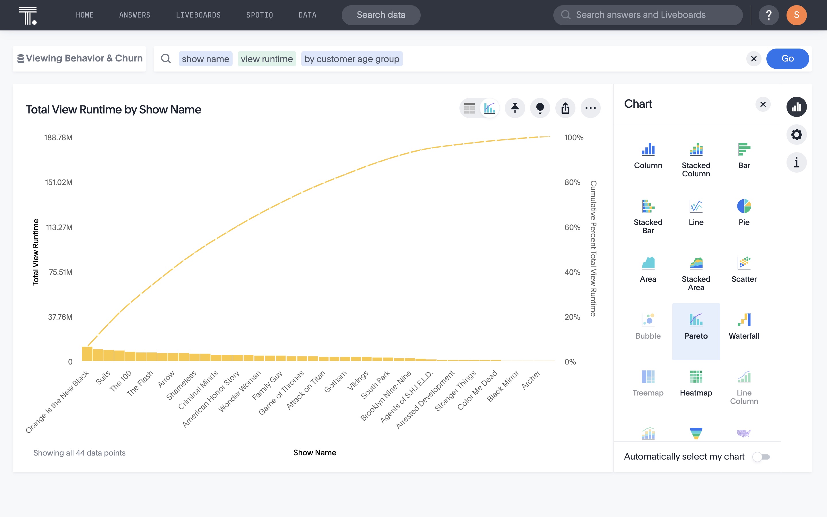
4. Media and communications
Data analytics plays a pivotal role across the media and communications industry—shaping content, boosting audience engagement, and building business strategies. You can use insightful visualizations to identify key customer segments, understand their viewership patterns, and improve campaign performance.
Here is a good example of data visualization that will help you gain better context about your content performance and viewership behavior:
5. Manufacturing and logistics
Manufacturers need to monitor real-time KPIs to optimize their operations, reduce cycle time, and improve their inventory turnover ratios. By building interactive dashboards and visualizations, you can track each operation and address bottlenecks immediately for successful outcomes.
For instance, manufacturers like Fabuwood use ThoughtSpot’s Liveboards to create visualizations like the data visualization example below to lower lead times and enable quicker decision-making.
6. Sales and marketing
If you are in the GTM area of your business, you know having accessible data is critical for understanding the sales pipeline and analyzing campaign ROI. By analyzing content engagement and high-conversion touch points, you can make informed decisions about where to invest in the future.
Designing a personalized dashboard gives you high-level visibility into critical KPIs and allows you to drill down to find granular insights. Take a look at this best data visualization example below.
7. Supply chain
Effective supply chain management is critical for the success of any business. However, the supply chain is riddled with an ever-evolving scope of uncertainty. Business analytics solutions will help you to stay on top of operations and improve efficiency. Whether you need to analyze supplier performance or monitor order fulfillment rates, interactive visualizations can help you uncover granular insights and craft winning procurement strategies.
Here’s an example of how supply chain leaders can get a clear overview of total spending by product group:
Start Getting Better Insights
Create a compelling data narrative with the right visualizations
Drawing on these data visualization best practices and industry examples, you can pick the right tool for your business and increase the value of data across your organization. See how easy it is to build interactive visualizations with ThoughtSpot’s AI-Powered Analytics—schedule a live demo to know more.


