


You’ve probably been there: you uncover an insight that could solve a real problem for your team, but when you put it on a slide, the chart falls flat. People get confused, skeptical, or just tune out.
That’s because data storytelling isn’t just about what you’re saying; it’s about empowering others to act on it.
The right chart makes your point instantly clear, highlighting the “why” behind the trend or tradeoff. The wrong one? It clouds the message, slows people down, or even leads to the wrong call.
So if you’re tired of watching good insights go nowhere, you’re in the right place. Let’s break down how to choose the right type of chart in data visualization to make your insights more valuable and actionable.
Table of contents:
With multiple types of data visualizations to choose from, it is best to familiarize yourself with the nuances of each type. This will help you understand which visualization best suits your dataset so you can boost engagement when you are telling your data story. Let’s dig in.
These are the classic, go-to visualizations that work for a wide range of use cases. If you’re ever unsure where to start, these charts offer simple, reliable ways to surface key insights clearly and quickly.
1. Bar chart
A bar chart visually represents data using rectangular bars or columns. Here, the length of each bar corresponds proportionally to its value. You can present these bars horizontally or vertically.
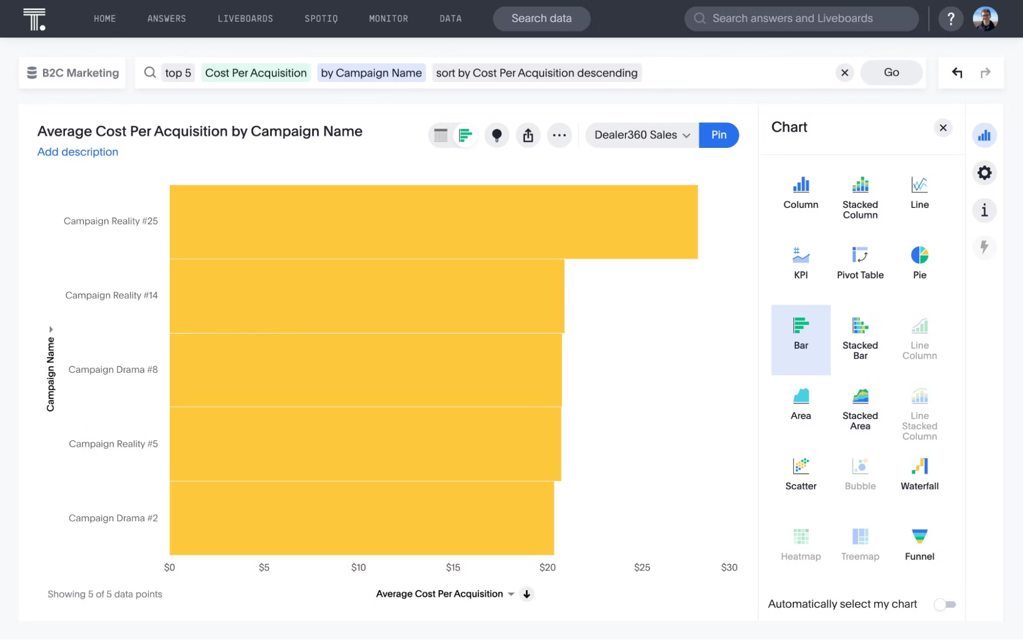
When to use bar charts?
Bar charts are excellent for comparing the values of different categories or groups. Apart from that, these types of charts are also helpful in showing the distribution of data across different categories.
Best practices for bar charts:
Clearly label each bar and axis with concise labels
Limit the number of bars and categories to avoid cognitive overload
Purposely use colors to highlight key points and convey meaning
2. Histogram
A histogram visualizes a single, continuous dataset. Although histograms and bar charts are used interchangeably, they differ in practice. For instance, a bar graph is a plot of a single data point (a sum, average, or other value) for each category while a histogram is a plot of a range of data.
When to use histograms?
Think of histograms as a more informative way to view the distribution of values in a dataset. It is ideal for visualizing the spread and variation of the data, helping you identify outliers or unusual data points that fall far outside the normal range of the data.
Best practices for histograms:
Choose an appropriate number of bins and their sizes
Consider using consistent intervals for bins to maintain uniformity and accuracy in data representation
Histograms are less effective with smaller datasets, so make sure you have sufficient data points.
3. Column chart
Column charts are the simplest, most versatile type of visualization used in data analytics. The horizontal chart displays your data in bars proportional to the values they represent.
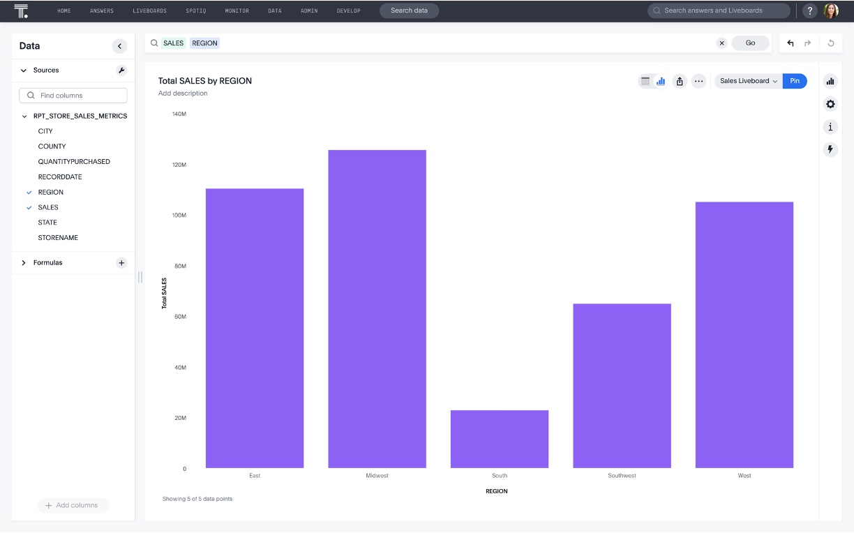
When to use column charts?
More often than not, column charts effectively compare data across different categories. They are also helpful in displaying rankings and order in a dataset, allowing viewers to identify trends quickly.
Best practices for column charts:
Minimize distracting visual elements, such as 3D effects or excessive gridlines
Focus on presenting key data points for a better understanding
Use contrasting colors to highlight specific columns.
5. Line chart
A line chart connects distinct data points through straight lines. Its best use case is to illuminate trends, patterns, and variable changes.
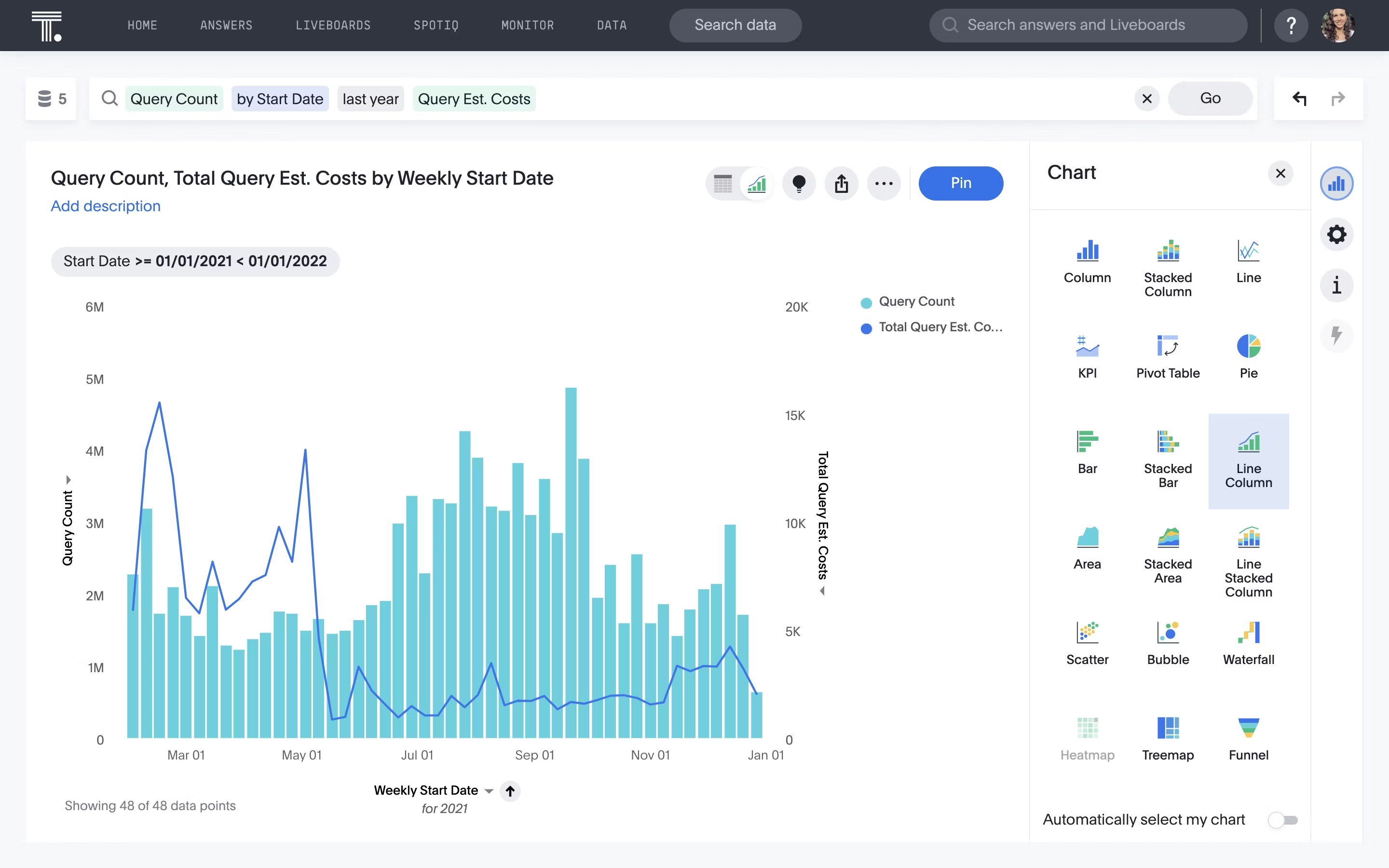
When to use line charts?
This type of chart helps measure how different groups relate to each other. This type of chart is also effective for demonstrating progression, making them suitable for scenarios like project timelines, production cycles, or population growth.
Best practices for line charts:
Make sure the data you're representing has a logical order
Add context through annotations and labels
If the dataset is large, use transparency or spacing to improve visibility
5. Pie chart
A common but limited type of graph is the pie chart. It is a circular, statistical graphic that divides data into slices, where each slice represents a percentage or proportion of the whole. You can create your own pie chart to illustrate how each category contributes to the overall dataset.
When to use pie charts?
This classic chart type is effective when you want to illustrate the proportion of each category in the dataset. The chart is suitable when you have limited categories, ideally less than six or seven.
Best practices for pie chart:
Keep the number of slices limited to maintain clarity
Clearly label each slice with clear text.
Follow consistency so viewers associate colors with specific categories
What’s hiding in your data? Find out by signing up for your demo
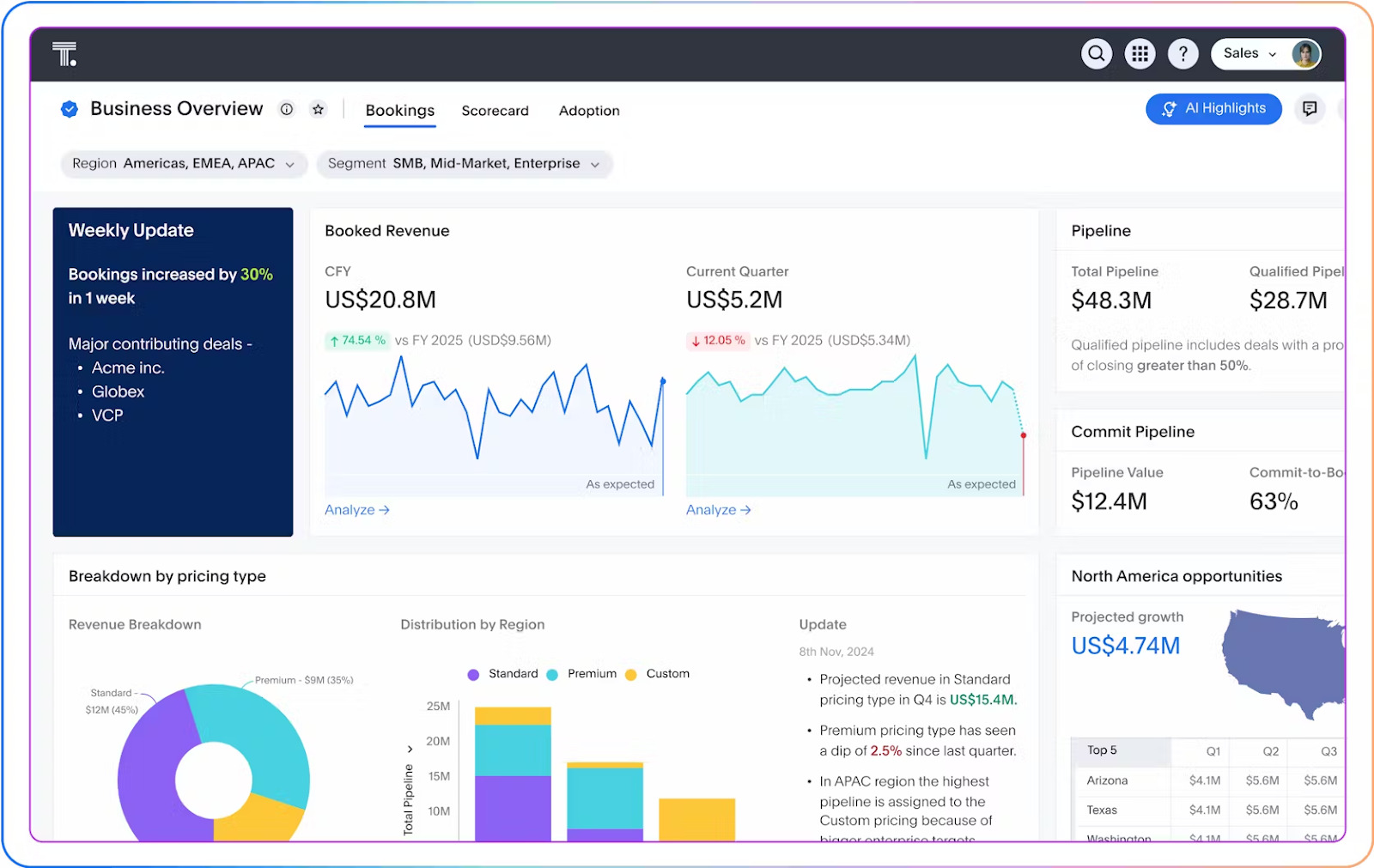
6. KPI chart
KPI (key performance indicators) charts are focused, high-impact visuals that show how your business—or a specific process—is performing against key goals. They're designed for quick checks and faster decisions, especially when the stakes are high.
With ThoughtSpot's AI-augmented dashboards, you’re not just looking at static metrics—you’re tracking KPIs in real time. Whether it's revenue growth, churn rate, or NPS, you get up-to-the-minute visibility into what’s working and what’s not.
Even better? These visuals are fully drillable, so you can click straight into the "why" behind the number.
When to use KPI charts?
KPI charts provide a clear and concise overview of various KPIs and metrics related to finance, operations, and sales. These types of graphs help you understand how each process impacts your bottom line.
Best practices for KPI charts:
Choose a modern dashboard solution with real-time data processing capabilities.
Select relevant datasets to measure performance over time.
Avoid overwhelming your viewers with too many KPIs; focus on the most critical ones that provide valuable insights.
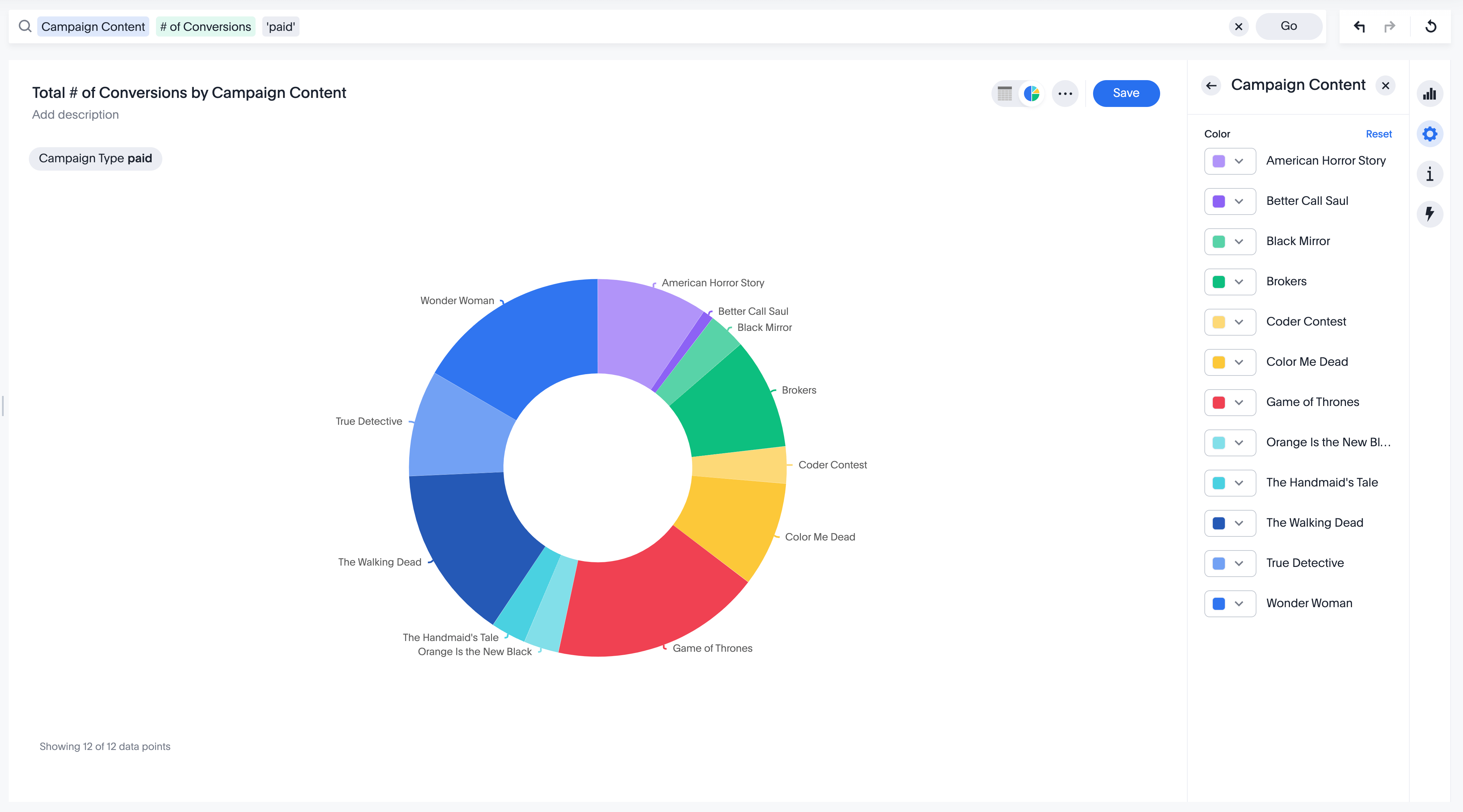
7. Donut chart
Donut charts are variations of pie charts that display data in a circular format, with a hole in the center. The center hole gives the chart its "donut" shape and makes it easier to visualize multiple data series.
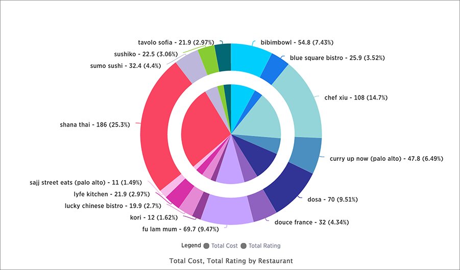
When to use donut charts?
A donut chart illustrates how different categories contribute to a whole. While pie charts are suitable for showing a limited number of categories, donut charts are more versatile and can handle a larger number of categories without becoming cluttered.
Best practices for donut charts:
Apply a consistent color scheme to differentiate categories.
Consider using labels with names and percentages for better context.
Do not use 3D effects or excessive gridlines that can distort the visual representation.
These charts are designed to help you compare categories, segments, or time periods side by side. Whether you're evaluating sales by region or support tickets by type, these visuals highlight how different groups stack up against each other.
8. Treemap chart
Treemaps are hierarchical charts that allow you to visualize data as nested rectangles. These rectangles or branches convey the structure and distribution of data, making treemaps useful for visualizing categorical and hierarchical relationships.
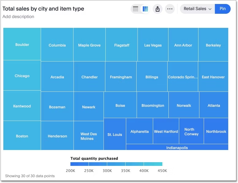
When to use treemap charts?
Apart from visualizing hierarchical data, this type of graph helps to illustrate part-to-whole relationships within a dataset, demonstrating how each category contributes to the overall composition.
Best practices for treemap charts:
Keep the size of the rectangle proportional to the size of the category
Clearly label each rectangle with concise labels
Use a single color with varying shades to show changes in data
9. Pareto chart
A Pareto chart combines a bar chart and a line graph. The rectangular bars correspond to individual values in descending order, while the line graph displays the cumulative percentage total. This type of chart follows the famous Pareto principle that emphasizes that 20 percent of causes result in 80 percent of problems.
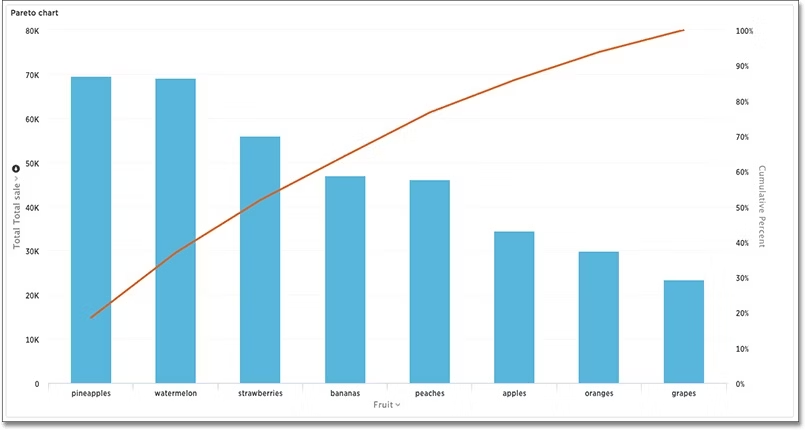
When to use Pareto charts?
A Pareto chart effectively showcases the key contributing factors to a particular outcome. Another use case of types of graphs is when you want to highlight problems based on their impact.
Best practices for Pareto charts:
Arrange all the categories in descending order based on their frequency, impact, or contribution
Use colors purposefully to enhance clarity
Add context with clear, concise labels for each category
10. Radar chart
Radar charts, also known as spider web charts, visualize data in a two-dimensional format, making them useful for comparing multiple variables across different categories.
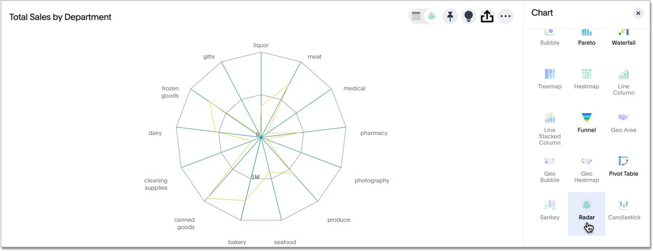
When to use radar charts?
Radar charts are best used to compare multiple dimensions in a compact space. It can also help you reveal patterns, relationships, or gaps between different variables or entities, such as customer satisfaction ratings across various service centers.
Best practices for Radar Charts:
Apply transparency to the lines or fill areas, allowing overlapping regions to be visible without becoming cluttered.
Maintain consistent scaling across all axes to facilitate accurate comparisons.
Add text summaries or labels for greater context.
11. Funnel chart
Similar to a stacked column chart, a funnel chart shows the progression or reduction of data across those stages. It is shaped like a funnel, with the largest section at the top and progressively smaller sections below.
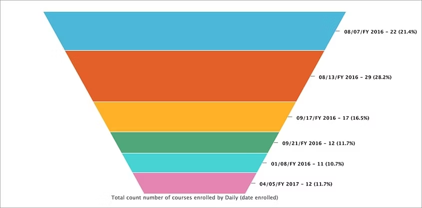
When to use funnel charts?
This type of chart is excellent for highlighting the progression or attrition of data. You can also use them to compare data across various stages.
Best practices for funnel chart:
Include at least three stages to compare the data.
Apply visual cues like color changes or annotations to highlight significant reductions between stages.
Adjust the widths properly, as it can confuse or mislead the viewers.
12. Waterfall chart
A waterfall chart is like a visual story that helps you see how different things add up to a final result. It explains how an initial value is affected by a series of intermediate positive and negative values. The waterfall chart receives its name due to its shape as it shows cascading effects.
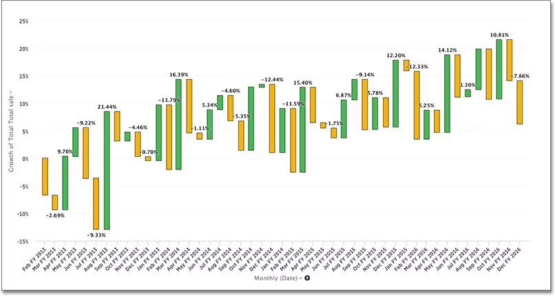
When to use waterfall charts?
This type of visualization helps communicate the sequential impact of various factors on a total value. The chart helps visualize the changes in the data and understand the flow of values.
Best practices for waterfall charts:
Add labels and use color coding to distinguish between positive and negative changes.
Maintain consistent scaling on the axis.
Start with the initial value and then progress by adding contributing factors.
13. Stacked bar chart
A stacked bar chart breaks down and compares parts of a whole across categories. Each bar represents a total value, segmented into colored sections that show how individual components contribute. It’s like a bar chart, but with more layers.
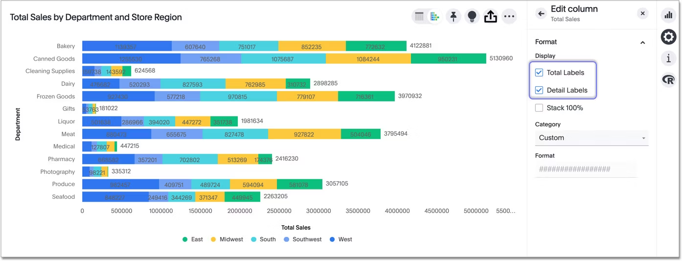
When to use stacked bar charts?
Stacked bar charts are perfect when you want to compare overall totals across categories and understand the composition of each total. They’re commonly used to visualize things like sales by product line over time, support tickets by type and priority, or expenses across departments and quarters.
Best practices for stacked bar charts
Limit the number of segments, as too many can make the chart hard to read.
Use consistent color coding to help users track categories across bars.
Include data labels or tooltips for precise comparisons, especially for smaller segments.
These charts are perfect for answering questions like: Is there a link between marketing spend and conversions? Or do certain user behaviors tend to occur together? Use them to move beyond what’s happening to understand how different factors interact.
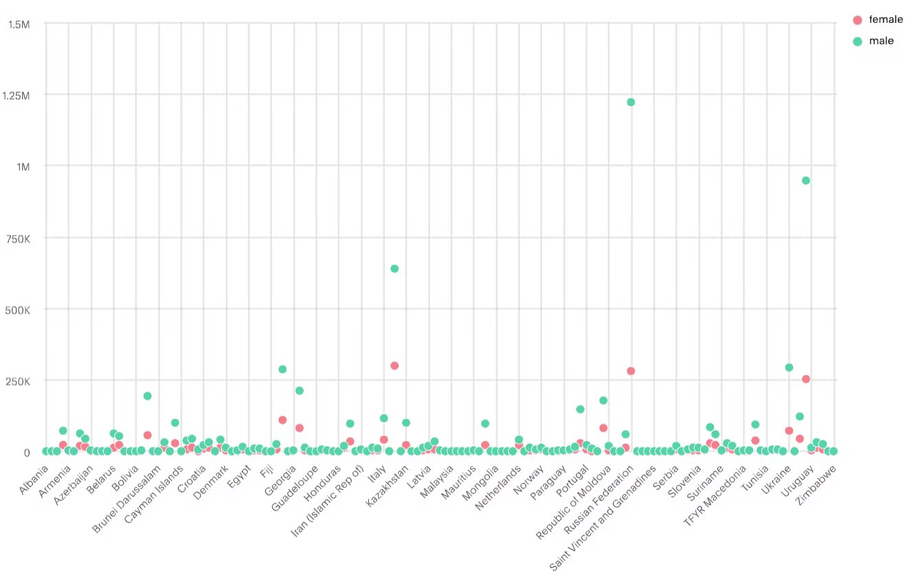
14. Scatter plot
Scatter plots are types of visualization that show a collection of data points ‘scattered’ around the graph. The data points can be evenly or unevenly distributed.
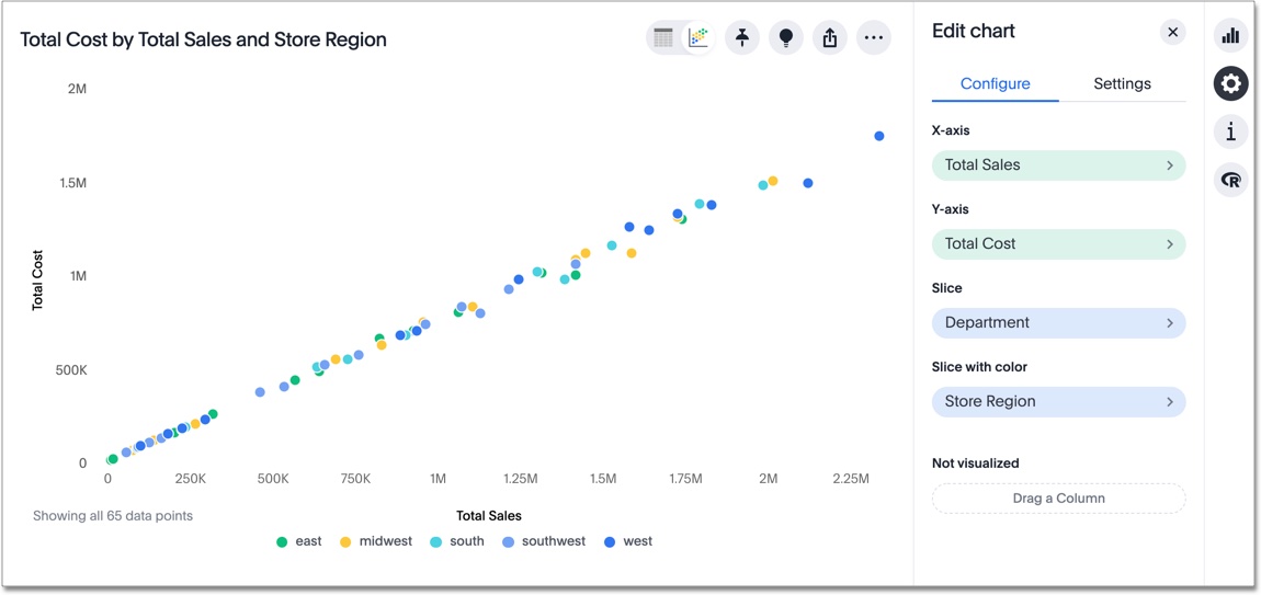
When to use scatter plots?
Scatter plots are ideal for exploring relationships and patterns between two continuous variables. They can help you identify trends, correlations, or potential clusters in the data.
Best practices for scatter plots:
Highlight outliers if present in the graph to showcase data distribution.
Add a trendline to highlight the relationship between variables.
Consider using different colors or marker sizes for overlapping points.
15. Bubble chart
The bubble chart is a variation of the scatter chart, which helps you look at relationships between three numeric variables. Each dot in the chart represents a data point, with its position determined by the X and Y values, and its size determined by the third value.
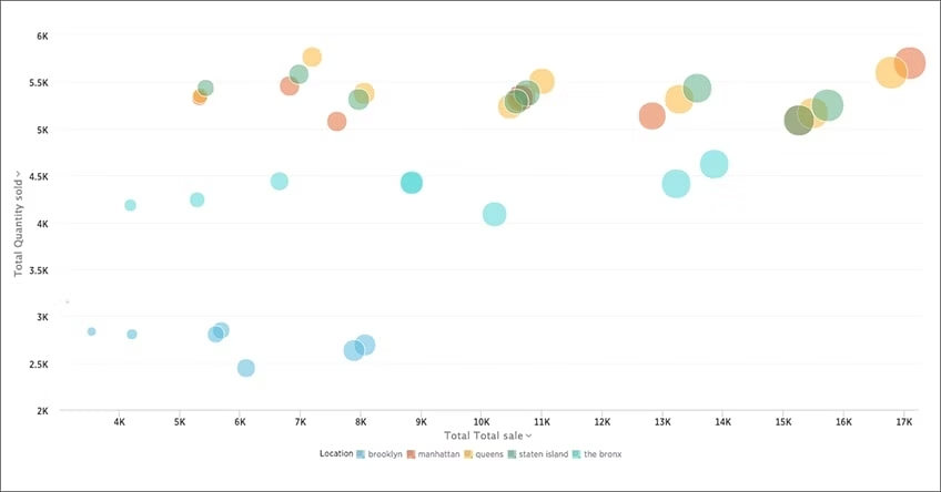
When to use bubble charts?
Like the scatter plot, a bubble chart primarily identifies patterns or correlations between variables. When you have a large dataset and want to represent it visually, bubble charts can display many data points in a single chart, making it easier to spot trends and outliers.
Best practices for bubble charts:
Maintain a consistent scale for bubble sizes to avoid misinterpretation
Adjust spacing or use transparency for better interpretation.
Add a legend to show how different bubble sizes correspond with the values of your third variable.
16. Sankey chart
A Sankey diagram is a flow chart that illustrates the movement of values from one set to another. In this type of graph, items are connected to other items using colored lines or arrows. The ones being connected are called nodes, and the connections are called links.
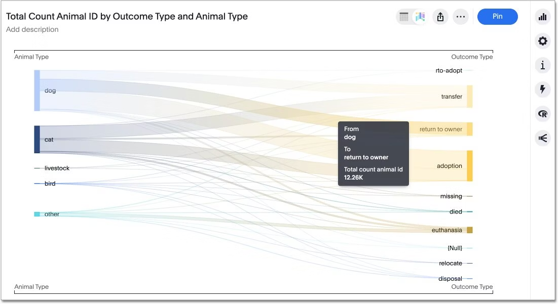
When to use Sankey charts?
Sankey charts are most effective when illustrating many-to-many relationships between two domains, such as product categories and their sales channels, or when depicting multiple pathways through a sequence of stages.
Best practices for Sankey charts:
Adjust the width of the arrows or bands accurately to reflect the quantity or flow rate they represent.
Consider using bolder or distinct colors to highlight the most important flows.
Use at least a minimum of two dimensions.
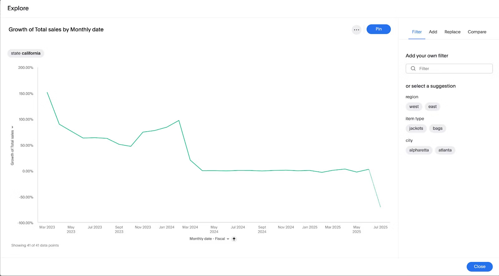
17. Area chart
An area chart is a graphical representation of quantitative data, emphasizing the magnitude of change over time. Unlike a line chart, it fills the area beneath the line, making it more visually striking and useful for illustrating cumulative values.
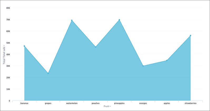
When to use area charts?
Apart from visualizing cumulative values, area charts are ideal for showing how values change, such as monthly revenue figures, yearly marketing performance, or daily sales estimates.
Best practices for area charts:
Include a zero baseline to compare the size of each group’s values.
Limit the number of data series to prevent overcrowding.
Don’t use an area chart to plot a single series. Use at least two datasets for comparison
Perfect for visualizing how things change, these charts help you track metrics across days, months, quarters, or years. Use them to spot growth, volatility, or key inflection points in your data.
18. Step chart
A step chart is a variation of a line chart that uses horizontal and vertical lines to connect data points, emphasizing sudden changes or "steps" in value rather than gradual trends. It’s great for processes or metrics that change at distinct intervals.
When to use step charts?
Use step charts when you want to show discrete changes over time—like pricing adjustments, system status changes, or policy shifts. They help clarify that values remain constant between steps, rather than implying a smooth transition.
Best practices for step charts
Use clear labels or tooltips to explain what triggered each step.
Avoid clutter by limiting the number of steps shown in one chart.
Combine with annotations if steps represent major business events or decisions.
19. Candlestick chart
A candlestick chart is a type of financial chart used to visualize the price movements of a security, derivative, or currency over time. Each ‘candlestick’ provides essential information for that period, with the thick body indicating the opening and closing prices, and the thin lines, or "wicks," showing the highest and lowest price reaches.
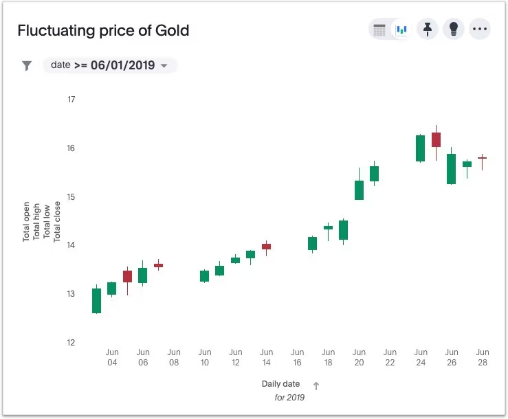
When to use candlestick charts?
Candlestick charts are used for technical analysis of equity and currency price patterns. By examining the opening and closing prices, along with the highs and lows of a given period, traders can uncover potential price movements based on historical patterns.
Best practices for candlestick charts:
Consider using distinct colors for bullish and bearish candles (For instance, green for bullish and red for bearish).
Avoid adding excessive indicators that can obscure the candlestick patterns.
Add annotations to highlight significant patterns, trends, or price level changes.
20. Sparkline
A sparkline is a small, simple line chart typically displayed without axes or labels. It’s designed to show trends in a compact space, ideally for dashboards, tables, or KPI tiles.
When to use sparklines?
Use sparklines when you need to show quick trends at a glance, especially alongside key metrics. They’re perfect for embedding in summary tables where space is limited but trends still matter.
Best practices for sparklines
Use sparklines next to numeric KPIs to add context to performance.
Keep them minimal—avoid axes, grids, or extra labels.
Consider color cues to highlight uptrends or downturns (e.g., green for growth, red for decline).
When location plays a role in your data story, these visuals help you see where things are happening. From comparing performance across regions to identifying spatial patterns, these geographic charts bring context to your insights.
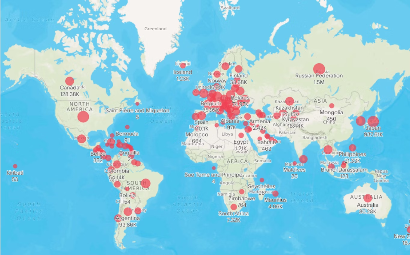
21. Geo chart
A geo chart maps values across predefined geographic areas—like countries, states, or cities—using colors, bubbles, or markers to represent magnitude.
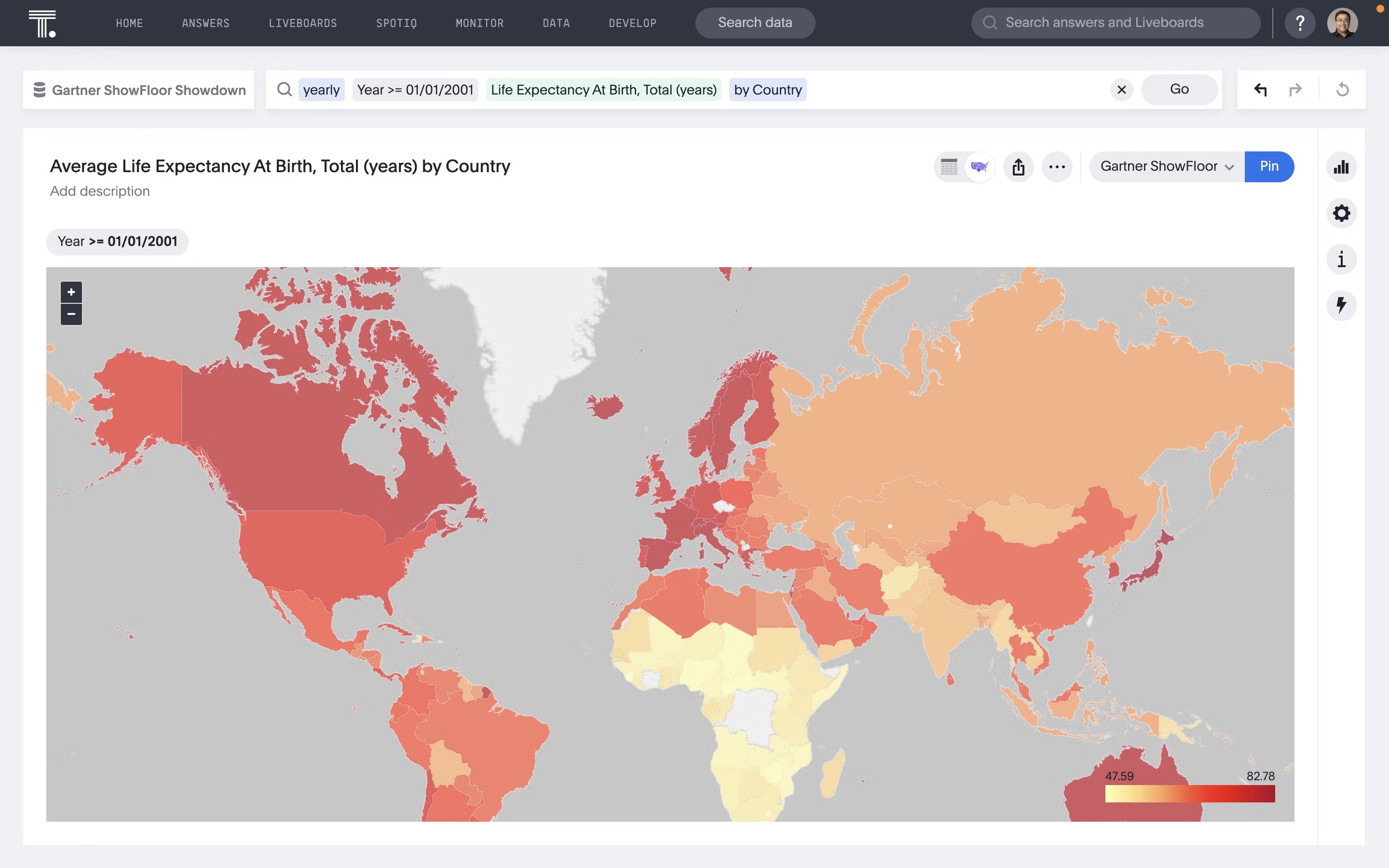
When to use geo charts?
Use these types of graphs to compare performance across regions, such as sales by country, website traffic by state, or user growth by city.
Best practices for geo charts
Stick to consistent color scales for accurate visual comparison.
Avoid overcrowding the map with too many data points.
Pair with filters or drilldowns to explore regional differences in more detail.
22. Scatter map
Similar to scatter charts, scatter maps use individual data points on a map to represent the spatial distribution of a variable or the relationship between two variables. This type of chart is ideal for identifying patterns, outliers, and correlations across different geographic regions.
When to use scatter maps?
Ideal for showing location-specific events or entities, such as store locations, incidents, deliveries, or check-ins.
Best practices for scatter maps
Use different sizes or colors to represent values or categories.
Use clustering in dense areas to prevent overlap.
Make maps interactive so users can zoom, filter, or hover for more detail.
23. Geographic bubble chart
Geo bubble maps combine the features of bubble maps with geographic locations. In these maps, bubbles of varying sizes are placed at specific locations on a map, and the size of each bubble represents a particular value or variable.
When to use geographic bubble charts?
Use bubble charts when you want to visualize and compare values across specific geographic locations, like store performance or customer count, while also identifying regional patterns and outliers. They’re especially useful when you want to show both position and scale on a map.
Best practices for geographic bubble charts
Size the bubbles proportionally, so the differences in values are easy to compare at a glance.
Leverage white space and smart spacing to keep the map readable and visually balanced.
Include tooltips or labels for added context, especially with similar-sized bubbles.
24. Heatmap chart
Heatmap charts are a type of map data visualization that uses a system of color coding to represent value. Each cell in the matrix is assigned a color based on the value it holds.
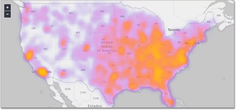
When to use heatmap charts?
This type of chart is commonly used to establish relationships between two variables across a grid. In the example above, the intensity of the colors in the map clearly demonstrates the variables, making it easy to identify patterns and trends.
Best practices for heatmap charts:
Choose an intuitive color palette that effectively conveys the magnitude of values.
Use visual cues to highlight significant values in the heatmap.
Utilize the design principle of white space to prevent overcrowding.
25. Box plot (Whisker plot)
A box plot shows the spread and distribution of a dataset, highlighting medians, quartiles, and potential outliers.
It’s great for spotting variability and comparing multiple groups side by side.
Think of it as a snapshot of how your data is spread out, not just the average.
26. Pictographs
Pictographs use icons or images to represent data quantities, making information more visual and engaging.
They’re useful for simple comparisons but can sacrifice precision for aesthetics.
Best for storytelling with audiences less comfortable with complex numbers.
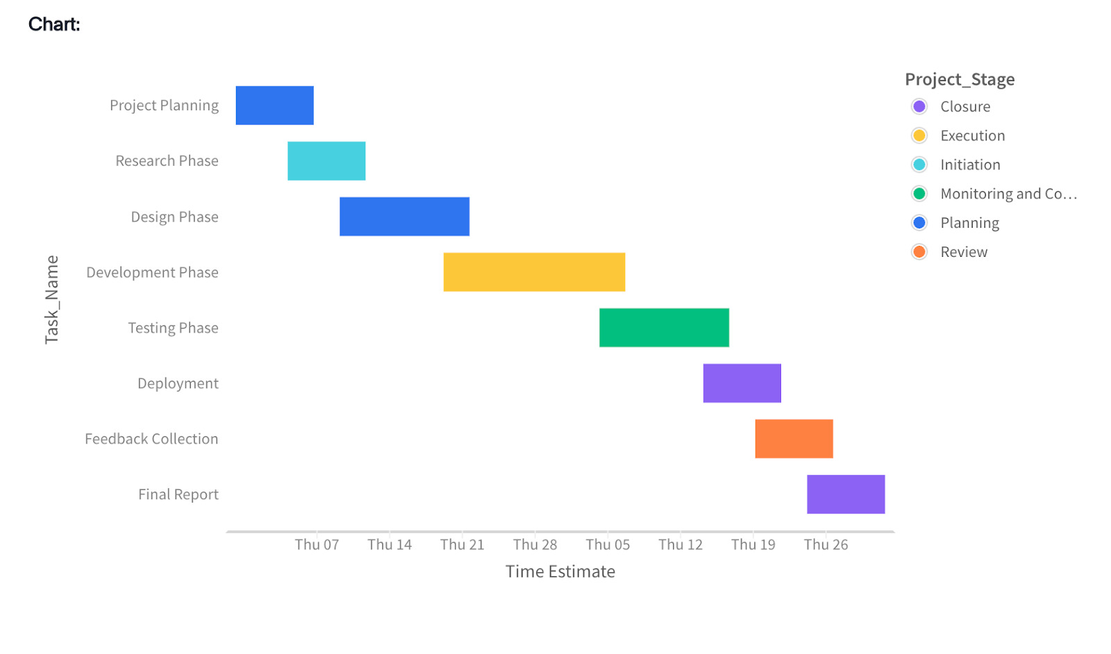
27. Gantt charts
Gantt charts visualize project timelines by showing tasks, durations, and dependencies over time.
They help track progress, milestones, and overlaps across teams.
A must-have for project management and planning.
28. Dot plot
Dot plots use dots to represent frequency or value, making comparisons across categories clean and simple.
They reduce clutter compared to bar charts and work well for small datasets.
Especially useful when precision matters more than flashy visuals.
Let’s be real—attention spans are short. Like, shorter-than-a-goldfish short. If your chart is confusing, cluttered, or just plain wrong for the data, you’ll lose your audience before they even get to your insight.
So how do you choose the right chart? The one that makes your point land and sparks action?
Here are important steps to help you nail it every time:
Know your goal: Are you comparing values, showing trends, highlighting proportions, or exploring relationships? Your objective should drive the chart type.
Understand your data: Look at the size, structure, and distribution of your dataset. Different chart types work better for different data formats.
Consider your audience: Tailor your visuals to their level of data literacy. Simpler charts often resonate more with non-technical viewers.
Prioritize clarity: Choose the chart that makes your point instantly clear. Don’t make your audience second-guess.
Stick to visual best practices: Use consistent colors, intuitive labels, and readable axes. Design with intention, not decoration.
Use interactivity wisely: When possible, let users explore with filters, drill-downs, or tooltips—especially in dashboards and digital reports.
Bring your data to life with interactive charts
Your data’s only as powerful as your ability to communicate it.
As your business leans harder into data, you need more than static charts; you need a powerful data visualization tool that helps you tell impactful stories with data.
With ThoughtSpot’s Agentic Analytics Platform, you can simply ask questions in natural language and get relevant, interactive visualizations. And with our expanded chart library—thanks to our new VitaraCharts integration—you’ve got even more ways to make your insights pop.
See what impactful data storytelling really looks like. Schedule your ThoughtSpot demo today!
Frequently asked questions
What are the different types of charts and graphs used?
There are many different types of charts and graphs, each designed to highlight specific patterns in your data. Common examples include bar charts, line charts, pie charts, scatter plots, heatmaps, and histograms. Choosing the right one depends on the story you're trying to tell and the kind of data you're working with.
How do I choose between different types of charts and graphs?
It comes down to your goal. Want to show trends over time? Go with a line chart. Comparing categories? A bar chart is your best bet. Trying to show parts of a whole? Use a pie or donut chart. When in doubt, think about what will make the data easiest to interpret at a glance.
What is the most common chart?
The most common chart is the bar chart, since it’s the easiest way to compare categories like sales by region or revenue by product. Line charts come in close second, especially for showing trends over time, but in most everyday dashboards and reports, bar charts tend to dominate because they’re simple, clear, and instantly recognizable.


