


Data is king. The more data you can gather and analyze, the better equipped you are to make informed decisions. And when it comes to analyzing data, there's no better way to do it than through interactive data visualization.
But what is interactive data visualization, what are the benefits of using interactive data visualization over traditional methods, and what are some best practices for creating effective visualizations? Read on to find out.
What is interactive data visualization?
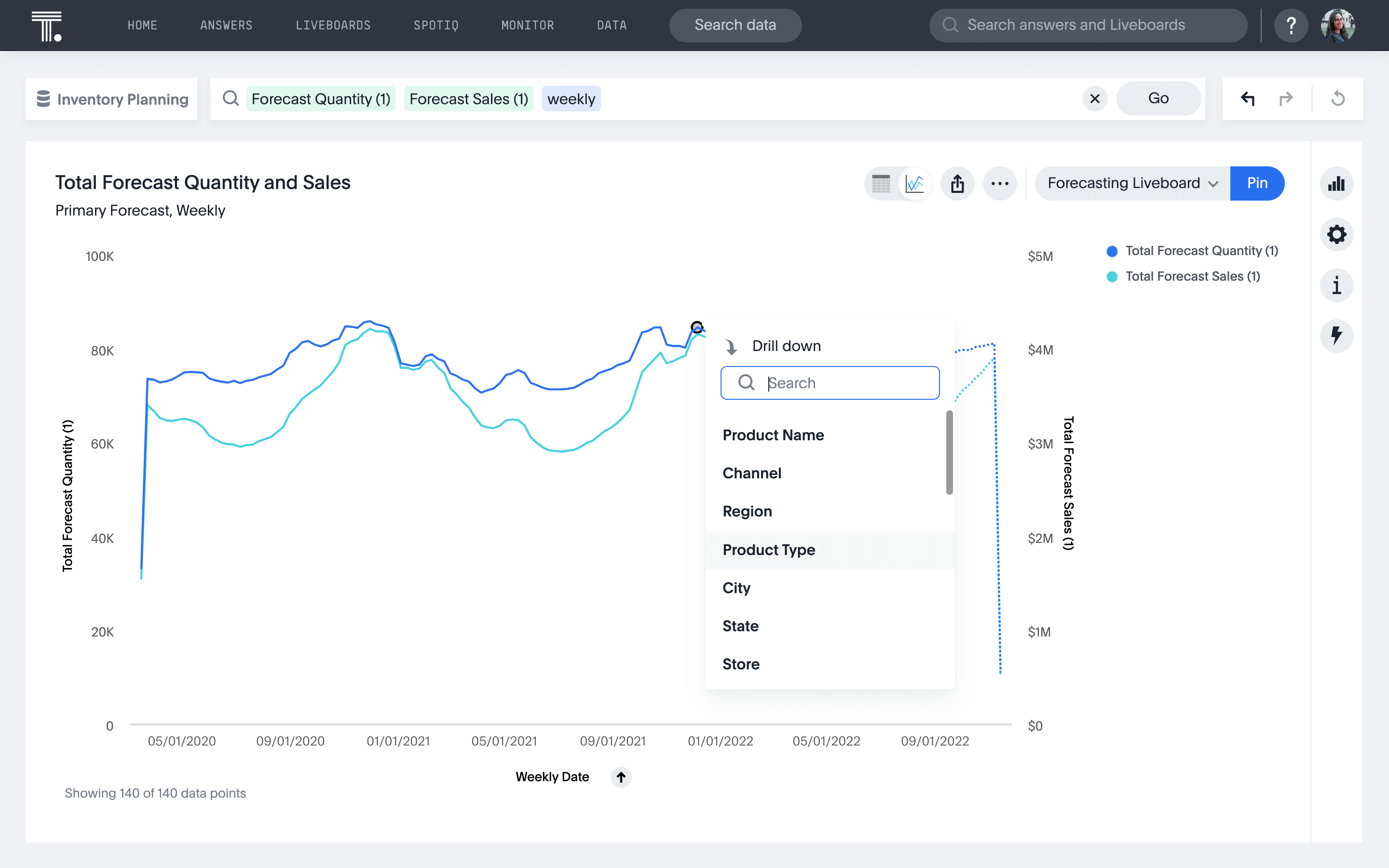
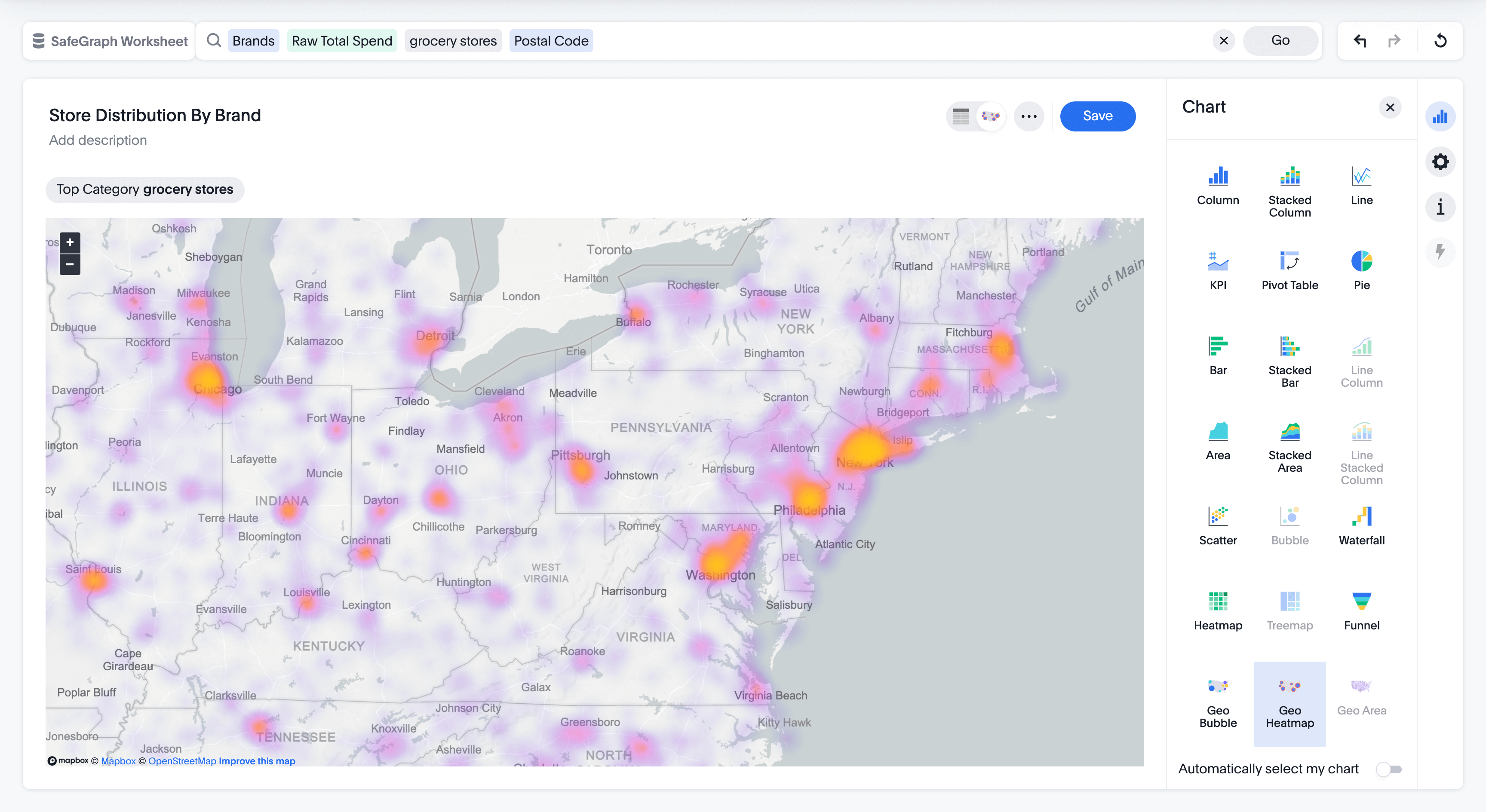
Interactive data visualization is a type of data visualization that allows users to interact with data in order to explore and understand it. This can be done through various means—such as allowing users to filter the data or providing interactive elements that allow users to drill down into specific parts of the data. Interactive data visualizations have become increasingly popular in recent years, as they provide a way to more effectively communicate data and insights.
4 benefits of interactive data visualization over traditional data visualization methods
There are many benefits of using interactive data visualizations over traditional static visualizations. That’s because interactive data visualizations empower you to:
1. Provide a more immersive experience that allows users to explore the data in greater depth
Using live analytics and easy-to-digest interactive data visualizations, Modern Restaurant Concepts improved their insights from days to mere seconds. Here’s what Director of Finance, Lisa Sauer, had to say:
“As we continue to move more and more data into one reporting platform, we have already been able to focus on deeper data driven decisions being made at every level.”
2. Reveal patterns and trends that may not be immediately apparent in static visualizations.
That was the case for CarTrawler, a Dublin-based technology company that relies on data to give travelers, agents, and mobility partners—think Hertz, United Airlines, EasyJet, and American Express—the best deals. Here’s what Patrick Callinan, Director of Insights and Data Science, said about CarTrawler’s move to interactive data visualizations:
“People are more able to look at patterns, rather than just repeating the same analysis, but just for a different country or supplier. Both business users and business analysts benefit—as does the wider business, and most importantly, our customers and partners.”
3. Allow users to manipulate the data to reveal different insights.
Consider Frontify, a cloud software platform provider that helps simplify brand management across teams. With interactive data visualizations, they were able to deep dive into their data to find insights instead of asking analysts to add more granular insights to existing reports.
In just 30 minutes, one business user can achieve what used to take their data and analytics team months—a 99.9% improvement. Learn more about Frontify’s self-service transformation.
4. Be more engaging and visually appealing to users than static visualizations
That was the case for Australian company, Langs Building Supplies. One particular use case the team is excited about is the ability to create heat maps of customer purchases.
Using interactive analytics, sales reps can quickly and easily see when customers aren’t taking full advantage of Langs’ expansive product inventory, and approach them with additional purchase opportunities.
Start Getting Better Insights
Best practices for creating effective and engaging interactive data visualizations
When creating interactive visualizations, there are a few best practices to keep in mind:
Keep it simple
Too much information is overwhelming. Stick to the most important data points and allow users to explore further if they want more detail. Use the right types of charts and graphs to keep it simple.
Make it pop
An interactive visualization that is well-designed and visually appealing will be more engaging for users.
Use intuitive controls
Users should be able to easily understand how to interact with the visualization. Keep controls simple and consistent with how users are accustomed to interacting with similar applications.
Provide clear guidance
It should be clear to users what they can do with the visualization and how to get the most out of it. Tooltips, legends, and other guidance can be helpful in providing this context.
5 examples of well-done interactive data visualizations
There are many great interactive data visualization examples that illustrate these concepts. A few notable examples include:
Interactive data visualizations by role
It’s clear that interactive data visualizations are useful for sports, health data, and businesses alike. But how can interactive data visualizations empower individual teams within each organization? Let’s take a look at a few role-specific use cases:
Finance
Some might say that finance is the most data-driven team in your organization. Consider data that you would pull from Netsuite, Oracle, Workday, Coupa, etc. If you’re envisioning an excel spreadsheet, we challenge you to think beyond the traditional and to the exceptional—business intelligence for finance. Consider the insights you might be able to uncover with interactive data visualizations.
Marketing

Marketing is another data-heavy team in your organization. Your marketing team is constantly tracking performance metrics and relying on key performance indicators (KPIs) to help them determine the success of a campaign. Best-in-class marketing teams connect that marketing data with sales data in order to determine a campaign’s ROI.
💡Related read: 8 best data visualization tools to use
Management
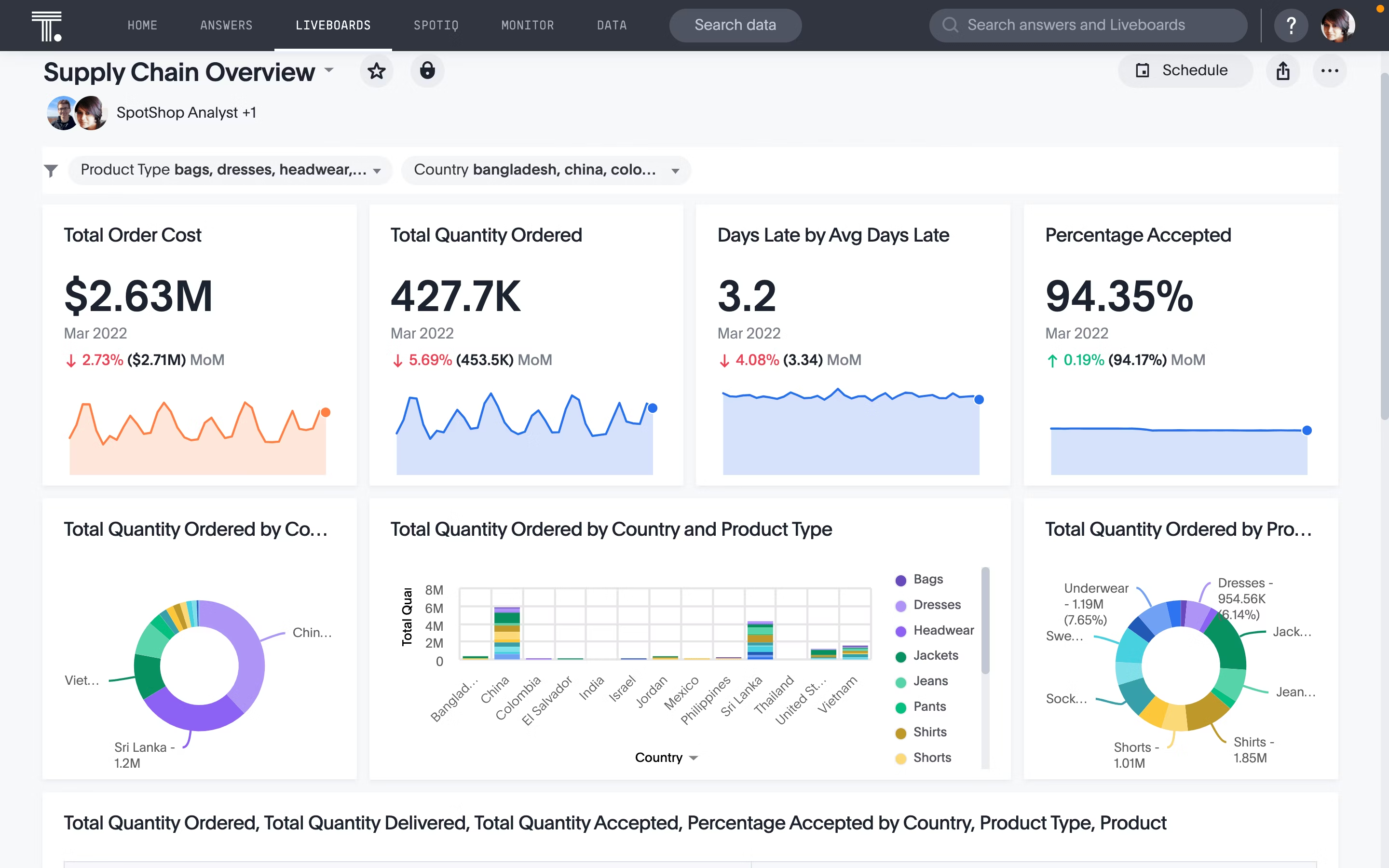
Business monitoring is essential to the success of any manager, and their team. Whether you’re improving efficiency, saving costs, planning inventory, or tracking goals, you need to define metrics and monitor them regularly to make progress. With a KPI software, you can track metrics in real-time and drill into that data to uncover the underlying reasons behind the performance.
Product
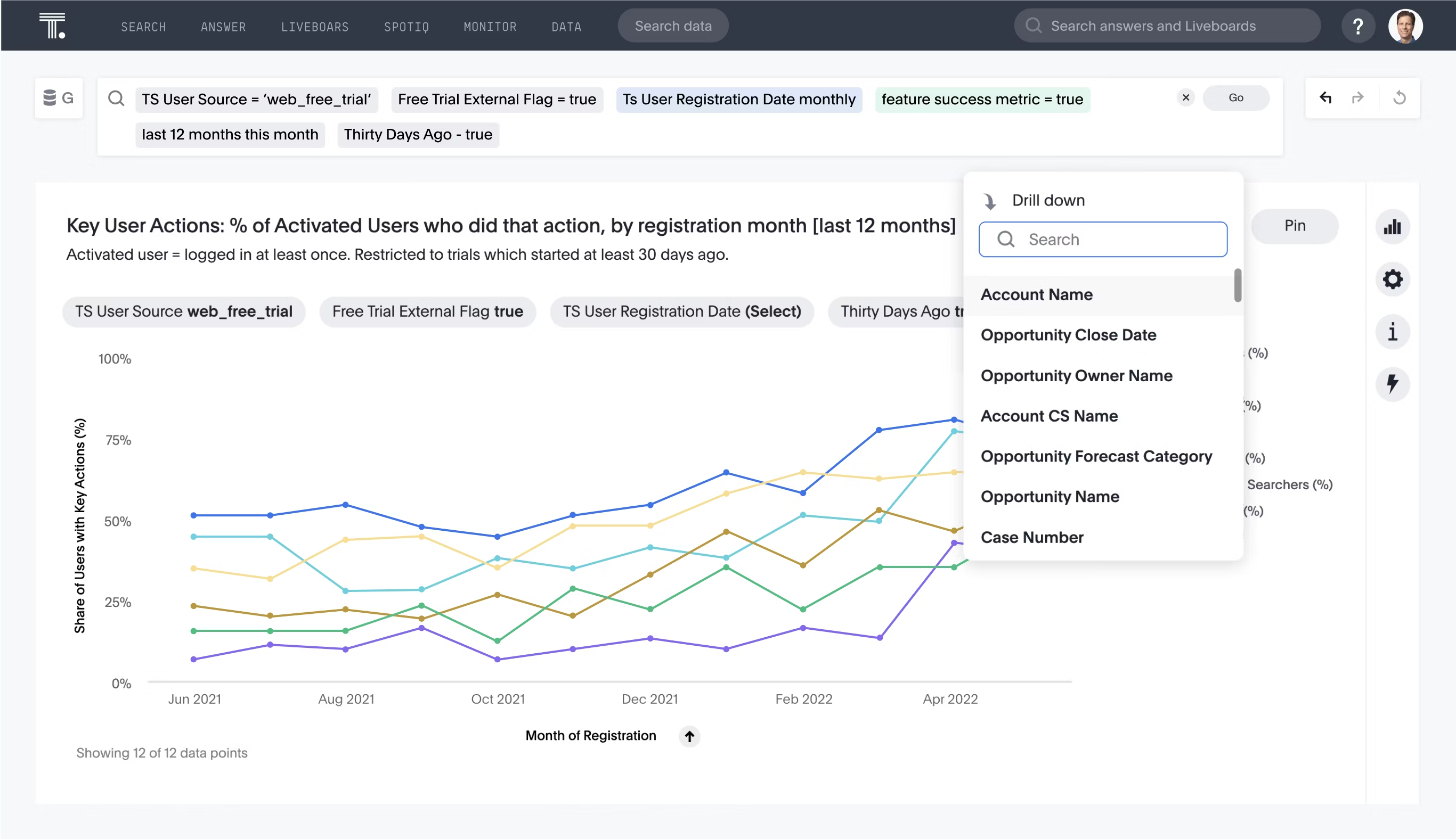
When it comes to developing sticky products with innovative features, data plays an essential role. You’re looking to understand which user behaviors correlate with positive outcomes, how you can encourage users to get more value out of the product, and what sticking points are users encountering. In order to gain a truly holistic view of your users and their behavior, interactive data visualizations are key.
Start visualizing your data differently
If you’re looking for a more effective way to communicate data and insights, interactive data visualization may be the answer. They allow users to explore data in more depth, revealing patterns and trends that might not be immediately apparent in traditional static visualizations. Best of all, interactive data visualizations are engaging and fun to use, which means your audience is more likely to pay attention and learn from them.
Ready to experience what it's like to drill down into data instantly? Start your free trial today.


