


Data plays a profound role in finance. In fact, some might argue that finance professionals are some of the most data-driven individuals in an organization. Financial analytics is a key component in this landscape, as it involves the systematic analysis of financial data to extract meaningful insights.
That’s because finance data, and the insights you draw from it, can literally make or break a company. This is especially true in times of economic uncertainty, when businesses are trying to make data-driven decisions about where to invest and cut resource allocation.
But the data isn’t valuable on its own—it has to be easily accessible and understandable in order to provide insights worth communicating across the broader organization. That’s where data visualization comes into play.
Why is data visualization important in finance?
Data visualization offers a number of benefits to finance professionals. Most notably, data visualizations:
Distill insights into easily digestible representations
Provide an accessible source of truth across the organization
Illuminate necessary actions and opportunities to ensure business success
How do you visualize financial data?
Creating a data-driven finance team requires thoughtful synchronization. Before you can start visualizing your financial data, you first have to capture the right data, build the infrastructure to bring all your data together, and ensure your financial team has the right data visualization tools to access that data. This process utilizes a collection of tools, often referred to as the modern data stack.
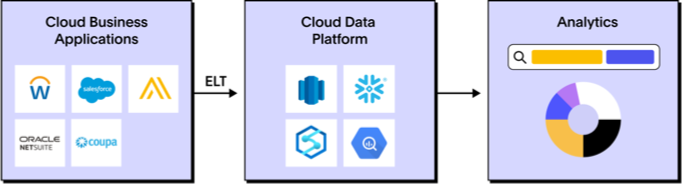
Once the data is accessible, your team can combine financial data with other essential business data to build insightful data visualizations and take action—ensuring the success of your organization.
But not every data visualization is ideal for finance. In fact, some visualizations may create more confusion than clarity. That’s why it’s important that you understand the basic principles of data visualization and have a reliable repertoire of data visualizations you can use to tell a compelling data story.
Start Getting Better Insights
Top 3 data visualizations every finance professional should know
1. Pivot table
A pivot table is an incredibly useful tool that aggregates large quantities of data into a single view. This visual summary organizes your data by different attributes, allowing finance teams to see the full picture of your organization in one singular view.
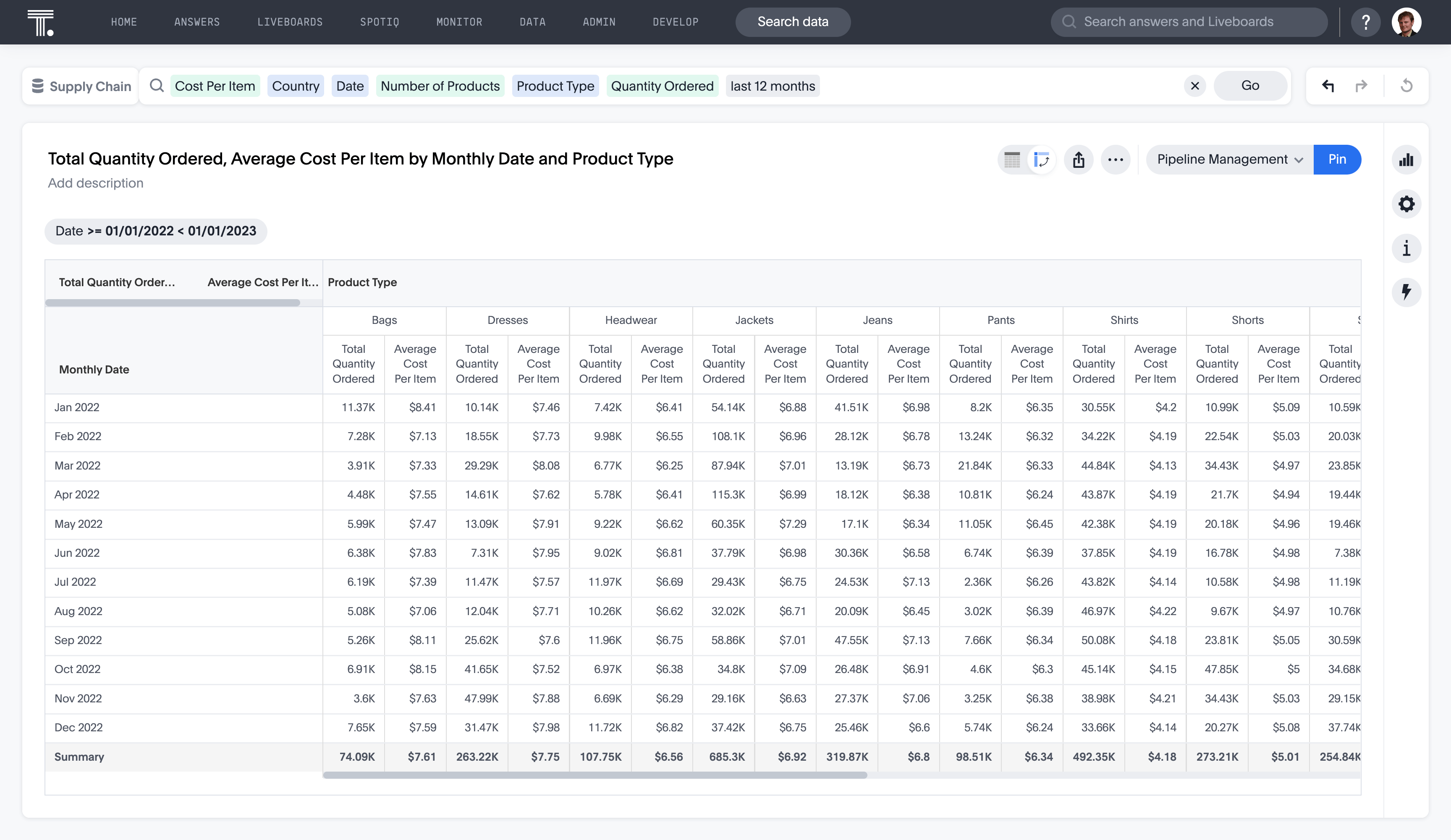
A pivot table could be useful in a variety of finance-related tasks. For instance, you could create a pivot table to visualize a breakdown of company revenue by customer, geography, and time period attributes.
As another data visualization example, you might want to see a birds-eye view of your accounts payable transactions. To do this, you could export your enterprise resource planning (ERP) data from sources like Netsuite, Oracle, Workday, Coupa, etc. into an excel spreadsheet. Using a pivot table, you can easily summarize spend by supplier over a specific time period.
2. Stacked bar chart
If you think of a bar chart as entry-level, then a stacked bar chart is the intermediate data visualization tool. That’s not because a stacked bar chart is inherently more difficult to build, but because it allows you to visualize different attributes within a single view. A stacked bar chart is especially useful in finance, where professionals are constantly assessing different dimensions of data.
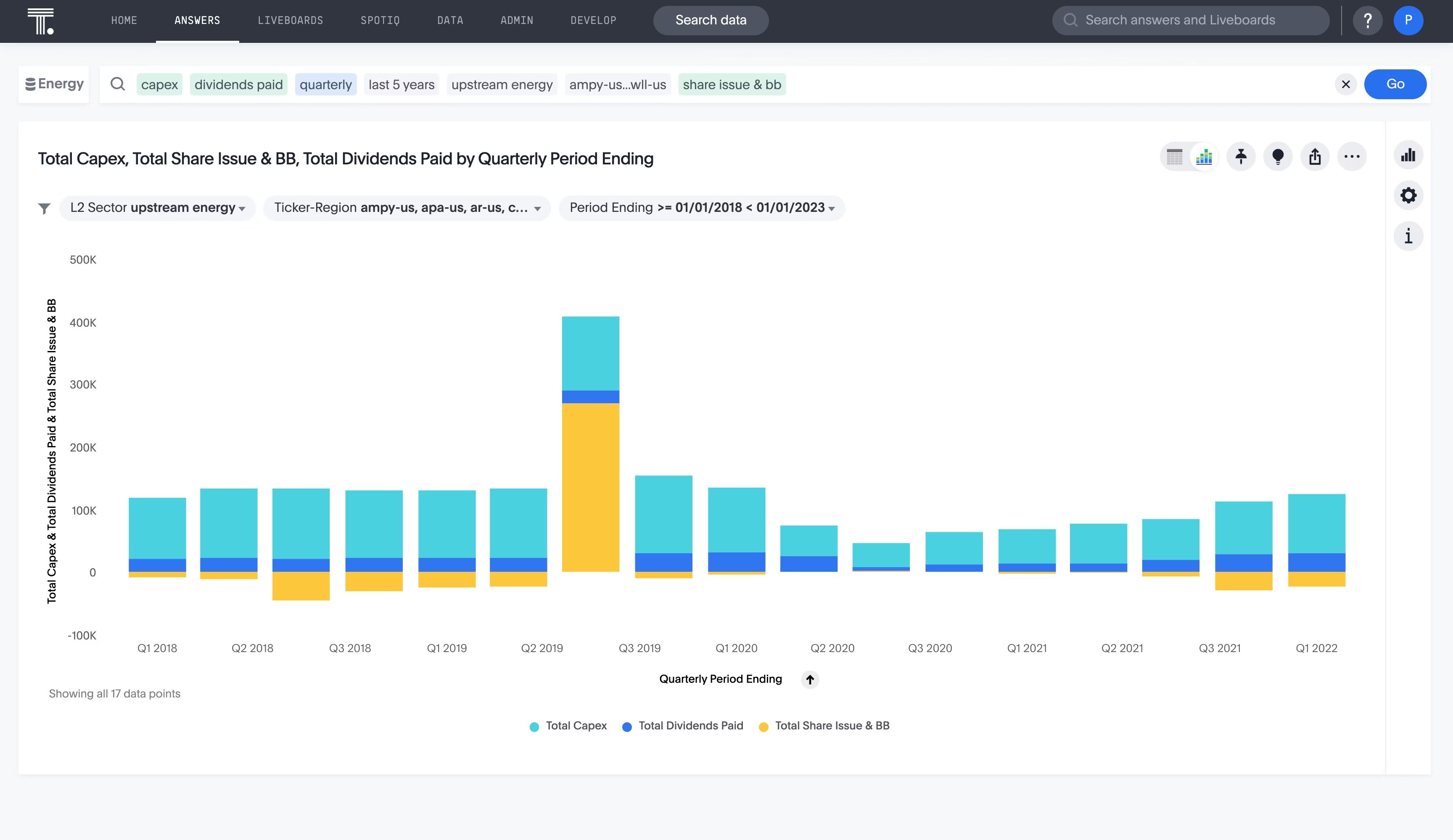
Sure, a single bar chart is still useful when focusing on one metric with various attributes—for instance, if you want to visualize your quarterly revenue for the year. But let’s say you wanted to view your quarterly revenue by product over the course of a year. In this instance, a stacked bar chart would be the best visualization tool.
Many finance professionals rely on stacked bar charts to point out anomalies that clue you into necessary actions. For example, maybe the stacked bar chart you built in the example above shows a low-revenue product line that should be discontinued.
💡 Relevant read: Histogram vs bar graph: Which should you use?
3. Heat maps
A heat map is another vital map data visualization tool for any finance professional, as it allows you to see how a data point is dispersed over a geographic area. This is especially useful if your organization operates in or sells to multiple locations.
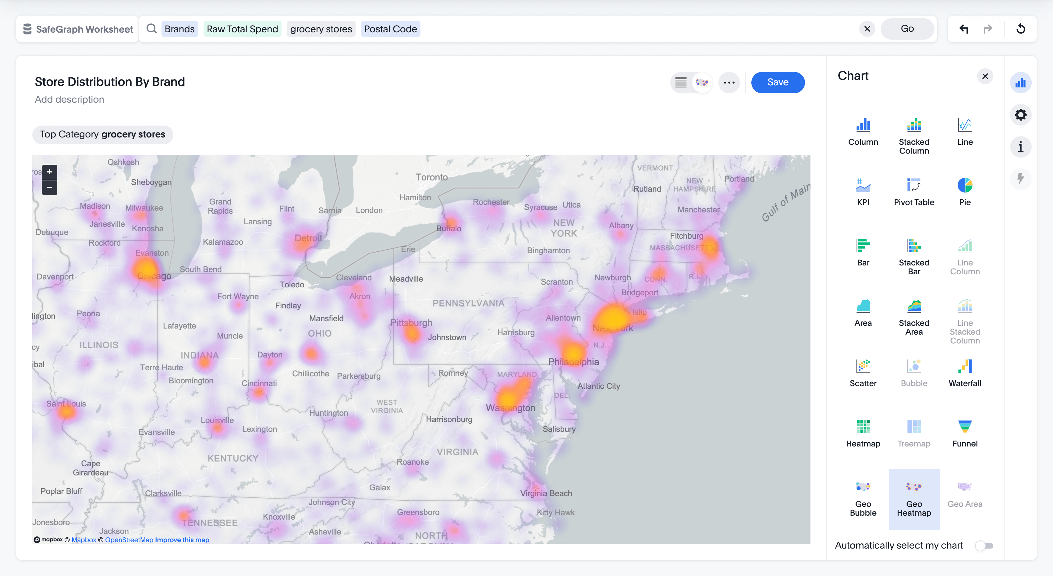
Perhaps you want to visualize where your customers are concentrated around the world so your organization knows how to best allocate resources like support, logistics, or marketing. If you notice that most of your customers live on the east coast, but your logistics warehouse is located in California, you might find opportunities for a reduction in shipping costs by moving said warehouse.
If you’re a technology or media company, you might use a heat map to visualize where you’ve had the most outages or downtime across regions, resulting in a loss of revenue. Viewing an outage map may clue you into region-specific infrastructure issues that are negatively impacting your bottom line.
Finding the right data visualization for finance professionals
While you might be able to quickly create some of these charts in excel or Google Sheets, other visualizations require data input from a variety of sources. This process can require rigorous data matching, data cleaning, and filtering before the data is ready to visualize. And even then, the data analytics tools required to interact with this data aren’t necessarily accessible to non-technical users.
This barrier to entry leads many finance professionals reliant on their data and BI teams to deliver these visualizations, creating a time delay. Or worse, the finance team might never see this data, leaving significant finance insights locked inside data silos, never to be discovered. But finance BI is essential for the success and profitability of your organization.
ThoughtSpot’s self-service analytics democratizes data, empowering front-line business users, like finance professionals, to create their own data visualizations with the ease of search. And our AI augmented analytics points users in the right direction, even when you don’t know where to look.
Find the insights that are hiding in your financial data—Start your free trial today.


