


When you check quarterly performance metrics, how quickly do you actually get an answer? If you're like most business leaders, what should be a five-minute check often turns into a days-long wait. Your analyst pulls the numbers and builds a report, only for you to find you have three more follow-up questions that will take another day to answer.
That's the limitation of static dashboards and reports. They show you what happened, but they don’t let you explore what’s behind the numbers or dig into what changed. The moment your question shifts, the dashboard stops being useful.
Interactive dashboards work differently. Instead of sending questions back and forth, you can explore the data yourself. You can filter, drill down, and follow your curiosity in real time to understand what’s driving the result and what to look at next.
This guide breaks down what interactive dashboards are, the patterns that make them effective, and real examples of how teams use them to move from reporting to decision-making faster.
What is an interactive dashboard?
An interactive dashboard is a business intelligence (BI) tool that displays key performance indicators (KPIs) and metrics while allowing you to directly engage with the data visualizations. Unlike a static report that shows a fixed snapshot, an interactive dashboard lets you filter, sort, and drill down into the data in real time to answer your own questions.
These tools offer incredibly powerful ways to investigate trends and spot anomalies. Most importantly, they help you understand the 'why' behind your data without needing to be a data analyst, which is a key part of improving your data literacy insights. When your business questions become more complex, dashboards must go beyond simply providing data. They need to provide a starting point for deeper interactive analytics.
Why interactive dashboards matter for faster decisions
Static reports and old-school dashboards create bottlenecks that can bury your workflow in data support tickets. Interactive dashboards break this cycle by giving you a hands-on way to get answers on demand.
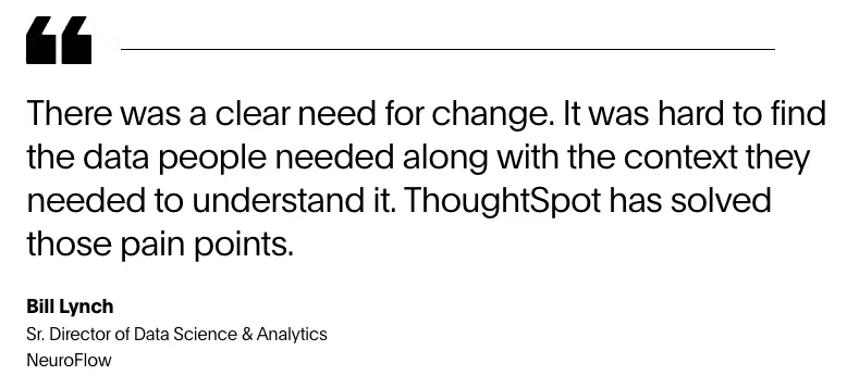
NeuroFlow, a behavioral health platform serving millions of patients, found that dashboards and reporting had turned into major pain points within their data infrastructure. Their analysts were drowning in repetitive requests, building the same dashboard reports over and over, while critical questions sat in the queue.
After implementing Liveboard Insights in partnership with ThoughtSpot, NeuroFlow cut its dashboard count by 85% and freed its team to focus on strategic analysis instead of report generation. Business users gained the ability to explore data independently and answer their own questions without waiting, while the analytics team shifted from repetitive report building to high-value strategic work.
How interactive dashboards work
Interactivity turns a dashboard from a static view into something you can actually explore. These patterns help you move from a high-level metric to a clear answer without breaking your flow.
1. Cross-filter and highlight
Cross-filtering lets you click on a data point in one chart and automatically filter or highlight corresponding data across other visualizations on the dashboard. This connected filtering helps you focus on specific segments, such as a particular region or product line, without losing the broader context of how that segment performs across different metrics.
This interaction pattern is particularly powerful when investigating performance gaps. Instead of manually filtering each chart separately or requesting multiple custom reports, you can isolate underperforming segments across all metrics at once, quickly identifying whether issues stem from product mix, seasonal trends, or customer behavior patterns.
2. Drill down anywhere
Drill-down capabilities let you click on high-level data points to break them into smaller components, such as moving from yearly to quarterly to monthly views. This transforms how you investigate anomalies, letting you explore unexpected spikes or dips without waiting for someone to pull the underlying details.
The real value emerges when you need to understand the story behind the numbers. Strong quarterly revenue can be broken down to reveal which time periods, products, and customer segments drove that performance. This granular visibility helps you replicate success and address problems at their source, rather than making decisions based on aggregated data that might hide critical details.
3. Parameter controls and what-if scenarios
Advanced interactive dashboards let you adjust parameters, such as sales quotas or budget thresholds, to test how your data changes based on different assumptions. This turns your dashboard into a planning tool, letting you model scenarios and see projected impacts across key metrics without building separate reports for each possibility.
This interactive modeling is a crucial new tool for evaluating strategies before committing resources. You can experiment directly with the variables that matter most to your business, resulting in more confident decision-making backed by data, whether you're setting next quarter's targets or evaluating a major strategic shift.
4. Time sliders and zoom controls
Time controls let you adjust your view from multi-year trends to single-week snapshots, which is essential because different questions require different time horizons. Long-term strategic planning might need years of history, while operational troubleshooting might need daily or hourly data from recent periods.
This temporal flexibility helps you separate signal from noise. What looks like a concerning trend in weekly data might reveal itself as normal seasonal variation when viewed quarterly. Conversely, seemingly stable monthly trends might hide significant short-term volatility that requires attention. Dynamic time ranges ensure you're always analyzing data at the right level of granularity for the decision at hand.
Start Getting Better Insights
How data visualization and dashboards drive action
Data visualization and dashboards work together to turn raw numbers into something teams can quickly understand and act on. Instead of scanning tables or exporting reports, dashboards bring key visuals into one place, making it easier to spot what’s changed and where to look next.
Interactive live dashboards add another layer by letting you investigate patterns as questions come up. You can follow a spike, compare segments, or explore drivers without needing technical skills or a separate analysis workflow. That’s often the difference between noticing something interesting and actually doing something about it.
Fresh data matters here. The most effective live dashboards connect directly to your cloud data warehouse, so decisions are based on what’s happening now, not yesterday’s snapshot. When dashboards rely on scheduled extracts, teams risk reacting to outdated information without realizing it.
Modern analytics platforms reduce friction even further by helping teams choose clear, effective visuals without overthinking chart design. Instead of spending time deciding how to display data, teams can focus on interpreting results and deciding what action to take.
Ready to see how interactive dashboards work? See how you can go from data to interactive insights in minutes. Start your trial.
Interactive dashboards that solve real problems
The value of an interactive dashboard isn’t in the visuals. It’s in how quickly it helps teams move from a question to a decision. Depending on your role, interactive dashboards show up in very different ways.
Here are a few common examples.
1. Executive dashboard performance monitoring
The best executive dashboards don't just display numbers; they reveal the story behind organizational performance. Instead of waiting for monthly board decks that are outdated before the meeting starts, C-suite leaders can investigate anomalies the moment they appear. A revenue dip in one zone might look like a regional problem until you drill down and discover it's actually one underperforming product line across all territories, fundamentally changing your response strategy.
Purpose: Give leaders a high-level overview of business health
Key KPIs: Revenue, profit margins, customer lifetime value (LTV), market share
Core interactions: Drilling down from annual goals to regional performance, receiving alerts when metrics are off track
2. Marketing campaign optimization
The difference between good and great marketing often comes down to speed of iteration. While competitors might wait days for campaign performance reports, interactive dashboards let you spot what's working—and what's burning budget—within hours of launch. The real power emerges when you can slice performance by audience segment in real time, discovering that your Gen Z campaign is crushing it on TikTok but flopping on Instagram, then shifting spend before the day ends.
Purpose: Track campaign effectiveness and optimize spend in real time
Key KPIs: Return on ad spend (ROAS), cost per acquisition (CPA), conversion rates
Core interactions: Filtering by channel and audience segment, comparing creative performance
3. Product engagement analysis
Feature adoption metrics tell you what's happening, but cohort analysis reveals why. The pattern that emerges when you compare power users to churned users often exposes the critical moments where your product either clicks or loses people. Maybe your onboarding flow works perfectly for tech-savvy users, but creates friction for everyone else, or perhaps that feature you're pushing heavily only resonates with your free tier users who never convert to paid.
Purpose: Understand how users interact with your product or app
Key KPIs: Daily active users (DAU), feature adoption rates, session duration, churn risk
Core interactions: Filtering by user cohorts, drilling through to individual user journeys
4. Supply chain operations
Supply chain disruptions rarely announce themselves; they start as small delays that compound into customer-facing crises. Interactive dashboards help operations teams catch these issues while they're still manageable, turning what would have been a "why didn't we see this coming?" conversation into proactive problem-solving. When you can visualize shipment delays on a map and immediately model alternative routing scenarios, you're not just monitoring your supply chain—you're actively optimizing it against real-world conditions.
Purpose: Monitor logistics and maintain operational efficiency
Key KPIs: On-time-in-full (OTIF) delivery, inventory turnover, order cycle time
Core interactions: Using map-based filters to track shipments, running what-if scenarios for different logistics routes
Why ThoughtSpot is built for interactive analytics
Most interactive dashboards still assume a fixed set of questions. They work well until your priorities shift or a new question comes up. At that point, progress slows, and teams are back to waiting for dashboards to be rebuilt.
ThoughtSpot takes a different approach. Interactive analytics aren’t an add-on. They’re the core experience.
Instead of limiting exploration to pre-configured views, ThoughtSpot dashboards are designed to support follow-up questions as they happen.
Search-driven exploration: Liveboard Insights are interactive dashboards with an embedded search bar. You can drill down into any visualization or type a new question to generate instant charts—no technical skills required.
Natural language queries: Spotter is a full-fledged agentic AI analyst that’s natively integrated into ThoughtSpot dashboards. That means you can ask questions like "show me the top 5 products by sales in New York last month" and get accurate visualizations back in seconds, eliminating the need to navigate complex filter menus.
Live data connections: Liveboards query your cloud data warehouse directly, ensuring you're always working with current information rather than stale extracts.
Self-service at scale: Business users gain independence to explore data without creating bottlenecks for analytics teams, while built-in governance ensures data security and accuracy across your organization.
Together, these capabilities convert dashboards from static reporting tools into dynamic exploration platforms. You get the flexibility to ask any question, the speed of live data, and the confidence that comes from governed, accurate insights.
Make faster decisions with interactive analytics
Moving from static reports to interactive dashboards changes how teams actually use data. Instead of waiting for answers or working from outdated snapshots, you can explore questions as they come up and act while the context is still fresh.
When data is easier to access and explore, teams move faster, align around the same metrics, and spend less time debating numbers and more time deciding what to do next.
If you want to see how modern interactive analytics supports this shift in day-to-day decision-making, explore ThoughtSpot and start a free trial.
Interactive dashboard FAQs
1. What is the main benefit of using an interactive dashboard over static reports?
Interactive dashboards eliminate decision-making bottlenecks by letting you drill down, filter, and explore data instantly with no need to wait for analysts once data models are prepared. You can investigate anomalies as they appear and pivot strategies based on current data, resulting in faster, more confident decisions.
2. How do interactive dashboards connect to live data sources?
Modern interactive dashboards query your cloud data warehouse directly using live connections. Every time you open your dashboard, you're seeing real-time information that reflects your business's current state, which is critical for time-sensitive decisions like campaign optimization or supply chain disruptions.
3. Can I create interactive dashboards without coding skills?
Absolutely. Modern BI platforms like ThoughtSpot Analytics use intuitive drag-and-drop interfaces and AI-powered visualization recommendations. Natural language search lets you ask questions in everyday language and instantly generate charts without coding.
4. What makes ThoughtSpot's Liveboards different from traditional interactive dashboards?
Traditional dashboards only answer pre-configured questions. ThoughtSpot's Liveboards embed search directly into the dashboard, letting you seamlessly ask new questions in natural language without rebuilding anything. Your dashboard evolves with your questions, not the other way around.
5. How does AI make interactive dashboards better?
AI automatically surfaces anomalies and hidden patterns you might miss, using configurable alerts to help you keep your eye on your most important metrics. Natural language processing lets you ask conversational questions like "why did sales drop in the Northeast?" AI also recommends the best visualizations for your data and explains what's driving metric changes, making data exploration faster and accessible to everyone.


