


A fixed layer of information in a siloed dashboard cannot provide the level of agility that our modern society demands. The good news? Modern business intelligence tools empower everyone to create real-time, interactive data visualizations that convert complex datasets into insightful visual representations and facilitate effective communication.
Yet, too often, we create many bad data visualizations. It may be simply due to poor design choices, but this can easily affect visibility and impair clear communication.
To help you avoid these pitfalls, we’ve pulled together some bad data visualization examples and best practices that outline what you can do instead. But before jumping into that, let’s understand how bad data visualizations can impact your bottom line.
Table of content:
Research by Gartner shows that by 2025, data stories will be the widespread way for companies to consume analytics. This means that learning how to make and present compelling data visualizations is no longer a choice—it's a necessity. That being said, let’s understand the implications of bad data visualizations on your bottom line.
Bad data visualizations can affect your company in several ways, including:
Waste of valuable resources: When data visualizations are unclear, stakeholders may spend additional time and effort reviewing, questioning, and seeking clarification. This prolonged review process consumes valuable time and resources causing delays in decision-making and operational inefficiencies.
User disengagement: Humans have an attention span of barely eight seconds. So, you have a small window of time for making your point. If your data story lacks clear, understandable visualizations, your stakeholders may lose interest. This disengagement hinders valuable follow-ups or discussions.
Confused audience: The ultimate goal of data visualization is to make insights understandable and actionable. But when they showcase inaccurate data or complicated visuals, it can result in misinterpretation, creating more confusion and inaction.
Missed opportunities: A complicated, overcrowded data story may take the spotlight away from actual insights, causing missed opportunities for innovation, improvement, or strategic decision-making.
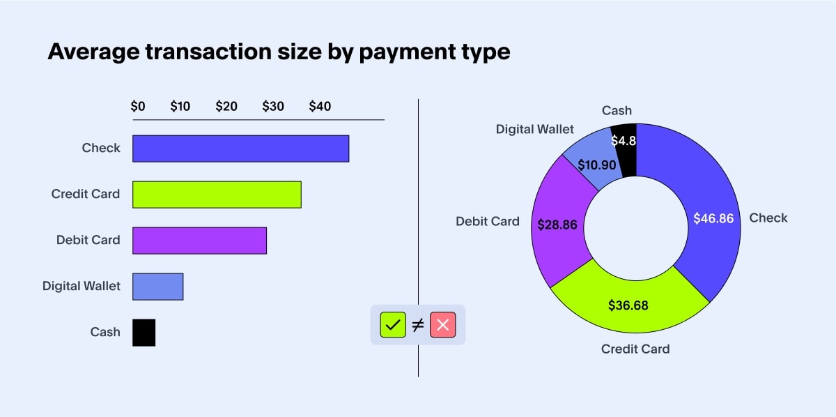
Data visualization is not just converting information into colorful charts. It’s about blending the aesthetics of design with the analytical rigor of data representation. The type of chart you choose matters just as much as the data itself because the wrong choice can distort insights or make them harder to grasp.
Let’s take an instance of misleading data visualization. Histograms and box plots help users understand data distribution. Choosing a pie chart here can lead to a lack of clarity regarding data distribution, making it harder to understand the spread and variability within the dataset.
💡 Relevant read: Histogram vs bar graph: Which should you use?
Consider following these tips:
Take into account your stakeholder preferences, expertise levels, and communication styles.
Study the form and function of each chart type.
Ask yourself whether the chart or graph serves a distinct purpose.
Think about what message you want to convey.
Without data context, your visualizations hold no value. With relevant text summaries, labels, and descriptive fields, you provide users with background information and facts surrounding a dataset—facilitating deeper understanding and driving data-driven decisions.
The challenge is adding context to your visualizations in the right way. Decision-making becomes impossible when you miss showcasing critical data points, annotations, and indications. Similarly, creating biased text summaries can mislead users.
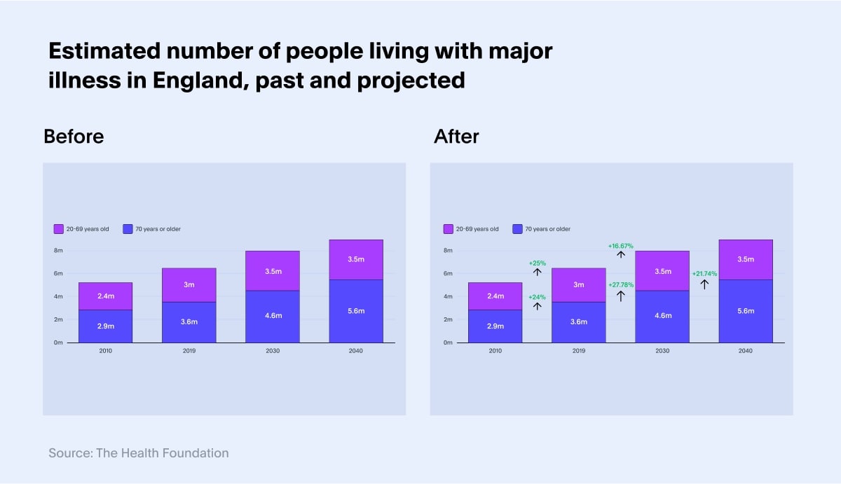
Consider this bad data visualization example: We have a chart from BBC, showing people living in England with major illnesses, both under and above the age of 70. Here, we can add better context by adding a percentage increase indicator to help viewers better understand the data. This small change can even help decision-makers formulate better healthcare policies.
Consider following these tips:
Enhance clarity by highlighting or reinforcing vital points in the data.
Add indicators to explain trends or outliers.
Spell out details that may not be immediately visible to the viewer.
Create text summaries in a simple and easy-to-understand language.
Watch out for missing fields and labels.
Focus on presenting the problem that the user is facing.
Modern data visualization tools offer a plethora of customization options that allow you to build visually appealing, interactive visualizations. This helps you present your data story effectively so users can discover new insights.
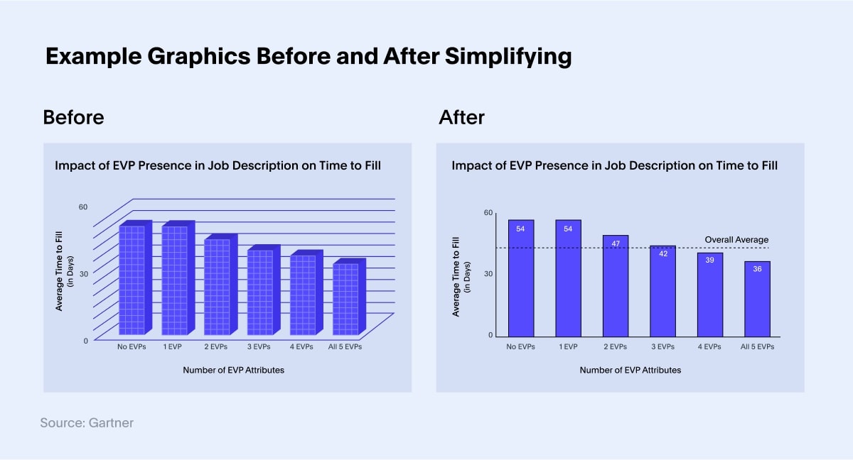
But here’s the catch: having too many visual elements is distracting. Whether you are building a dashboard or a report, don’t fall into the trap of making your visual design messy. The goal is to highlight critical information, not complicate it. Try to incorporate simplicity and make data interactive to encourage data discovery.
Here’s a classic bad data visualization example where excessive designing takes viewers' eyes away from critical insights:
Consider following these tips:
Identify the key insights you want your audience to take away from the visualization. This will guide you in selecting the most relevant design for your chart.
Embrace whitespace to provide visual breathing room. Adequate spacing between elements helps prevent visual clutter and enhances overall readability.
Ensure that labels are clear, concise, and directly related to the data they represent.
When used strategically, colors can help you highlight critical findings, easily communicate your insights, and establish relationships between two distinct objects in your data visualizations. Jarring colors or inconsistent color cues won’t help your audience understand the data any better. Instead of adding cognitive overload to your audience, you should work towards reducing it.
Here’s a bad data visualization example highlighting the significance of using colors strategically:
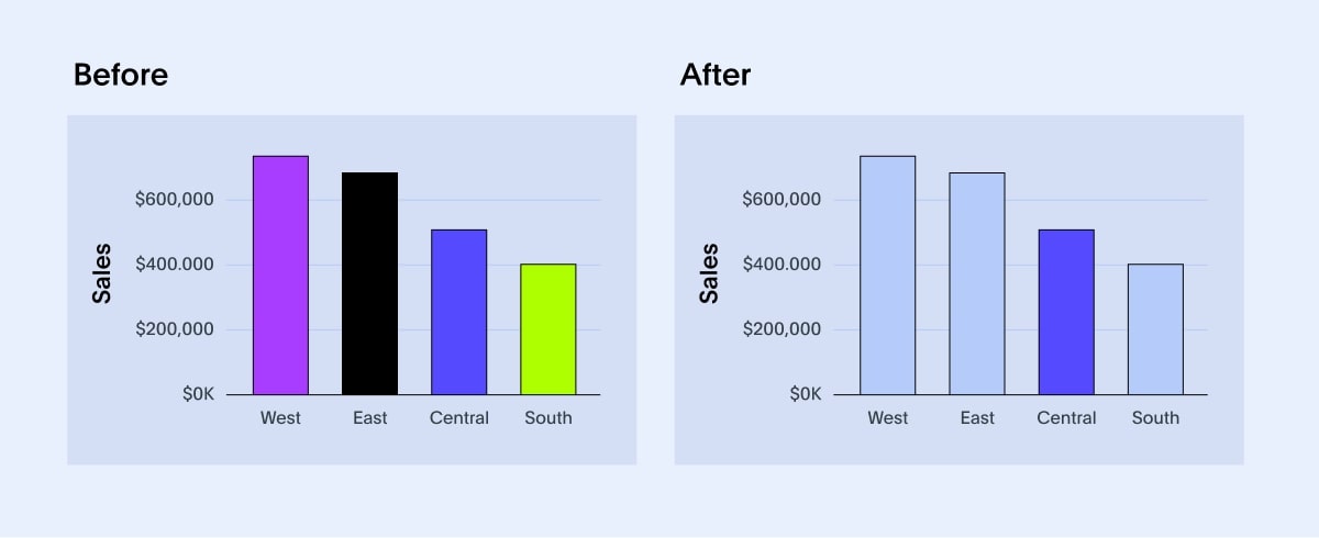
The colors of the left chart are harsh and can deter stakeholders’ attention from the region we wanted them to focus on. But the colors on the right are much muted and effectively communicate what we wanted to highlight.
Consider following these tips:
Keep your color palette simple and adjust saturation and hues to please the viewers’ eye.
Limit the number of colors in your palette to avoid unnecessary complexity.
Pay attention to color contrast to make information easy to consume.
Use vibrant colors sparingly, as it can lead to visual fatigue.
Maintain consistency across visualizations as it is easier for users to recognize and interpret valuable insights.
A well-crafted narrative is memorable and creates a significant impact. Instead of just throwing facts on a slide deck, you should present your data visualizations through a compelling narrative. This helps the audience understand the ‘why’ faster and retain critical insights.
Look at the bad data visualization example below:
Although the sales dashboard above may offer contextual information, connect the dots when presenting your data story. The best way to incite action from insights is to introduce the problem, describe your data-driven visualizations, and unpack your findings.
Consider following these tips:
Structure your data story with a beginning, middle, and end.
Introduce the context and background information, present the main insights, and conclude with a summary.
Choose the visualizations that best represent your data and support your narrative.
Incorporate real-world examples or anecdotes. Connecting the data to relatable stories keeps the audience engaged.
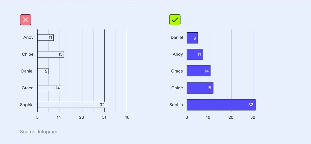
Not all charts and graphs are created equal. Some require putting greater emphasis on certain anomalies, while others want to highlight a significant trend. So how do you balance the elements in a way that makes sense to the viewer?
The answer is simple—establish a visual hierarchy. It essentially guides the viewer's eyes to the most critical information, helping them focus on key insights and trends in the data.
Here’s an example of bad graph that emphasizes the importance of visual hierarchy:
Consider following these tips:
Leverage size to emphasize key elements.
Arrange elements in a logical order that supports the hierarchy.
Use contextual cues like labels and data points to highlight critical insights.
Keep your design simple and avoid unnecessary clutter.
When done right, data visualizations can create phenomenal shifts in how we make business decisions. Because they convey complex information in a simple, coherent manner, giving everyone instant access to actionable insights.
However, doing so requires a powerhouse business intelligence tool like ThoughtSpot that generates best-fit visualizations using AI-Powered Analytics. With ThoughtSpot, you can effortlessly create interactive dashboards and visualizations and discover insights using everyday language queries.
See how easy it is to build dashboards from scratch with ThoughtSpot. Register for your live demo today!


