


“On its own, data has zero value,” says data expert Bill Schmarzo. And he’s right. A spreadsheet full of numbers doesn’t mean much until you can pull out the stories, patterns, and insights hiding inside. That’s the difference between having data and being data-driven.
And the upside is huge. Accenture research shows data-driven companies grow revenue 10–15% faster than their peers.
So why isn’t everyone cashing in? Because most teams are still chained to BI tools that are slow, rigid, and only tell you what has already happened.
The good news? That’s changing. AI-powered data visualization tools are here, making insights instant, exploration effortless, and dashboards feel less like static reports and more like decision engines.
Here are some of the top AI data visualization tools to know in 2026:
Quick comparison of top AI visualization tools
| Tool | Best for | Standout feature | Gartner rating |
|---|---|---|---|
| ThoughtSpot | Organizations that want everyone to explore and act on live data | AI agents, AI-augmented dashboards, natural language queries, and automated insights | 4.6 |
| Zoho Analytics | Enterprises looking for scalable analytics | AI-generated insights and interactive visuals | 4.4 |
| Julius | Teams needing quick, code-free insights and collaboration | Intuitive interface with automated visualizations and data transformation | N/A |
| Domo | Small and medium-sized organizations seeking low-code analytics | AI-generated dashboards and auto-chart generation | 4.5 |
| Explo | Teams that want visualizations without heavy coding | AI-powered interactive visualizations with customizable dashboards | N/A |
You’ve seen the options, now let’s break down each tool so you can pick the one that truly makes your data work for you.
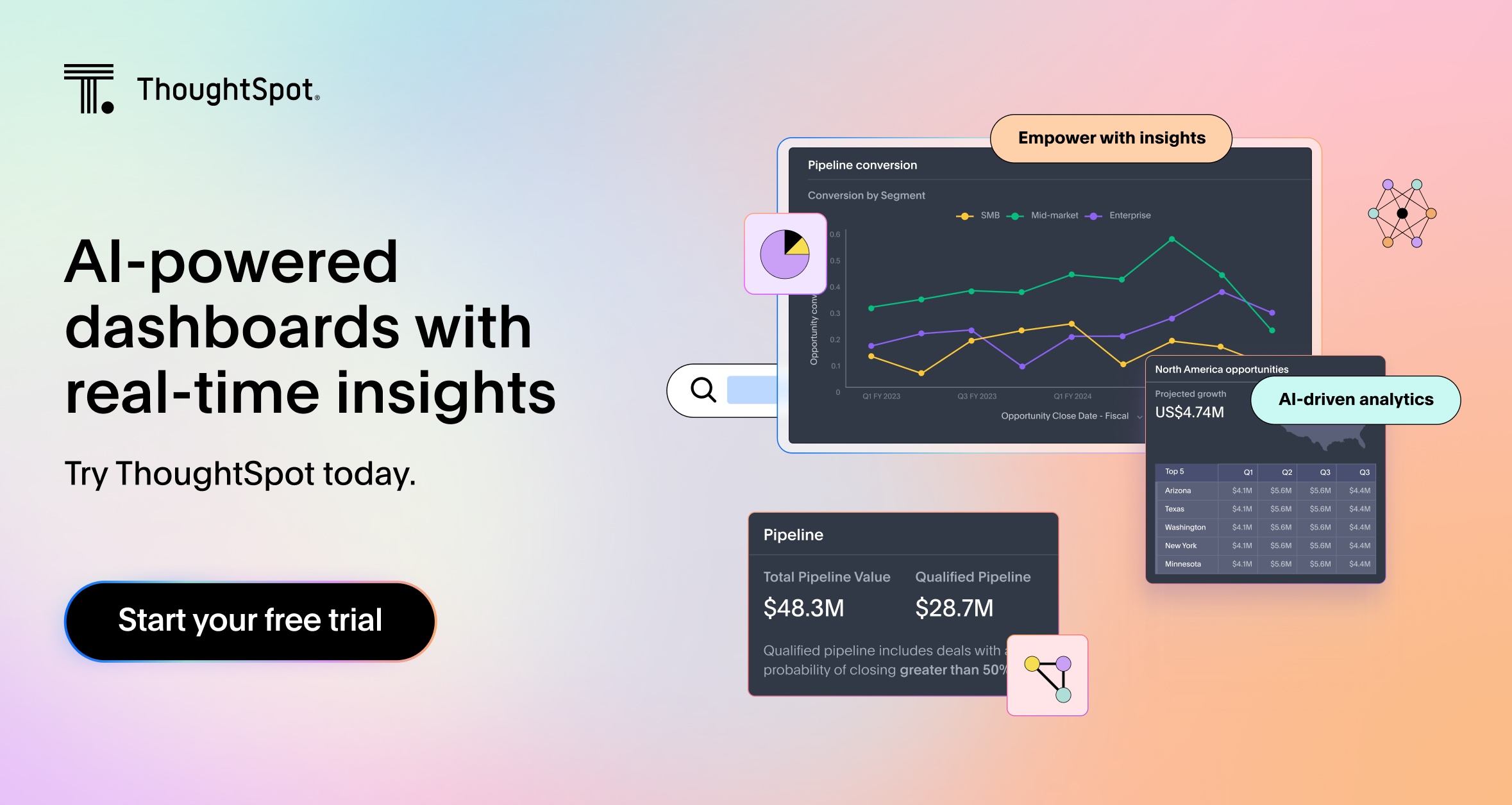
ThoughtSpot delivers an AI-powered, conversational experience that’s a far cry from the outdated, static dashboards of legacy BI tools. Unlike traditional dashboards that are slow, limited, and require manual effort to extract insights, ThoughtSpot’s AI-augmented dashboards serve up personalized and actionable insights, right when they matter the most.
With a search-based interface and built-in agents, you can easily explore your data, ask questions in natural language, and get instant answers and visualizations, making it easy for anyone in your organization to make smarter, data-driven decisions.
Core features
Dedicated AI analyst: Spotter, ThoughtSpot’s dedicated AI Analyst, puts you in the driver's seat. Simply ask a question in natural language and get immediate, conversational answers.
AI-powered dashboards: Liveboards provide a real-time, interactive view of your data, keeping you updated on business metrics as they evolve.
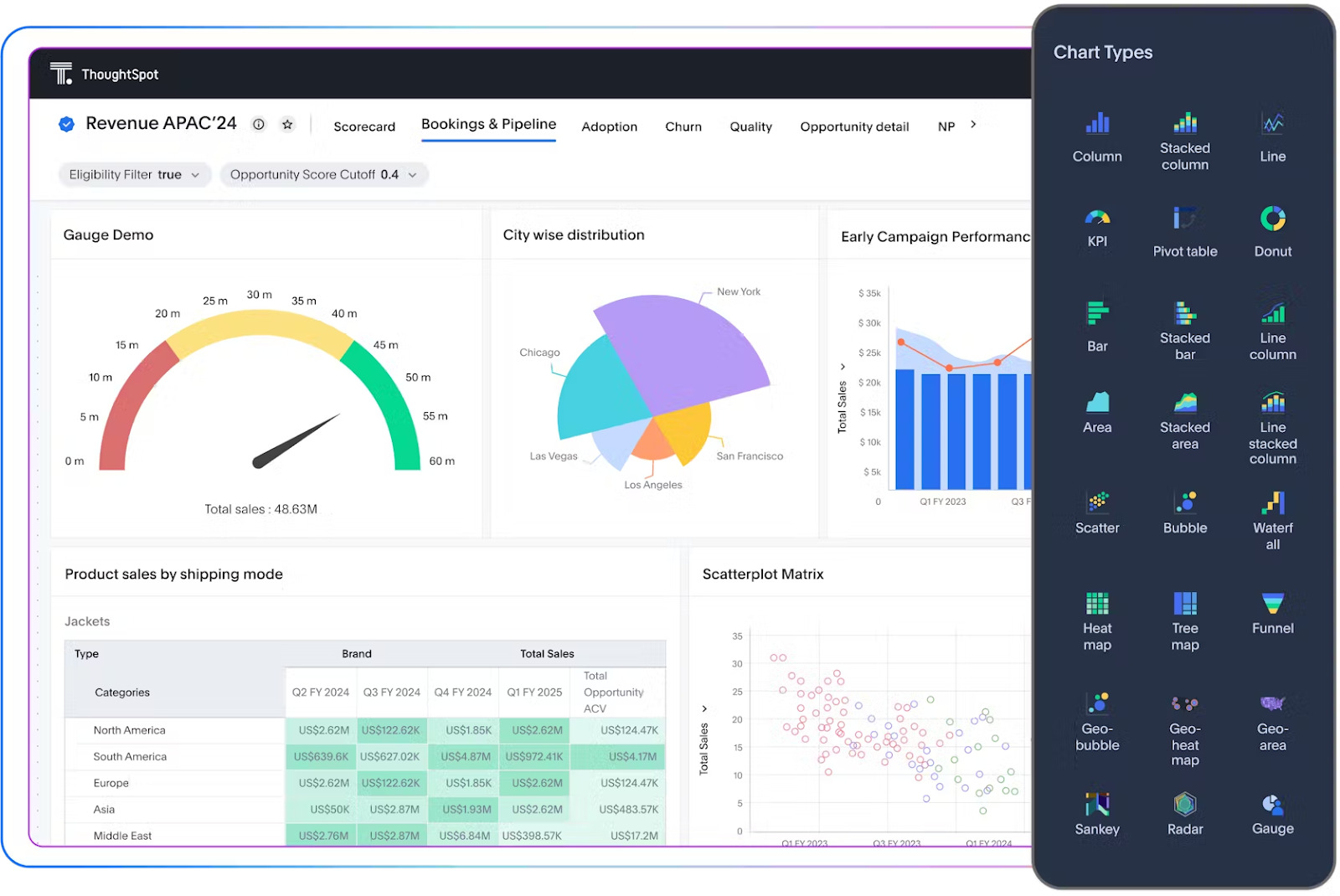
Interactive data visualizations: Pick the visualizations that make sense for your data and your team. ThoughtSpot lets you explore, drill, and pivot across metrics instantly.
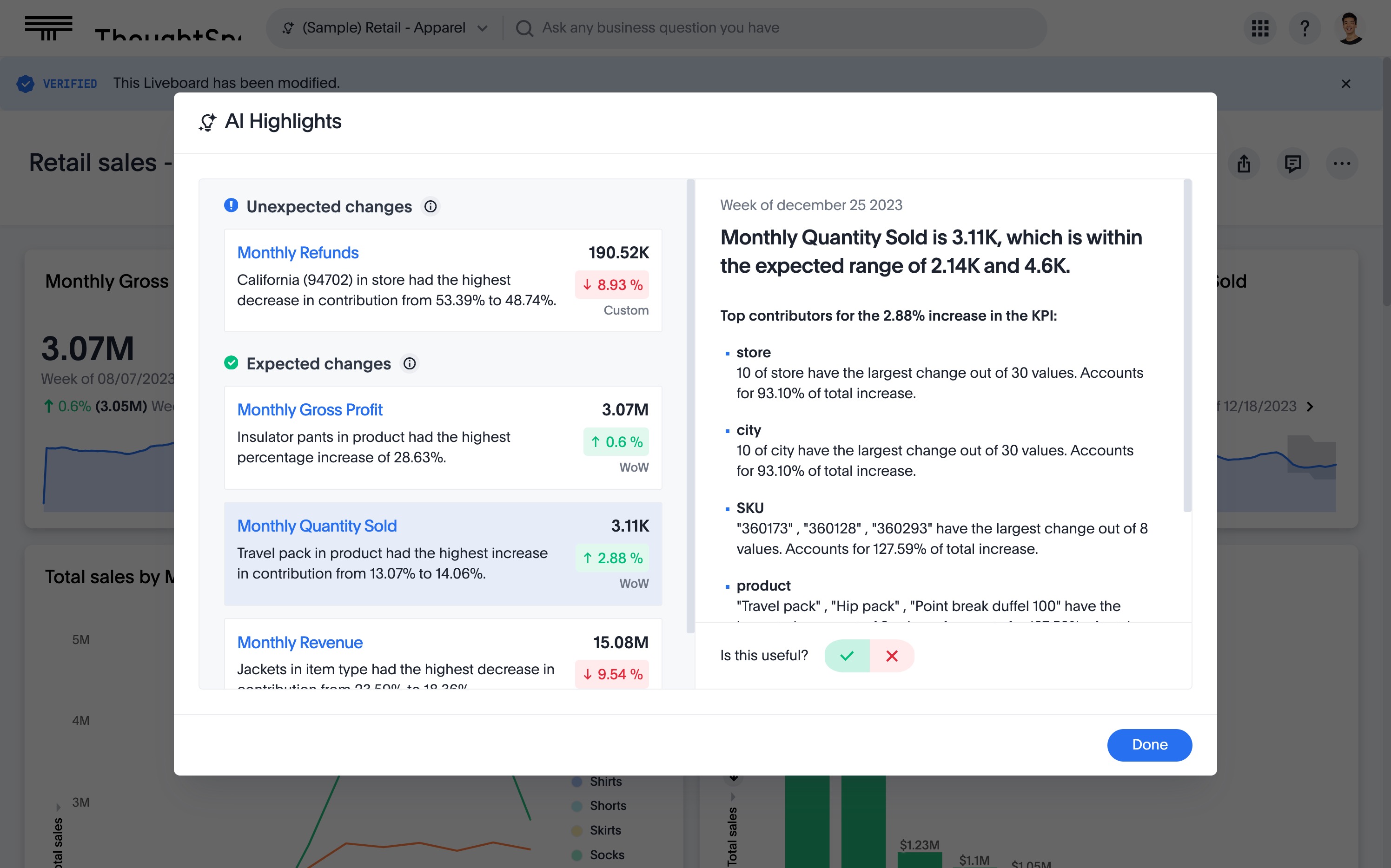
Actionable insights: ThoughtSpot can detect patterns, anomalies, and correlations and surface these automatically, giving you a deeper explanation of your data.
Pros
Empowers business users with self-service analytics, enabling everyone on the team to explore and generate insights.
Explainable AI output and human-in-the-loop feedback to build trust.
Cons
Some advanced features may require additional training for users.
For accurate AI answers, additional data modeling may be required.
Pricing
ThoughtSpot offers flexible pricing models designed to meet the unique needs of different businesses and enterprises. Here’s a quick breakdown of each plan:
The Essential plan—starts at $25/month
The Pro plan—starts at $50 per user/per month
The Enterprise plan—custom pricing
Zoho Analytics is an end-to-end business analytics platform that combines data visualization, analysis, and collaboration in one easy-to-use interface. You can connect data from multiple sources, track performance in real time, and share insights effortlessly across teams.
It also includes Zia, a built-in AI assistant that helps users surface insights faster using natural language queries and automated analysis.
Core features
AI-powered insights: Zia helps uncover insights fast using natural language queries and automated analysis.
Customizable visuals: Build dashboards and reports tailored to your team with an intuitive drag-and-drop interface.
Auto analysis: Automatically spot patterns, trends, and anomalies in your data.
Predictive insights: Forecast trends and make data-driven predictions for your business.
Pros
Flexible data integration from multiple sources.
Collaborative features for team-wide analytics.
Cons
Limited and sometimes unclear customer support.
Data prep features exist but may be less intuitive or impactful for end users.
Pricing
Zoho Analytics offers flexible pricing to suit different team sizes and needs. Plans start at $24/month (billed annually), with a free plan available. Pricing scales based on factors like number of users, data rows, and workspaces.
Julius is designed to make data analysis as simple as having a conversation. You can connect data from multiple sources using different connectors and use a chat-based interface to ask questions in natural language and discover insights, generate visualizations, and perform complex data transformations.
The platform also features predictive modeling capabilities that help you forecast trends, identify potential outcomes, and make data-driven decisions.
Core features
Chat interface: Ask questions in natural language and get AI-powered insights.
Smart visualizations: Automatically generate charts and dashboards to highlight trends.
Trend detection: Spot correlations, anomalies, and key drivers in your data.
Data manipulation: Perform calculations, filters, and transformations easily.
Pros
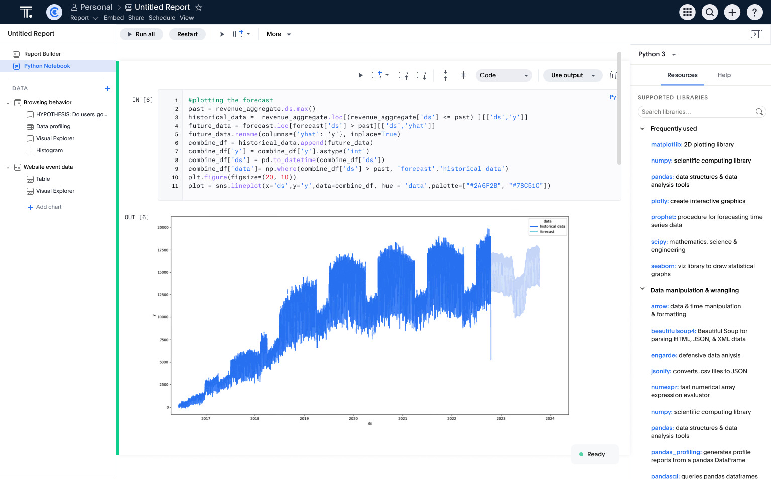
Notebooks and advanced analytics for deeper exploration.
Responsive, helpful customer support.
Cons
Slower processing can limit real-time analysis.
Fewer analytical features compared to competitors.
Pricing
Julius offers a free plan with basic access, and paid plans start at $16 per user per month, with flexible options based on team size and feature needs.
Domo is an open-source data visualization solution that helps users gather, analyze, visualize, and share data from various sources. With a drag-and-drop interface and a pre-built visualization library, users can connect their data and build dashboards.
The platform has recently added new AI capabilities that help users build advanced data models, automate workflows, predict outcomes, and monitor insights.
Core features
Data preparation: Clean, transform, and organize data from multiple sources.
Dashboard creation: Interactive dashboards with charts, KPIs, and filters.
Augmented analytics: AI-powered insights reveal hidden trends and anomalies.
Real-time syncing: Keep dashboards up-to-date automatically.
Pros
Drag-and-drop interface simplifies dashboard creation.
Extensive connectors make integrating data sources easy.
Cons
Advanced features can be overwhelming for new users.
Pricing can be complex and unpredictable due to the consumption-based model.
Pricing
Domo uses a consumption-based pricing model that can vary significantly based on your deployment (cloud or on-prem), data storage needs, number of users, and the features you choose.
Explo is an embedded dashboard and reporting software with advanced analytics features, such as data blending, modeling, and visualization. It connects to multiple databases and enables users to build and share custom dashboards using an intuitive interface.
The platform also boasts AI features, such as Explo AI, that allow data pros to use text prompts to ask questions, get AI insights, and create charts.
Core features
AI report builder: Generate custom reports using natural language.
Custom visualizations: Extensive library of charts and maps for branded dashboards.
Data modeling: Build reusable datasets with SQL logic for consistent analytics.
Embedded analytics: Seamlessly integrate dashboards into apps with iframes or web components.
Pros
Natural language and drag-and-drop reporting make dashboards easy to create.
Fully customizable interface aligns with your app’s branding.
Cons
Analytical capabilities are more limited than those of feature-rich competitors.
Occasional performance bugs can impact usability.
Pricing
Explo offers three pricing tiers. The entry-level plan is free, providing basic functionality, while the paid plans start at $795 per month for 25 users, offering full access to advanced features and customization options.
What features to look for in an AI-powered data visualization tool?
These days, every analytics vendor swears their platform is “AI-powered.” But flashy charts in a demo mean nothing if the AI can’t stand up to the pace, scale, and complexity of your real-world data.
Let’s break down the factors that help you make an informed buying decision:
| Feature | Why it matters | What to look for |
|---|---|---|
| Natural language processing (NLP) | You don’t have to rely on SQL or technical queries to get insights. NLP removes barriers so anyone can ask questions and get instant answers. | Accurate query understanding, context-aware responses, and support for follow-up questions. |
| AI highlights | You can’t spot every pattern manually. AI should surface trends, anomalies, and correlations you didn’t know to look for. | Instant anomaly detection, correlation analysis, and prioritized insight alerts. |
| Predictive analytics | Knowing what happened isn’t enough. AI should help you anticipate what’s next. | Built-in forecasting, scenario modeling, and actionable recommendations tied to business metrics. |
| Explainable AI | Blind trust in AI is risky. Explainable AI builds confidence by showing how an insight was generated. | Transparency into data sources, methodology, and drivers behind each visualization. |
| Human-in-the-loop controls | AI is susceptible to biases and hallucinations. Human review ensures accuracy, mitigates bias, and keeps context in decision-making. | Feedback loops, the ability to refine AI suggestions, and governance over automated outputs. |
| Interactivity | Even the smartest AI insights fall flat if they aren’t easy to interpret. Clear, interactive visuals make data stories stick and drive action. | Dynamic charts, drill-down capabilities, customizable dashboards, and AI-suggested visual formats. |
How is AI used in data visualization?
Think data visualization is about making pretty charts? You’re dead wrong.
AI is turning dashboards into strategic decision tools that don’t just show you what happened: They tell you why it happened, what’s likely to happen next, and what you should do about it.
Here’s how AI-powered data visualization tools give you a competitive edge:
1. Automated insight discovery
AI analytics platforms can scan millions of rows in seconds, surfacing trends, anomalies, and correlations you might not even know to look for. Instead of spending hours slicing and filtering data, you get visualizations that highlight the most important patterns instantly.
Here’s how Spotter makes it even easier:
2. Predictive insights
Data visualization used to be about what happened. AI-powered ones take you further, helping you predict what’s likely to happen next.
Imagine spotting a sales dip or supply chain delay before it hits, giving you time to adjust and avoid the impact. This is where your dashboard stops being a reporting tool and starts being a strategic advantage.
3. Dynamic, personalized views
Different leaders need different lenses on the same data. AI tailors dashboards to each role, surfacing margin trends for a CFO or adoption metrics for a product manager, without building separate views. The result: data that’s instantly relevant to whoever’s looking.
4. Anomaly and outlier detection
Catching a sudden traffic spike or sales drop often happens too late, after the moment has passed. AI-driven anomaly detection changes that by monitoring your data in real time, flagging patterns that deviate from the norm, and instantly visualizing them.
For instance, ThoughtSpot’s Spotter can automatically detect anomalies across your metrics and alert you, so you never miss critical changes in your business.
5. Narrative-driven data storytelling
A chart alone can tell you what happened, but not why it happened. AI-powered visualizations bridge that gap, layering in context and even recommending next steps.
The result is a complete data story that anyone can understand, share, and act on.
Bring your data to life with AI-powered data visualizations
Let’s be real: AI-powered analytics isn’t just a shiny new tool. When used strategically, it can completely change the way your business operates. In fact, our MIT survey shows that 56% of early adopters have already exceeded their business goals by acting on insights at the right time.
With ThoughtSpot, your team can do the same. Ask questions, explore data freely, and discover hidden revenue opportunities or operational efficiencies instantly. ThoughtSpot’s Spotter surface insights automatically, while powerful visualizations make it easy to understand trends and act immediately.
See how fast your insights can turn into action. Start your demo today.
Frequently asked questions
Which AI tool is best for data visualization?
The best AI tool depends on your team’s needs and the type of insights you want to discover. Many tools claim to be “AI-powered”, but few combine natural language queries, automated insight generation, and interactive visuals like ThoughtSpot. With ThoughtSpot, your team can ask questions in natural language, surface hidden trends instantly, and act faster, turning data into decisions without the bottlenecks.
Can non-technical teams use AI visualization tools?
Yes. Many modern AI visualization software allow users to explore data using natural language queries or drag-and-drop interfaces. This allows them to explore their data without writing complex queries.
Do AI visualization tools work with existing data systems?
Most AI visualization platforms integrate with cloud and on-premises databases, allowing teams to leverage existing data without complex migrations.
How do AI visualization tools compare to traditional dashboards?
Unlike static dashboards, AI tools for data visualizations dynamically surface insights, highlight anomalies, and guide users to relevant patterns without manual setup.


