


According to Forbes, 90% of the information processed by the brain is visual. So, when presented with a graph, chart, or diagram, we can instinctively grasp its meaning far quicker than sifting through pages of text. This inherent skill forms the foundation of visual analytics—an approach to data analysis that uses the power of visualization to unlock insights and drive decision-making.
But visual analytics is about more than just pretty pictures. By transforming raw data into interactive data visualization, visual analytics uncover patterns, trends, and relationships that might otherwise remain hidden. In this article, we’ll examine the principles, applications, and significance of visual analytics in today's data-driven world.
Table of contents:
Visual analytics is an interdisciplinary field that combines techniques from data visualization, interactive interfaces, and analytical reasoning to explore and understand complex datasets. By using interactive visualizations to facilitate the exploration, analysis, and communication of data-driven insights, this approach makes data more accessible and understandable. Even more, it empowers you and your to derive actionable insights to enhance decision-making.
1. Enhanced understanding
Visualizations make complex data more accessible and understandable. By presenting data in graphical formats, visual analytics helps you grasp trends, patterns, and insights more quickly than traditional data analysis methods. This approach makes data exploration intuitive, allowing users to interact with and investigate their data from multiple angles.
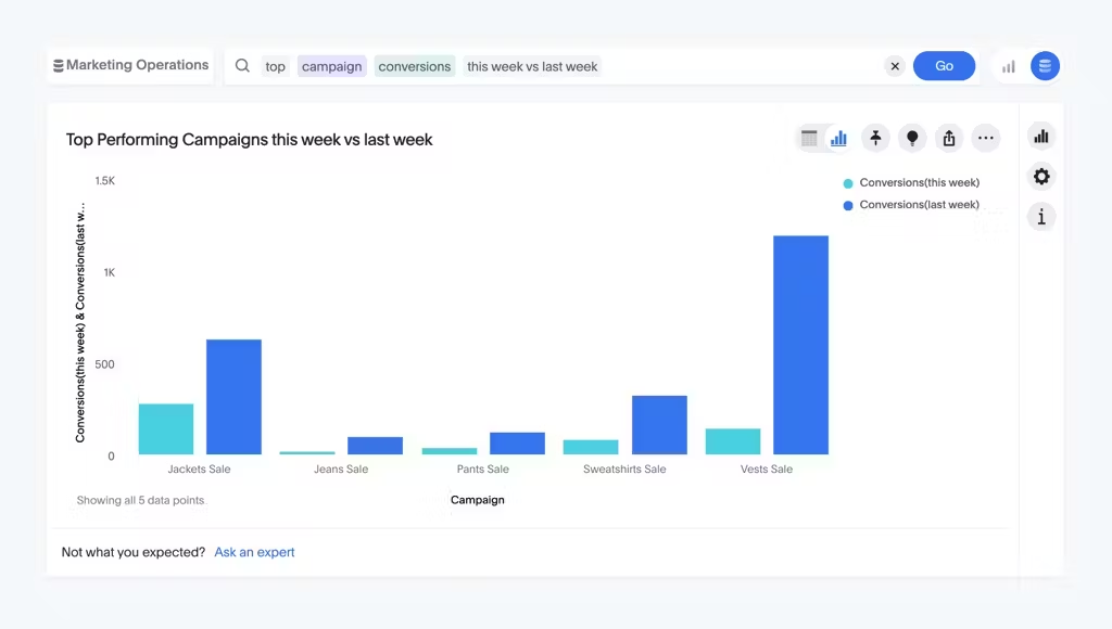
For instance, a retail company can use visual analytics to track sales performance across different regions. Interactive dashboards enable managers to quickly identify which products are selling well and where.
2. Real-time insights
Visual analytics lets you quickly monitor performance metrics, spot new trends, and detect anomalies in real-time. This agile analysis accelerates the process of deriving actionable insights, allowing you to respond promptly to dynamic conditions or unforeseen opportunities.
For example, an e-commerce platform can use real-time visualizations to monitor website traffic, monitor page views, and identify sudden drops in conversion rates. This allows them to optimize product listings, adjust marketing campaigns, and implement targeted promotions to enhance user experience.
3. Increased productivity
By creating a single source of truth and streamlining workflows, visual analytics tools enhance productivity. This frees up valuable time for you to focus on high-level analysis and strategic decision-making, ultimately leading to more efficient operations and resource utilization.
But don't just take our word for it—let's take a look at Wellthy. Wellthy’s data team, already swamped with ad-hoc requests, found themselves struggling to tackle extensive data projects. With the introduction of ThoughtSpot, they gained the freedom to ask queries and explore data without constraints. This helped the company save over $200k by increasing analyst efficiency.
“Wow, this is exactly what I expected it to do. This can replace three or more things on my current report that I have to build manually today.”
4. Cross-disciplinary collaboration
Visualizations serve as powerful communication tools, enabling stakeholders to share insights and findings with other members of the team. Visual analytics fosters collaboration by providing a common visual language for discussing data. This promotes knowledge sharing and facilitates the exchange of interdisciplinary insights.
Within this collaboration framework, innovative features like ThoughtSpot’s note tiles further enhance communication. You can provide important directions for how to read or use a specific visualization. For example, a note tile could provide insights on understanding customer engagement metrics in a marketing campaign dashboard, ensuring the data is accurately interpreted and assisting marketers in optimizing their strategies for better results.
5. Predictive capabilities
Advanced visual analytics tools incorporate predictive modeling, AI analytics, and machine learning algorithms, enabling you to forecast future trends and outcomes based on historical data patterns.
In an episode of The Data Chief featuring two healthcare powerhouses—Gilead Sciences and ZS Associates, Murali Vridhachalam and Mahmood Majeed talk about how they use predictive analytics to improve patient outcomes.
“The ecosystem has been quite sophisticated, we apply AI use cases to predict the likelihood of a prescriber writing a script before a script is being written. You can prescribe and actually predict a patient dropping a therapy before it drops, or you can actually predict a plan changing their formulary status before it happens.”
Listen to the full episode here-
Visual data analytics utilizes various techniques and tools to analyze data. Some common types include:
Charts and graphs: Charts and graphs are basic visualizations that represent data points using graphical elements such as bars, lines, and pie slices. Examples include bar charts, line graphs, and pie charts, which are often used to illustrate trends, comparisons, and proportions in data.
Dashboards: Dashboards are interactive visual displays that consolidate and present key metrics, KPIs (Key performance indicators), and other relevant information in a single, customizable interface. Modern dashboards or Liveboards as we call them provide a comprehensive overview of data at a glance. These enable you to monitor performance, track goals, and make informed decisions.
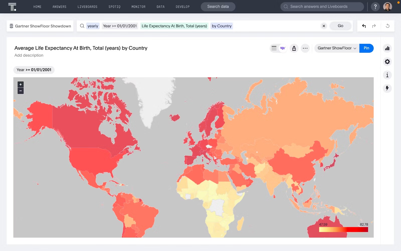
Maps: Geographic information system (GIS) visualizations use maps data visualizations to represent spatial data and geographical relationships. They are particularly useful for analyzing location-based data, such as demographic trends, market segmentation, and resource allocation.
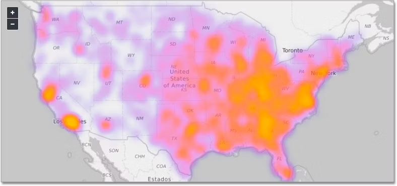
Heatmaps: Heatmaps use color-coded gradients to represent the density or intensity of data values across a spatial or categorical grid. They are commonly used to visualize patterns, correlations, and outliers in large datasets, such as website traffic, customer behavior, and sensor data.
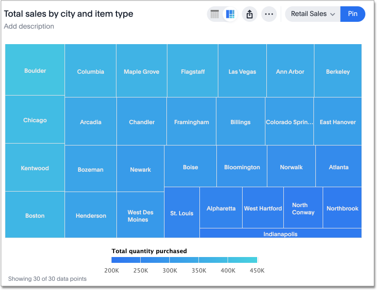
Tree maps: Tree maps visualize hierarchical data structures using nested rectangles, with each rectangle representing a category or subcategory. They are useful for displaying hierarchical relationships, such as organizational structures, file directory structures, and hierarchical data sets.
Scatter plots: Scatter plots display individual data points as dots on a two-dimensional graph, with one variable plotted on each axis. They are useful for visualizing correlations, clusters, and outliers in multivariate data sets, allowing you to identify patterns and relationships between variables.

1. ThoughtSpot
ThoughtSpot is a cutting-edge visual analytics tool that is revolutionizing analytics with AI-powered, self-service that makes data exploration seamless and interactive. Our innovative Liveboards take your data from static reports to vibrant, real-time visual experiences, enabling you to see trends and patterns as they emerge. With a vivid and interactive interface, ThoughtSpot helps you dive deep into your data and make informed decisions effortlessly.
Core features
Real-time data visualization: Liveboards offer dynamic visualizations that update instantly with new data, keeping you aligned with the latest business metrics.
Interactive exploration: Engage with your data through filters and drill-downs on Liveboards, making it easy to uncover deeper insights.
Comprehensive data integration: Aggregate data from multiple sources, including databases, spreadsheets, and cloud services, for a unified view.
Mobile accessibility: Responsive Liveboards that adapt to mobile devices, allowing you to access insights anytime, anywhere.
AI-powered search: Utilize natural language search to simplify the discovery of trends and patterns, leveraging AI for meaningful data insights.
Advanced analytics: Features like ‘Change Analysis’ and ‘AI Highlights’ help identify key trends and anomalies, offering a real-time overview of your business.
AI-assisted data modeling: ThoughtSpot’s AI-assisted data modeling and exploration tools, including Sage Coach, refine complex data tasks with greater precision.
Automated alerts: Stay updated with automated notifications on crucial KPIs through ThoughtSpot Monitor, ensuring you never miss key metrics.
Experience the power of ThoughtSpot’s visual analytics—sign up for a free trial today!
2. Tableau
Tableau serves as a platform for business intelligence and visual analytics. It allows users to connect to various data sources and create dashboards that visually represent raw data. While Tableau’s interface simplifies the process of building visualizations, large datasets can still be challenging for those without a background in development or data science.
Core features
Drag-and-drop interface: Allows users to build visualizations by dragging and dropping elements
Real-time data analysis: Updates visualizations with data from live sources
Advanced analytics: Provides tools for tasks such as forecasting and trend analysis
Extensive integration: Connects with various data sources, including databases and cloud services
3. Power BI
Power BI is a visual analytics tool developed by Microsoft that integrates well with other Microsoft products. It helps users create interactive reports and dashboards from various data sources. Power BI is designed to turn data into actionable insights, but its full capabilities are best utilized when combined with Microsoft’s ecosystem.
Core features
Custom visualizations: Enables the creation of specific reports and visuals based on user needs
Natural language query: Allows users to query data using plain language and receive visual answers
Interactive dashboards: Features elements like drill-downs and filters for detailed data exploration
Microsoft integration: Integrates well with other Microsoft products like Excel and SQL Server
4. SAS Visual Analytics
SAS Visual Analytics focuses on data analysis and visualization. It provides features for generating automated insights and performing predictive analytics. The tool is aimed at users who need to explore complex data and obtain actionable business intelligence.
Core features
Automated insights: Uses machine learning to provide insights and recommendations
Interactive dashboards: Allows for detailed data exploration through dynamic dashboards
Predictive analytics: Includes tools for forecasting and trend analysis
Data preparation: Provides capabilities for data cleansing and preparation
5. Spotfire
Spotfire, from TIBCO, is a tool for data visualization and real-time analytics. It handle complex datasets and provides capabilities for interactive data analysis. Spotfire’s features are geared toward users who need real-time insights and effective data exploration tools.
Core features
Interactive analytics: Supports creating interactive visualizations and conducting exploratory analysis
Data connectivity: Connects with various data sources
Real-time data streaming: Provides updates and analytics based on live data
1. Business intelligence
Visual analytics is widely used in business intelligence (BI) to analyze and visualize key performance indicators (KPIs), sales trends, market trends, and customer behavior. Organizations use visual analytics tools to create interactive dashboards and reports, enabling executives and decision-makers to monitor business performance and identify opportunities for growth and optimization.
To better understand this use case, let’s take a look at a real-life scenario of Modern Restaurant Concepts. Former Finance Director Lisa Sauer streamlined reporting by adopting ThoughtSpot's Liveboards. This enabled real-time monitoring of sales and labor data for General Managers across numerous nationwide restaurants.
“As we continue to move more and more data into one reporting platform, we have already been able to focus on deeper data-driven being made at every level.”
2. Scientific research
Across scientific research, visual analytics plays a key role in analyzing experimental data, conducting data-driven simulations, and visualizing complex scientific phenomena. Researchers employ visual analytics tools to explore patterns, correlations, and relationships in data from diverse scientific domains, including genomics, astronomy, climate science, and neuroscience.
In an episode of The Data Chief, Victoria Gamerman, Global head of digital transformation describes a connection between “science and data” and “data storytelling.” For her, telling the story of the data is part of developing a strategy.
Listen to the entire episode here–
3. Marketing and customer analytics
Within marketing and customer analytics, visual analytics aids in analyzing customer segmentation, purchasing behavior, marketing campaign performance, and social media engagement. Marketers can also utilize AI marketing analytics tools to craft visualizations that offer insights into customer preferences, sentiment analysis, and the efficacy of marketing initiatives.
Companies like Neobank Northmill have used customer segmentation to create a more personalized banking experience. The bank was experiencing technical bottlenecks with its legacy BI tool. By implementing ThoughtSpot’s self-service analytics, they were able to analyze user data and identify areas for improvement in the onboarding process. In turn, Northmill boosted its customer conversion rates by 30%.
“It is all about being as relevant and personal as possible so users’ personal finance can benefit from the insights. It can be getting a notification of a discount deal at your favorite cafe or a tailored offer to lower the cost of your insurance.”
Visual analytics isn't just about seeing data—it's about seeing growth opportunities. With ThoughtSpot's AI-Powered Analytics, you can turn complex datasets into actionable insights, driving informed decision-making at every level of your organization.
Experience the power of visual analytics firsthand. Schedule a live demo with ThoughtSpot.


