


Studies consistently show that we understand and remember information better when it's presented visually. In fact, visuals are processed 60,000 times faster than text. So, why stick to dull spreadsheets when you can leverage the power of visual storytelling?
With map visualizations, your data becomes a story you can explore. No longer constrained by static representations, your data becomes an immersive experience.
Table of contents:
Interactive map data visualizations refer to the dynamic and graphical representation of geographical or spatial data on a map. Crafted to effectively convey information about the distribution, patterns, and relationships of data across diverse geographic locations, these visualizations differ from traditional, static maps. Because maps provide the ability to visualize and engage with data, they offer a more immersive and accessible data exploration experience.
Geospatial representation: The primary feature of interactive map visualizations is the ability to represent data on a map, allowing you to understand patterns and relationships in a geographical context. This makes geospatial data analytics especially valuable for identifying regional trends, customer behavior, and operational patterns.
Zoom and pan: You can zoom in and out of the map to explore details at different levels of granularity. The ability to pan across the map allows for navigation and exploration.
Layered information: Multiple layers of information can be overlaid on the map, enabling the visualization of various data sets simultaneously. This can include points, lines, polygons, heatmaps, and more.
Customizable markers: You can customize markers to represent different types of data points. For example, markers of various shapes, colors, and sizes can be used to convey different attributes or categories.
Filtering and highlighting: Filtering data based on specific criteria or parameters is a key feature of interactive map visualizations. Doing so enables a more focused exploration of data and helps highlight relevant information.
Interactive legends: Legends provide a key to interpreting the map's symbols and colors. In interactive maps, legends are dynamic and may update as you interact with the map, changing the displayed data.
Tooltip information: When you hover over a data point, tooltips can display additional information about that particular location or data element. This feature enhances the user's understanding of the data without cluttering the map.
Time-series data: Some interactive map data visualizations support time-based data, allowing you to see how data evolves, which could involve animations or the ability to slide through different time periods.
Search and query: You can search for specific locations or query the data to find relevant information. The search feature enhances interactivity and provides a more personalized experience.
Responsive design: Interactive map visualizations should be responsive to different devices and screen sizes, ensuring a seamless experience for users on desktops, tablets, and smartphones.
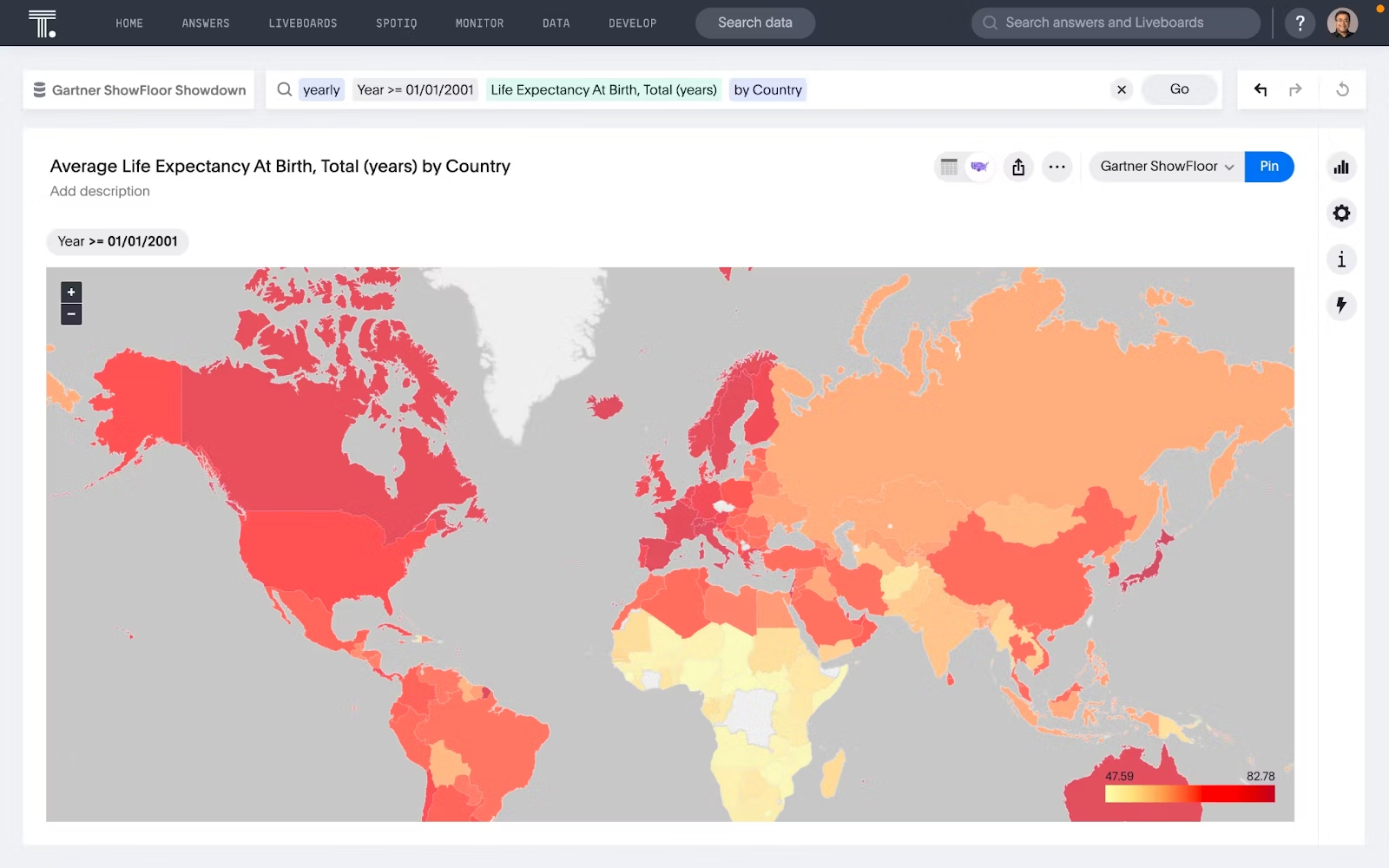
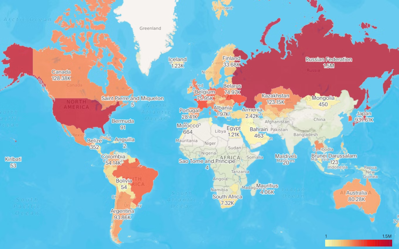
1. Choropleth maps:
These types of graphs use color coding to represent different values or levels of variability within predefined geographic areas. They are commonly used for showing demographic or statistical data.
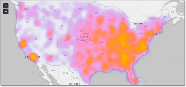
2. Heatmaps:
Heatmaps use color intensity to represent the density or concentration of data points in a specific area, making them effective for visualizing patterns and trends in spatial data.
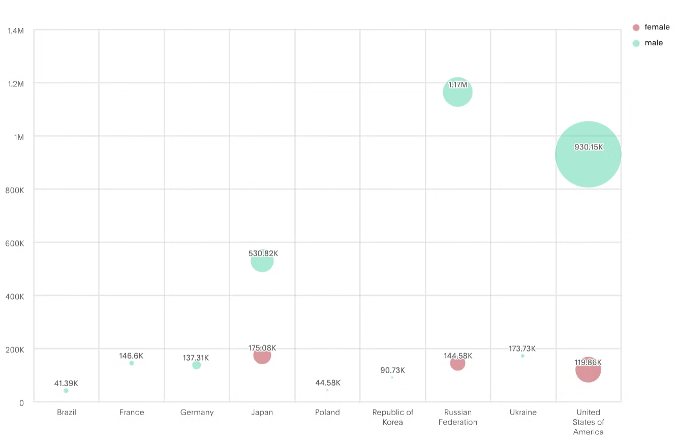
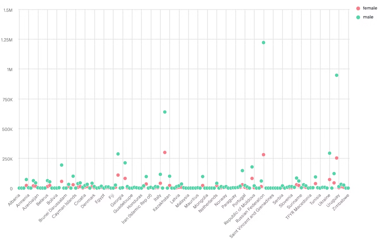
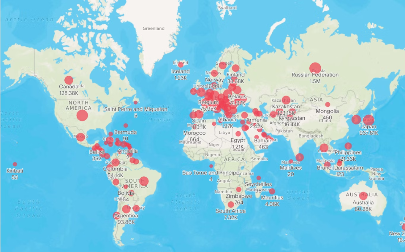
3. Bubble maps:
Bubble maps display data using varying sizes of bubbles at specific locations on a map. The size of the bubble corresponds to a particular value, making it easy to compare data points.
4. Marker maps:
Marker maps use icons or markers to represent specific locations on a map. Each marker can contain additional information when clicked, making it useful for displaying point-specific data.
5. Flow maps:
Flow maps illustrate the movement of goods, people, or information between different locations. They use lines or arrows to show the direction and volume of the flow.
6. Scatter maps:
Scatter maps use individual data points on a map to represent the spatial distribution of a variable or the relationship between two variables. They are valuable for identifying patterns, outliers, and correlations across different geographic points.
7. Story maps:
Story maps combine maps with multimedia elements like images, videos, and text to tell a narrative. They are useful when presenting information in a chronological or thematic order.
8. Layered maps:
Layered maps allow you to toggle between different layers of information, displaying multiple datasets or perspectives on the same geographic area.
9. Real-time maps:
These maps display data in real-time, such as live traffic updates, weather conditions, or social media feeds. In this way, real-time maps provide a dynamic and up-to-the-minute view of a specific area.
10. Geographic area maps:
Geographic area maps provide a visual representation of specific administrative or geographic boundaries, such as countries, states, provinces, or districts. These maps are essential for political, demographic, and administrative analyses.
11. Geographic bubble maps:
Geo bubble maps combine the features of bubble maps with geographic locations. In these maps, bubbles of varying sizes are placed at specific locations on a map, and the size of each bubble represents a particular value or variable.
12. 3D maps:
Three-dimensional maps add depth to the visualization, allowing you to explore terrain and geographic features in a more immersive way.
13. Timeline maps:
These maps show changes in data over time. You can interact with a slider or play button to visualize how specific variables evolve across different periods.
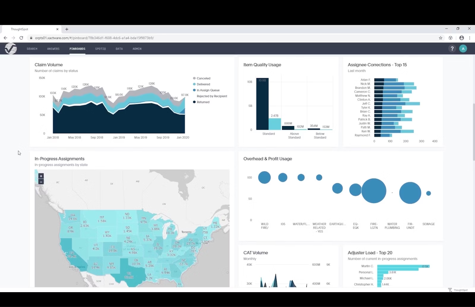
1. Verisk's dynamic data exploration
With ThoughtSpot's embedded analytics, Verisk, a global risk analytics firm, transformed its application–Verisk Xactware. By incorporating interactive maps, Verisk Xactware now provides customers with seamless self-service access to insurance data, empowering claims professionals to identify errors, track progress, and benchmark performance.
This integration eliminated manual report creation, reducing wait times and boosting developer productivity by 40%. The introduction of interactive maps not only streamlined workflows but also significantly improved the user experience (UX) of Verisk Xactware. The intuitive interface enhances engagement, contributing to increased profitability for Verisk, where user interaction directly impacts the bottom line.
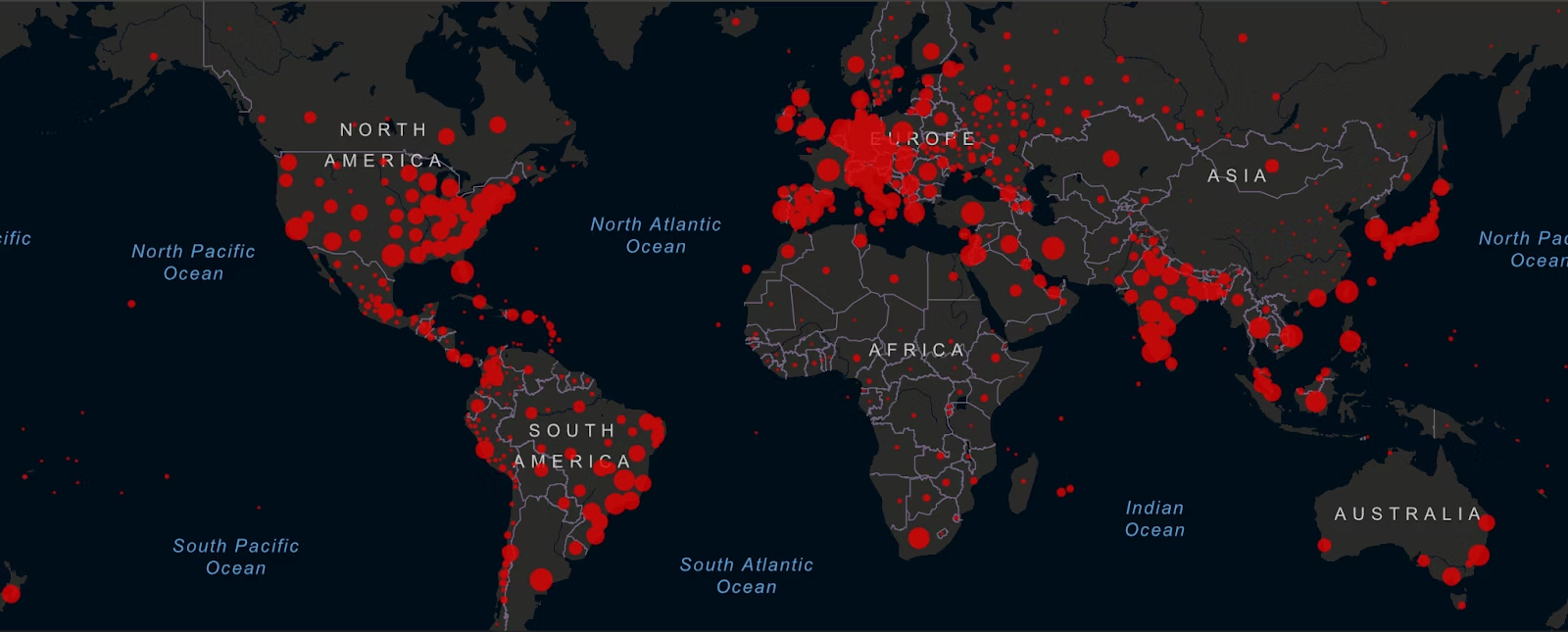
2. Johns Hopkins COVID-19 dashboard
The Johns Hopkins COVID-19 dashboard is widely used to track and visualize the global impact of the COVID-19 pandemic. This example of interactive map data visualization displays real-time data on confirmed cases, deaths, and recoveries at the global and country levels. You can drill down to specific regions and observe trends over time, making it a valuable resource for public health officials, researchers, and the general public.
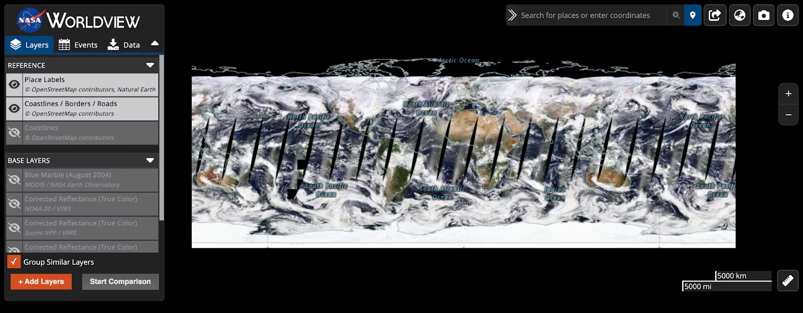
3. NASA worldview
NASA worldview provides an immersive experience for exploring satellite imagery of Earth. You can view near real-time data on climate, weather patterns, and environmental changes. This interactive map allows researchers, scientists, and the public to monitor events such as wildfires, hurricanes, and deforestation, providing valuable insights into the Earth's dynamic systems.
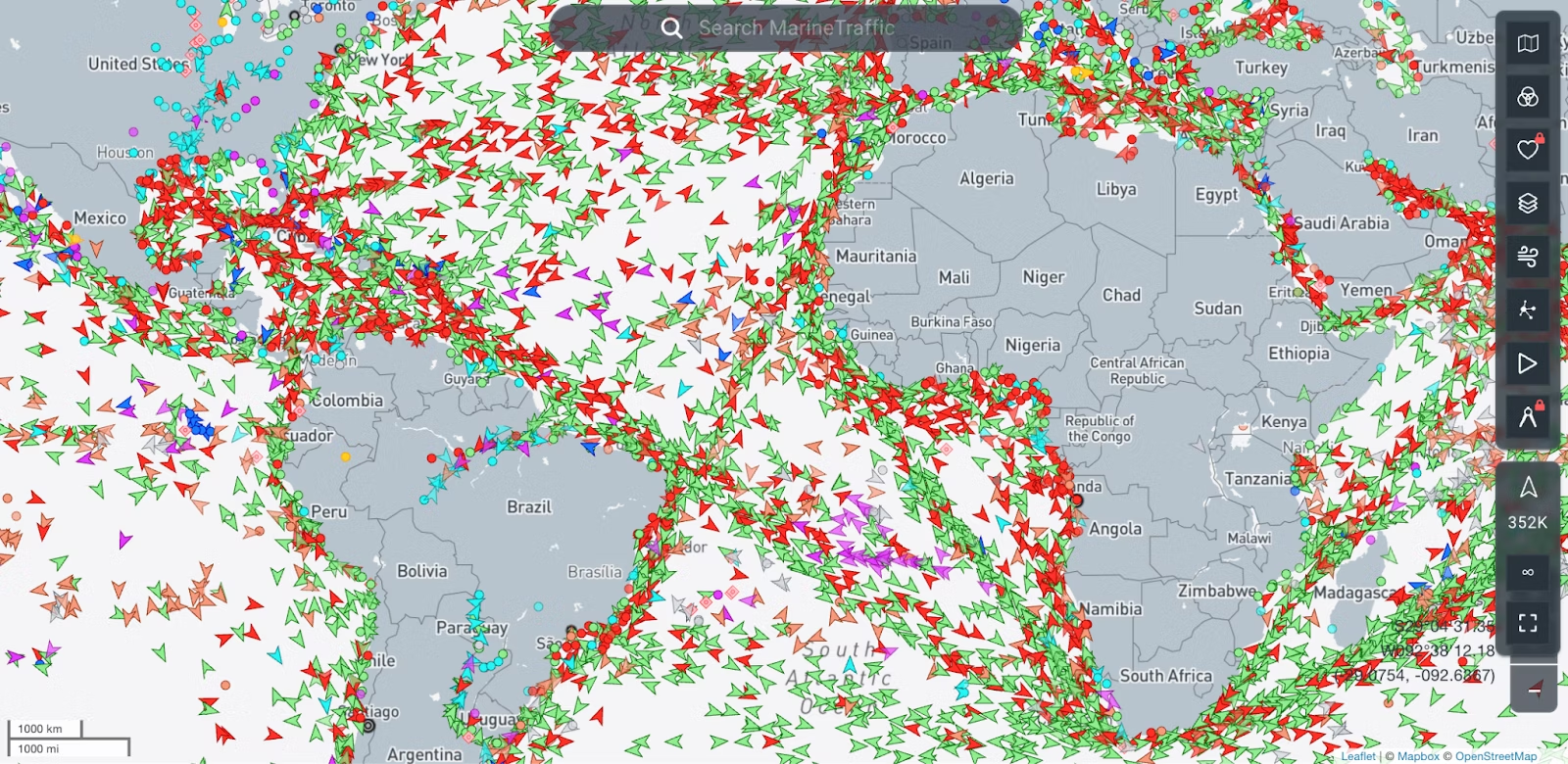
4. MarineTraffic
MarineTraffic offers an interactive map displaying real-time information about ship movements and vessel positions around the world. It's valuable for tracking marine traffic, monitoring shipping routes, and enhancing maritime safety.
5. AirVisual Earth
AirVisual Earth provides a real-time global air quality map. You can explore air pollution levels, monitor particulate matter concentrations, and understand the impact of air quality on health.
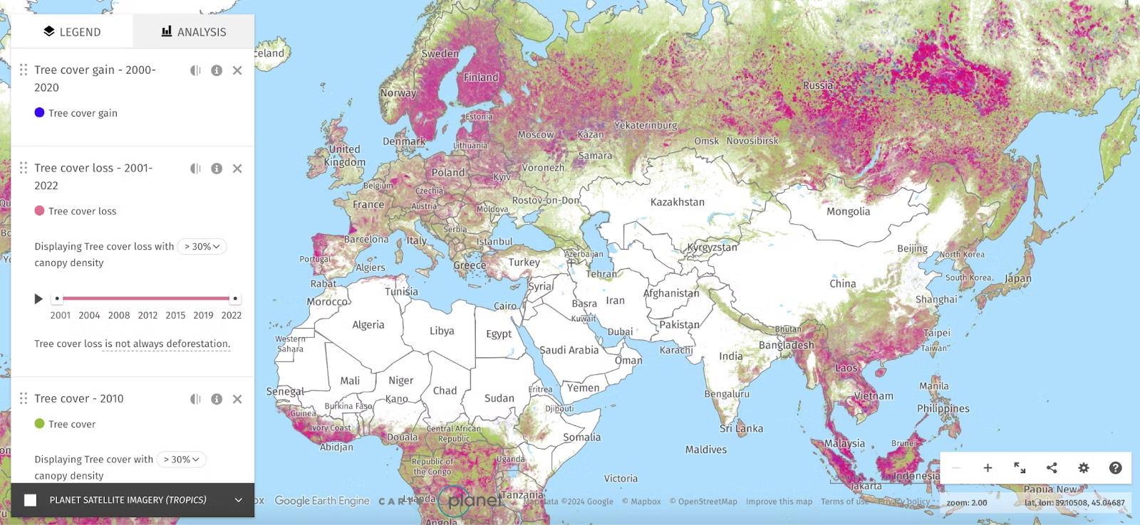
6. Global Forest Watch
Global Forest Watch uses interactive map data visualization to monitor and visualize deforestation and forest degradation globally. By integrating satellite data, you can explore real-time and historical trends, identify areas at risk, and track conservation efforts. This tool is crucial for environmentalists, policymakers, and researchers working to address deforestation and protect global forest ecosystems.
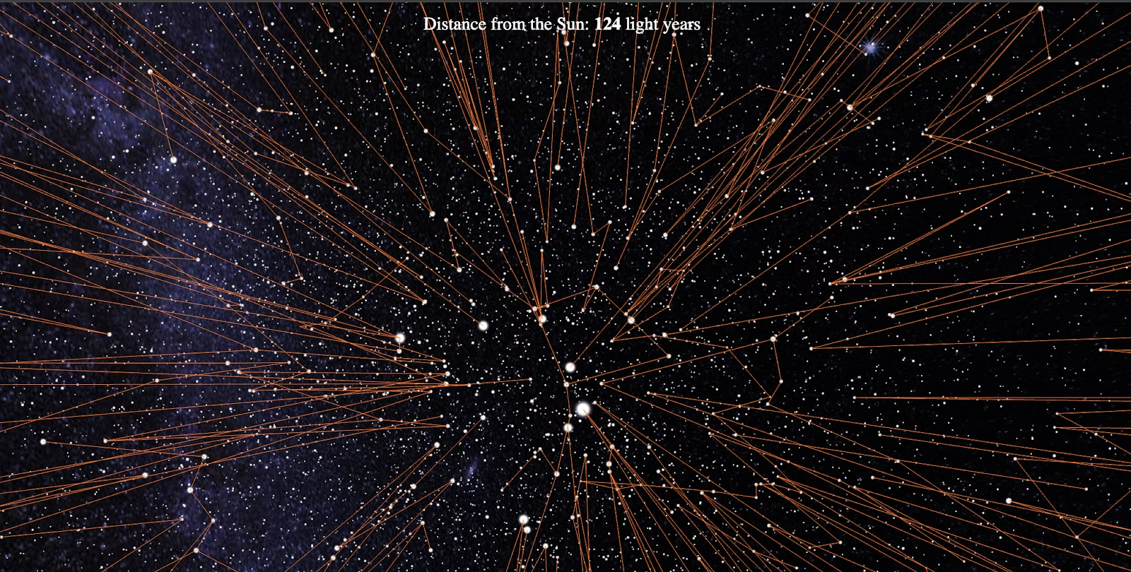
7. Star Mapper
Start Mapper presents a captivating representation of data sourced from the European Space Agency’s Hipparcos catalog, featuring 59,921 stars. By panning across the map, you can navigate the night sky. The visualization is divided into five sections, each altering the displayed data and visual presentation based on distinct scientific values. Exploration of the starry map is facilitated through dragging and scrolling, with filters allowing the toggling of star names or constellations.
8. NOAA's climate explorer
The National Oceanic and Atmospheric Administration's climate explorer offers interactive map data visualization to visualize climate data, including temperature and precipitation trends, helping researchers and policymakers understand climate patterns.
9. Global incident map
The Global incident map displays real-time incidents and events around the world, including natural disasters, crime, and other emergencies. It's a comprehensive tool for monitoring global events.
10. Google Earth Engine Timelapse
Google Earth Engine Timelapse is an interactive map that allows you to explore the changes in the Earth's surface over the past several decades. It combines satellite imagery to show the dynamic transformations of landscapes, urban areas, and ecosystems over time. You can select locations around the world and observe the impact of human activities, climate change, and natural phenomena through a visually compelling timelapse.
Interactive map data visualization is an invaluable tool for unlocking the full potential of your data. Having a modern data analytics solution like ThoughtSpot makes that process easier.
Try it for yourself—see how ThoughtSpot revolutionizes your interactions with data. Sign up for a free trial today.


