


Your data isn’t slowing down, and neither are the demands on your team. You’re expected to move quickly, make smart decisions, and communicate insights clearly. That’s where data visualization tools come in.
Instead of sifting through endless rows of numbers, you can turn your data into charts, dashboards, and visuals that actually tell a story. It’s no wonder the data visualization market is projected to hit $19.20 billion by 2027, growing at a 10.2% annual rate, according to Fortune Business Insights.
The challenge? There are too many tools to choose from. Some promise simplicity, others claim enterprise power, but it’s tough to compare them side by side.
In this guide, we’ll walk you through the real benefits of data visualization tools, what features to prioritize, and how to evaluate the top options available.
Table of contents:
ThoughtSpot stands out with its agent-powered analytics and data visualization platform. Instead of relying on static dashboards, ThoughtSpot Spotter brings real-time insights directly into the tools your team already uses, like Salesforce and Slack. It's all about making your data work for you, with visualizations that help you quickly spot trends and patterns.
And the best part? We’ve made sure that ThoughtSpot is easy to use for both data analysts and business users alike. Whether you're exploring data or making decisions, the experience is designed to be intuitive and accessible for everyone.
Core features
Generative AI with Spotter: Your built-in AI Analyst combines LLMs with ThoughtSpot’s relational search to deliver instant insights. Ask anything, follow up for deeper analysis, and get real-time alerts without writing complex queries.
AI-Augmented dashboards: Static reports are a thing of the past. These interactive dashboards update instantly, letting you track KPIs, drill into data, and find meaningful insights without waiting on manual updates.
Embedded analytics: With ThoughtSpot Embedded, bring ThoughtSpot’s visualizations directly into the tools and apps your team already uses, from Salesforce to ServiceNow. Put insights where decisions happen.
Data integration: You can bring data from various sources into a single dashboard. This provides a holistic view of your data by connecting to databases, spreadsheets, cloud data sources, and even third-party databases.
Advanced analytics features: Features like ‘Change Analysis’ and ‘AI Highlights’ use advanced algorithms to identify important trends and anomalies, giving you a comprehensive view of your business in real-time.
Automated alerts: Stay informed with automated alerts on key KPIs through ThoughtSpot Monitor, ensuring you’re always up-to-date with important metrics.
Best for
Businesses that need real-time, AI-powered data visualizations to make fast, informed decisions. Ideal for teams looking for an intuitive, scalable tool that provides rich, interactive dashboards with minimal reliance on the data team.
Pros of ThoughtSpot
Ask questions in natural language and get instant, AI-driven data visualizations.
Reduces dependency on data teams by allowing users to create and explore their own visualizations.
Seamlessly integrates with cloud data platforms for a unified, efficient data experience.
Real-time updates ensure your data visualizations are always current, helping teams stay agile.
Cons of ThoughtSpot
Advanced features, such as custom data modeling and complex visualizations, may require some training to master.
Regular updates introduce new features, which may require some adjustment time.
G2 rating: 4.4/ 5
Pricing
14-day free trial
Essentials: $1,250 /month (20 users)
Pro: Custom
Enterprise: Custom
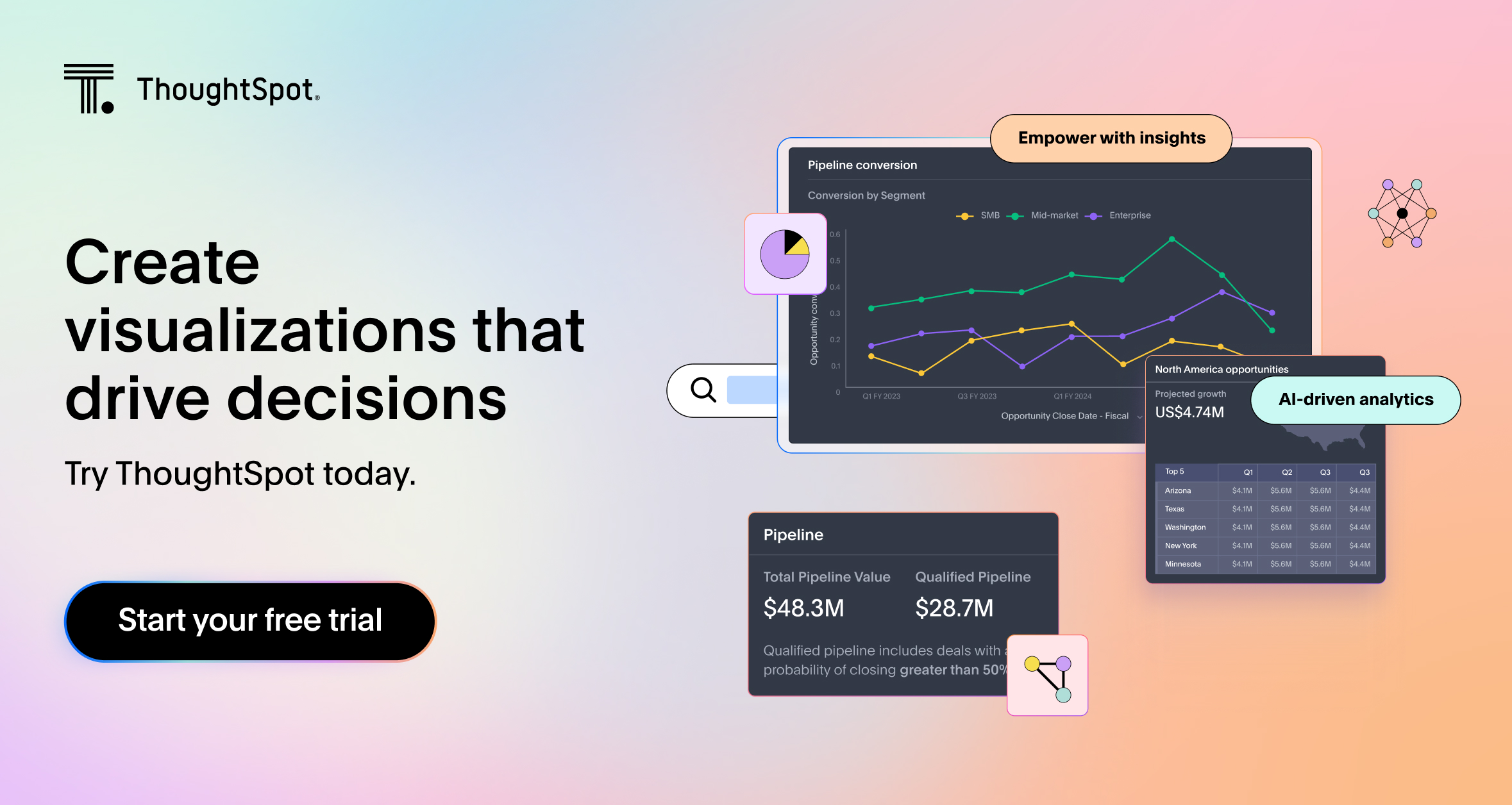
Tableau serves as a platform for business intelligence, data analytics, and data infrastructure. Tableau allows you to connect to data sources and craft dashboards that present visual representations of raw data. However, large datasets can often appear cryptic to individuals who lack a background in development or computer science.
Core features
Data connection and import: Connect to various data sources like databases, spreadsheets, and cloud services
Data visualization: Create visualizations including bar charts, line charts, scatter plots, and maps
Dashboard creation: Merge multiple visualizations into dashboards
Data blending: Combine data from different sources for unified analysis
Pros:
Customizable visualizations.
Strong community and support ecosystem.
Cons:
Steep learning curve for beginners.
Can be expensive for smaller teams.
Limited real-time data handling compared to some competitors.
G2 rating: 4.4/ 5
Pricing
14-day free trial
Tableau Creator: $75 per user/month
Tableau Explorer: $42 per user/month
Tableau Viewer: $15 per user/month
💡Relevant read: Top Tableau competitors and alternatives to consider
Developed by Microsoft, Power BI is a data visualization tool that integrates with other Microsoft products. It offers a range of visualization options, from basic charts to advanced visuals, and provides data modeling capabilities. Power BI is often used in organizations that rely on Microsoft's ecosystem. Despite its intuitive interface, Power BI has a steep learning curve, and you would need analytical skills to harness its full potential.
Core features
Create dashboards and reports: Create dashboards and reports with a drag-and-drop interface
Visualizations: Use standard visuals like charts and maps, or create custom ones with Power BI’s SDK
Change analysis: Analyze and explain changes in data values within the visualization
Data modeling: Shape, clean, and define data relationships, and create measures with Power Query, Power Pivot, and DAX
Pros:
Affordable pricing with good integration with Microsoft tools.
Easy to use, especially for Excel users.
Cons:
Limited customization options compared to Tableau.
Performance issues with large datasets.
Lacks some advanced analytics features out of the box.
G2 rating: 4.5/ 5
Pricing
30-day free trial
Free account
Power BI Pro: $10 per user/month
Power BI Premium: $20 per user/month
Power BI Embedded: Pricing varies
💡Relevant read: 10 Power BI alternatives and competitors to consider
Coupler.io is a no-code data analytics and reporting platform that offers 800+ integrations to collect, transform, and visualize data. It’s built for teams looking to create real-time dashboards using tools they already work with, like Looker Studio, Power BI, or other data visualization platforms. Its strength lies in automation, allowing users to schedule data refreshes and build unified reports from multiple sources without writing code. Over 100 pre-built and automated reporting dashboard examples from Coupler.io’s gallery will help you get started.
Core features
Data transformation tools: Clean and structure data before visualizing
Auto-refreshing dashboards: Schedule data updates up to every 15 minutes
Multi-source blending: Combine datasets from various platforms and accounts
Template library: Use pre-built or custom dashboards for different business functions
Pros:
Beginner-friendly and doesn’t require coding skills
Excellent for automating repetitive reporting tasks
Human-supported onboarding
Cons:
Steeper learning curve for complex workflows despite a user-friendly interface
Limited out-of-the-box integrations
Basic support across all plans, with limited training resources for advanced users
G2 rating: 4.8/ 5
Pricing
Have a free plan
Personal: $24/month
Professional: $99/month
Team: $199/month
Business: $499/month
Sisense is an analytics platform that enables you and your team to extract data from multiple sources and generate insights. Sisense is known for its embedded analytical capabilities, which includes open-source integration and access to RestAPI. However, reviews have reported extensive training is needed for installation and set up and the complexity of setting up data cubes. It may take a longer time to become proficient in using the platform and making the most of its capabilities.
Core features
Data integration: Connect to databases, cloud services, and spreadsheets to consolidate data
Data modeling: Transform, clean, and model data, define relationships, and create calculated fields
Data visualization: Create charts, graphs, and dashboards to display data
Ad-hoc analysis: Explore data and create reports and visualizations with minimal technical skills
Pros:
Customizable and flexible for advanced users.
Good for large datasets and big data environments.
Cons:
UI/UX can feel clunky
Expensive for smaller businesses
Complex setup and integration
G2 rating: 4.2/ 5
Pricing
30-day free trial
Custom pricing
Domo is a data visualization solution that analyzes data and shares insights for decision-making. It helps you get answers to questions, make predictions, and perform what-if scenarios. Domo offers support to all personas. While the platform was previously built for analysts, it now offers functionalities and support to both designers and developers.
Core features
Visualizations: Use different charts and custom maps for data visualization and dashboard creation.
Customizable dashboards: Create and adjust dashboards and reports with a low-code tool, including layout changes, annotations, and filters
AI model management: Deploy models from Domo or external sources like OpenAI and Hugging Face
Data modeling: Use a drag-and-drop interface to set up data models from various sources
Pros:
Easy-to-use and visually appealing dashboards
Integration capabilities with a wide range of data sources
Cons:
Can get expensive as the user base grows
Limited customization compared to competitors
Some features require advanced technical knowledge
G2 rating: 4.3/ 5
Pricing
30-day free trial
Custom pricing
Google’s Looker is a unified self-service analytics platform that allows business users to create dashboards and reports from various data sources, build embedded applications, and streamline workflows with real-time insights. Looker allows integrations with open-source solutions through Google Cloud Platform. Consequently, its data processing capabilities can be augmented with Vertex AI, AutoML, and BigQuery ML.
Core features
Self-service data visualizations: Create data models, metrics, dashboards, and reports using LookML
Ad-hoc reporting: Connect to Looker’s semantic model for data analysis and reporting, including anomaly detection
Real-time view of your data: Access real-time insights from the cloud and apply filters to data
Pros:
Integration with Google Cloud and other data sources
Good for data modeling and exploration at scale
Cons:
Can be expensive for smaller teams
Learning curve for non-technical users
Less intuitive than some alternatives
G2 rating: 4.4/ 5
Pricing
30-day free trial
Custom platform and user pricing
💡Relevant read: Looker vs Tableau.
Zoho Analytics helps you in data preparation, data visualization, and exploration. The analytics solution helps you track key performance metrics, identify outliers, make future predictions, and discover hidden insights. Infused with AI technology, Zoho Analytics offers a set of pre-built templates.
Core features
Data integration: Import data from spreadsheets, cloud databases, and online applications
Data preparation: Transform data, merge datasets, perform calculations, and create custom metrics
Data visualization: Use templates for charts, graphs, pivot tables, and dashboards, and create reports with a low-code interface
Augmented analytics: Access insights and recommendations using AI, ML, and NLP, and perform predictive analysis
Pros:
Affordable and great for small to medium-sized businesses
Easy-to-use interface with good integration options
Cons:
Limited customization and advanced features
Lacks real-time data capabilities
Can struggle with larger datasets
G2 rating: 4.3/ 5
Pricing
15-day free trial
Basic - $24/month for 2 users
Standard - $48/month for 5 users
Premium - $115/month for 15 users
Enterprise - $455/month for 50 users
Custom quotes are also available
Yellowfin is a business intelligence and data visualization platform that supports creating and managing dashboards and reports. It allows users to customize visualizations and share insights across teams. The tool integrates with various data sources, offering flexibility in data analysis. Yellowfin also includes collaborative features to facilitate teamwork and discussion around data.
Core features
Automated insights: Provides actionable insights with minimal manual intervention
Collaboration: Enables sharing of reports and visualizations with team members
Data visualization: Offers various options for creating interactive visualizations
Mobile support: Allows access to dashboards on mobile devices
Reporting: Facilitates detailed and customizable report creation
Pros:
Storytelling and data collaboration features
Flexible deployment options (cloud, on-premise, or hybrid)
Cons:
User interface could be more intuitive
Performance issues with large datasets
Expensive for smaller organizations
G2 rating: 4.3/ 5
Pricing
30-day free trial
Custom pricing
Strategy provides a platform for enterprise analytics with a focus on handling large datasets and delivering interactive dashboards. It supports advanced analytics functions, such as predictive modeling and data mining. The platform integrates with numerous data sources and offers mobile access for on-the-go data analysis. Strategy is geared towards large organizations needing robust data analysis tools.
Core features
Advanced analytics: Supports in-depth data analysis and complex calculations
Customizable dashboards: Allows for tailored dashboards to specific requirements
Security features: Includes measures for data protection and user access control
Mobile access: Optimizes dashboards for mobile devices
Data integration: Connects with multiple data sources for a unified view
Pros:
Good for large-scale enterprise implementations
Advanced analytics and mobile BI capabilities
Cons:
Expensive, especially for small businesses
Can be difficult to set up and use without IT support
User interface can feel outdated
G2 rating: 4.2/ 5
Pricing
Custom pricing
💡Relevant read: 5 MicroStrategy competitors for AI-powered insights
Metabase is an open-source business intelligence solution known for its user-friendly interface. It allows users to create visualizations and dashboards with minimal technical expertise. Metabase supports querying data from various sources and provides features for sharing insights within teams. It is particularly useful for smaller organizations or teams looking for a cost-effective data analysis solution.
Core features
Easy interface: Provides a drag-and-drop interface for creating visualizations
Open-source: Allows for customization and extension with community support
Query builder: User-friendly query builder for non-technical users
Embedding: Supports embedding of visualizations into other applications
Pros:
Open-source with easy setup and user-friendly interface
Good for quick insights and basic visualizations
Cons:
Limited customization and advanced features
Can struggle with large datasets
Less support for enterprise-level needs
G2 Rating: 4.4/ 5
Pricing
Open Source - Free
Starter - $ 85 /month (first 5 users) + $ 5/ month per user
Pro - $ 500 /month (first 10 users) + $ 10/ month per user
Enterprise - Custom pricing
AWS QuickSight is a cloud-based business intelligence service that enables users to build interactive dashboards and visualizations. It integrates with AWS services for seamless data exploration and reporting. QuickSight includes features for real-time data analysis and machine learning insights. It is designed for scalable use and supports natural language querying.
Core features
Scalable visualizations: Handles large data volumes efficiently
Cloud integration: Integrates with AWS services like S3 and Redshift
Interactive dashboards: Enables creation of dashboards with real-time updates
Machine learning insights: Incorporates ML models for advanced analytics
Pros:
Integrates with AWS data services
Scalable and cost-effective for AWS users
Cons:
Limited customization compared to other tools
User interface is not as intuitive as some competitors
May require AWS expertise for optimal use
G2 Rating: 4.3/ 5
Pricing
Author (connect to data, create dashboards and reports, and share content with other users)
Author - $24 per user/month
Author Pro - $50 per user/month
Reader (can explore interactive dashboards, receive email reports, and download data)
Reader - $3 per user/month
Reader Pro - $20 per user/month
SAP BusinessObjects is a business intelligence suite that provides tools for data visualization, reporting, and analysis. It supports creating interactive dashboards and integrating with multiple data sources. The data visualization software is suited for enterprise-level deployments and offers extensive data governance capabilities. It is designed for organizations with complex data environments.
Core features
Reporting tools: Provides capabilities for creating and customizing reports
Data integration: Connects with SAP and other data sources
Data exploration: Offers tools for detailed data analysis
Security and governance: Includes features for data protection and user access management
Pros:
Good for large enterprises
Strong data governance and security features
Cons:
Expensive, especially for smaller businesses
Complex setup and configuration
Can be difficult for non-technical users to learn
G2 Rating: 3.8/ 5
Pricing
Custom pricing
When trying to tell a data story, visualizations are a great tool to simplify the communication of data. Whether presenting to colleagues, clients, or stakeholders, visual representations make it easier to tell a story and engage with your audience. Here are some key advantages:
Enhanced understanding: Because we humans are visual creatures, we process visual information much faster than text or numbers. Charts, graphs, and maps allow you to grasp patterns, trends, and relationships at a glance.
Better decision-making: Visualizations enable you to quickly identify insights and trends, leading to more informed and data-driven decisions. By visualizing data, you can easily spot outliers, correlations, and anomalies that may impact your decision-making process.
Deeper data exploration: Interactive features in data visualization tools allow for in-depth exploration. You can filter, drill down, and adjust visualizations in real-time to uncover detailed insights.
Clear communication: Visualizations simplify the presentation of complex data, making it easier to convey insights to diverse audiences. This ensures that your data story is both compelling and understandable.
Efficiency gains: Automating the visualization process saves time and resources. With user-friendly interfaces and pre-built templates, you can create polished, professional visuals quickly and efficiently.
Selecting the right data visualization tool from the multitude available can be overwhelming. To make an informed decision, consider these key factors:
Ease of use: Opt for a data visualization tool with intuitive interfaces and user-friendly features that require minimal technical expertise. The tool should facilitate the creation of visualizations quickly and effortlessly, reducing the need for extensive training or coding skills.
Data connectivity: Ensure the data visualization solution you choose supports connections to various data sources, such as databases, spreadsheets, and cloud services. Effective data integration is crucial for thorough analysis and accurate visual representation.
Visualization options: Evaluate the range of visualization types the tool offers. A diverse selection of charts, graphs, and maps will help you present different data sets and analyses effectively.
Interactivity and customization: Look for a data visualization platform that provides interactive features, allowing you to explore data in-depth and customize visualizations. Capabilities such as drilling down, applying filters, and modifying visual elements can enhance data exploration and storytelling.
Collaboration features: If teamwork is a factor, choose a data visualization tool with strong collaboration capabilities. Features like real-time sharing, commenting, and versioning support efficient teamwork and streamline the feedback process.
By assessing these factors and matching them with your specific needs, you can select a data visualization platform that optimally supports your data analysis and communication goals.
To fully leverage the power of data visualization, it is crucial to integrate these tools into your workflow seamlessly. Here are some steps to consider:
Identify your data sources: Determine the sources of data that you want to visualize. This may include databases, spreadsheets, cloud services, or APIs. Ensure that the chosen tool supports connectivity with these sources.
Clean and prepare your data: Before visualizing the data, ensure that it is clean, accurate, and relevant. Perform necessary data cleaning steps, transformation, and aggregation to obtain meaningful insights.
Choose the appropriate visualization: Select the right visualization technique to represent the data effectively. Consider the type of data, the relationships you want to highlight, and the goals of your visualization.
Create interactive dashboards: Build interactive dashboards or reports that allow users to explore the data and derive insights on their own. Enable filters, drill-downs, and other interactive features to enhance user experience.
Automate data refresh: If your data is constantly changing, set up automated data refreshes to ensure that the visualizations are always up to date. This will save you time and effort in manually updating the visualizations.
Data visualization tools help you streamline your data analysis process and make data-driven decision-making a seamless part of your organizational culture.
Effective data visualization isn’t just about pretty charts, it’s how modern data teams make smarter decisions, move faster, and stay ahead of the competition. Choosing the right tool can mean the difference between reactive reporting and proactive strategy. You need a platform that balances performance, flexibility, and clarity, especially as data volumes and complexity grow.
That’s where ThoughtSpot shines. With AI-Augmented Dashboards, intuitive natural language search, and real-time insights, it’s built for teams that want to do more with their data, without waiting on dashboards or digging through spreadsheets.
Bring your data to life with interactive visuals—book your demo today!


