


Most businesses say customer satisfaction matters. But if you look at where they invest? It's clear many still treat it like a nice-to-have.
The truth: a good customer experience directly impacts your bottom line. McKinsey found that improving CX can boost revenue by 2-7%. And one of the fastest ways to act on customer data? A dashboarding tool.
Modern dashboard goes far beyond pretty charts. It helps you:
Track performance in real time
Spot hidden trends
Personalize customer journeys
Tell a clearer, more actionable data story
Make data-driven decisions that actually move the needle
The challenge? There are dozens of dashboard tools out there, each promising more insights than the last. So, which one actually fits your business?
This guide breaks down the top 13 dashboard software platforms in 2026, what they’re best at, key features, and how to choose the right one for your team.
Table of contents:
- 13 best dashboard software to use in 2026
- ThoughtSpot
- Tableau
- Power BI
- Qlik Sense
- AWS QuickSight
- Whatagraph
- Domo
- IBM Cognos Analytics
- Looker
- Yellowfin
- Oracle Analytics Cloud
- Polymer
- Zoho Analytics
- What to look for in data dashboard software?
- What are the mistakes to avoid with dashboard software?
- Bring your data to life with interactive dashboards
Before diving into the rest, we’d be remiss if we didn’t talk about the best data dashboard software in 2026. While we may seem a bit biased, we assure you that our customers and even Gartner MQ 2025 for Analytics and BI think it too.
ThoughtSpot’s Liveboards offer dozens of interactive data visualizations to help users gain personalized, real-time insights to curate powerful data stories. And with Spotter, as your AI Analyst, users can ask complex questions about their data and gain instant visualizations.
Look at what Bill Lynch, Sr. Director of Data Science & Analytics at NeuroFlow, a leading software company dedicated to improving mental health outcomes, has to say about ThoughtSpot’s self-serve visualization capabilities:
“We needed a tool that was personalized and fostered data literacy. We knew ThoughtSpot would allow us to make business users partners and co-create alongside the data team.”
Core features:
AI-powered search: Spotter lets anyone ask questions about their data and gain instant insights and visualizations.
Real-time data visualizations: Liveboards offer a real-time view of what’s happening in your business, allowing you to easily identify trends, patterns, and anomalies.
Personalized visualizations: Select, pin, rearrange, and share charts and tables with drag-and-drop ease to create compelling data stories with Liveboards. You can also add notes, text summaries, or highlight specific data points for better clarity.
Seamless connectivity: Easy integration with multiple cloud data sources and databases allows you to stay on top of all your KPIs changes.
Augmented analytics: Features like SpotIQ and ‘AI Highlights’ leverage advanced machine learning algorithms to give you deeper insights into specific business problems.
Analyst Studio: Seamlessly move between ad-hoc analysis and data modeling to gain greater insights from your data with Analyst Studio.
Mobile accessibility: Gain insights on the go with ThoughtSpot Mobile. You can track KPIs on your Liveboards and even share insights with your team, no matter where you are.
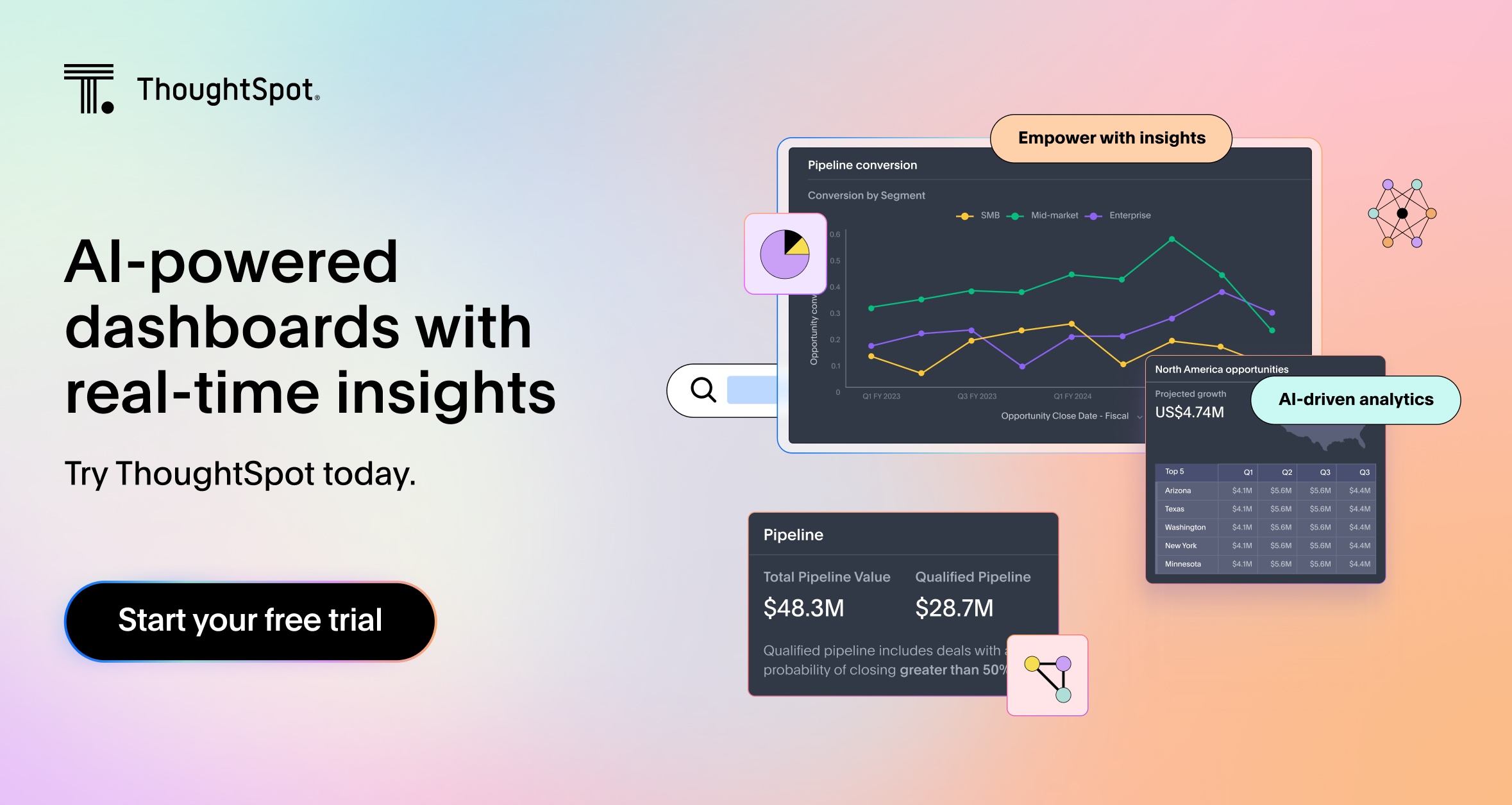
Tableau is a dashboarding software best known for offering a vast library of pixel-perfect data visualizations. Its core mission is expressed as "Helping people see and understand data." It has been a favorite tool among technical users as it helps them extract data from various sources, prep it, and visualize it. However, for business users with limited technical expertise, navigating through the platform and creating visualizations is practically impossible.
Core features:
Advanced visualization: Create complex charts, graphs, tables, and dashboards with drag-and-drop functionality
Tableau’s Ask Data: Engage with data using the ‘Ask Data’ feature that allows users to ask questions in natural language and receive answers in the form of automatic data visualizations
Connects multiple data sources: Connect to various data sources like databases, spreadsheets, and cloud services
Predictive analytics: Build predictive models and identify trends with advanced modeling techniques
💡Must-read: Top Tableau competitors and alternatives to consider

Power BI is Microsoft’s AI-powered data analytics platform that lets users interact with data with engaging dashboards and reports. The scalable platform centralizes data in a secure hub, allowing you to explore charts, tables, and graphs to uncover hidden insights and create a better context for business users. Power BI extracts data from multiple sources, including Excel spreadsheets, SQL databases, and Microsoft's cloud platform Azure.
Core features:
Drag-and-drop interface: Create dashboards and reports using a drag-and-drop graphical interface
Interactive visualization: Use filters, parameters, and dimensions to discover specific data points or areas of interest
Predictive analytics: Analyze data and build predictive analytics models to anticipate future outcomes for your business
Integration with Microsoft product suite: Combine data from multiple sources, including the Microsoft product suite for better analysis
💡Must read: 10 Power BI alternatives and competitors to consider
Qlik Sense is one of the best dashboard softwares that lets users perform complex calculations and build dashboards to help users understand data more effectively. This low-code dashboard software connects data from cloud warehouses and other sources to create a single source of truth. With AI assistance, users can prep data and build and share dashboards that enable intelligent decisions across organizations.
Core features:
A wide variety of visualizations: Refine your dashboards with various visualization options
AI assistance for data preparation: Clean, enrich, and transform datasets with AI-powered features
Advanced analytics: Ask questions, use AutoML, and build predictive data models
Real-time data monitoring: Access real-time insights and quickly respond to emerging patterns in data
AWS QuickSight is Amazon’s business intelligence platform that helps users in data preparation, exploration, and building dashboards and paginated reports. QuickSight has a serverless architecture with AI capabilities that allows users to ask natural language queries and get relevant suggestions.
Core features:
Data preparation and management: Connect to diverse data sources, cleanse and transform data, define relationships, and create calculated fields
Intuitive interface: Create charts, graphs, and dashboards using a user-friendly, drag-and-drop interface
QuickSight Q: Ask data-related questions in natural language and gain automated visualizations and insights
Paginated reports: Build, schedule, and share multi-page reports like invoices, statements, and operational summaries
Whatagraph is an all-in-one marketing dashboard and reporting software built for marketing agencies that need to centralize, analyze, and share multi-source data fast. Designed with ease-of-use in mind, you can blend metrics, visualize cross-channel performance, and create white-labeled dashboards even if you don’t have any technical experience. You can also easily create internal monitoring dashboards for your team and track marketing KPIs in real-time.
Core features:
Multi-source data integration: Connect to 55+ channels across advertising, social, SEO, CRM, eCommerce, and analytics platforms. Or bring in offline data using Google Sheets, CSV, or BigQuery
Data transformation: Build custom metrics and dimensions, create data blends across channels (e.g., total ad spend), and apply formulas without leaving the platform
Customizable dashboard builder: Create custom dashboards using drag-and-drop widgets. Visualize metrics with tables, graphs, scorecards, pie charts, and more
AI summaries and insights: Use the built-in AI chatbot to ask performance questions, or generate summaries that explain key insights automatically
Domo makes data analytics accessible for everyone with interactive, customizable dashboards. The platform boasts AI models such as ChatGPT and Bard, allowing users to get fast answers to complex questions, create automated alerts, and make future predictions. Through live analysis, you can get actionable insights that help you gain a real-time view of your operations.
Core features:
Real-time dashboards: Use different charts and custom maps for dashboard creation and bring real-time KPIs to life
Connectivity with multiple data sources: Import data from spreadsheets, cloud databases, and online applications
AI data modeling: Deploy models on a serverless architect or integrate them with existing machine learning (ML) infrastructures
Easy report sharing: Distribute dashboards and reports via email, links, or through Domo’s mobile app
Cognos Analytics is IBM’s dashboard tool for reporting, analytics, and data visualization. The platform features a drag-and-drop interface with natural language processing for dashboard creation. Users can build ML models, receive automated insights, and leverage GenAI features to uncover hidden relationships in data.
Core features:
Dashboard creation: Users can drag and drop data elements to build interactive dashboards that display key metrics and insights.
AI assistant: Use natural language processing to build charts and dashboards and share information
Data preparation: Clean and prep data from multiple sources, add calculated fields, join data, and create new tables
Forecasting: Incorporates ML models for predictive analytics
Looker is a modern data platform focused on delivering reliable, governed dashboards across an organization. Built with a semantic modeling layer (LookML), it allows teams to define metrics centrally and reuse them across dashboards. While it requires some technical setup, it’s highly customizable and scalable, making it a popular choice for data teams working within the Google Cloud ecosystem.
Core features:
LookML modeling: Define metrics and business logic in a central model layer for consistency across reports
Exploration & drill-downs: Users can explore data, drill into specifics, and create custom views without writing SQL
Google Cloud integration: Native compatibility with BigQuery and other Google Cloud services
Data governance: Maintain control over metric definitions, access permissions, and versioning
API access & embedding: Extend Looker with APIs or embed dashboards into apps and internal tools
Yellowfin is a dashboard reporting software that supports creating and managing dashboards and reports. Its user-centric approach is where Yellowfin excels in but sometimes falls short, relying more on traditional dashboard-based reporting. The workflow controls, machine learning algorithms, and drag-and-drop interface enable users to streamline tasks and make data-driven decisions.
Core features:
Data discovery: Query large datasets using subqueries, advanced functions, linked filters, and more
Automated insights: Gain automated insights and visualizations from data
Custom dashboards: Personalize visualizations to monitor KPIs and track performance metrics
Collaboration: Share insights, comment on reports, and collaborate with other teams in real-time
Oracle Analytics Cloud is a business intelligence suite with a drag-and-drop interface that allows users to create interactive dashboards to gain insights. The platform integrates with multiple data sources, allowing you a high-level view of critical KPIs. However, navigating Oracle Analytics Cloud can be difficult for business users as the platform is designed for organizations with complex data environments.
Core features:
Customization tools: Provides capabilities for creating and customizing dashboards and reports
Data integration: Connects with Oracle cloud suite and other data sources
Data exploration: Offers tools for detailed data analysis
Machine Learning insights: Incorporates ML models for advanced data analysis
Polymer is another business dashboard software that helps users and data teams combine data from different sources and explore it using dashboards, visualizations, and filters. With Polymer, users can build custom dashboards and reports, get AI-assisted answers, add notes, and share insights with users across the organization.
Core features:
Custom dashboards: Create and refine dashboards and reports
AI-assisted answers: Uncover insights, auto-generate dashboards, and perform ad-hoc analysis
Connectivity with multiple databases: Integrates with multiple cloud warehouses and databases
Data modeling: Supports in-depth data analysis and advanced data modeling
Zoho Analytics is a self-service BI and dashboard software designed to help businesses visualize their data with minimal technical overhead. It offers an intuitive drag-and-drop interface, AI-powered assistant, and hundreds of pre-built connectors to make data preparation and dashboard creation fast and simple. While not as advanced as some enterprise platforms, it’s a solid choice for SMBs and teams looking for affordable, functional dashboarding.
Core features:
AI assistant (Zia): Ask questions in natural language and get AI-generated visualizations and reports
Pre-built connectors: Connect to over 250 data sources including CRM, marketing, finance, and cloud storage platforms
Collaboration: Share dashboards, set access controls, and add comments directly in reports
Data blending & modeling: Combine data from different sources and create complex metrics or calculated fields
Embedded analytics: Integrate dashboards into websites, apps, or portals
1. Intuitive interface
One of the reasons why business users are still obsessed with dashboards is that they can be built quickly, without requiring any technical expertise. Choose a dashboard software with a drag-and-drop interface that is easy to navigate and has pre-built templates to help your team instantaneously spin up real-time visualizations. An intuitive interface boosts user engagement and empowers everyone to explore and understand data, leading to deeper insights.
2. Customization
The best dashboard tools adapt to your business, not the other way around. Prioritize platforms that offer flexible layouts and multiple visualization options. This allows users to highlight key metrics, spot trends or anomalies, and tailor dashboards to different teams or use cases.
3. Integration
Real-time decisions rely on real-time data. Choose a BI solution that connects seamlessly to your data sources, whether that’s spreadsheets, cloud warehouses, or third-party platforms. The easier it is to bring all your data into one place, the more complete your view will be. This helps you search for relevant information to build interactive dashboards and stay on top of trends.
For example, ThoughtSpot’s native integrations with Google Sheets and Excel let users analyze live data without needing manual exports or ETL.
4. Performance
Slow dashboards kill momentum. If your team has to wait for queries to load or visualizations to render, they’ll lose patience and valuable insights. This is especially frustrating during ad-hoc analysis, when quick answers are critical. Choose a tool that can handle large datasets without lag and scale as your needs grow. A high-performance dashboard keeps your workflows moving and supports more advanced analysis when you’re ready to go deeper.
5. Mobile accessibility
Dashboards shouldn’t be confined to your desktop. Mobile access allows users to monitor KPIs, track performance, and share insights, anytime, anywhere. Whether you're in a meeting or on the move, having data at your fingertips helps teams stay informed and act quickly. Prioritize tools with responsive mobile apps or browser-friendly layouts that don’t sacrifice usability.
1. Trying to show everything at once
More charts are not equal to more insight. Crowded dashboards make it hard to focus and even harder to act. If users need a legend to interpret every chart, you’ve probably gone too far.
2. Designing for the data team, not the business user
A dashboard should speak your user’s language, not SQL. If your sales team needs a walkthrough just to find their pipeline, it’s not working.
3. Ignoring performance
If your dashboard takes 30 seconds to load, most people won’t bother. Slow queries, bloated data models, or inefficient joins can kill adoption fast.
4. Choosing metrics without clear goals
Vanity metrics are easy to track but hard to act on. Good dashboards focus on metrics tied to decisions: What do you want someone to do when they see this number?
5. Treating dashboards as “set and forget”
Business priorities change. Your dashboards should, too. Revisit them regularly to retire stale metrics, add new ones, and adjust to new goals.
While it can be challenging for a business to keep pace with customer expectations, it also opens up many ways to develop long-term relationships with them. Having the right dashboard software can help you reduce the time it takes to realize value from data and create engaging touchpoints that drive business value.
Don’t leave your data sitting in a lifeless dashboard—book our demo to understand how you can leverage our AI-powered dashboards to gain instant insights into your operations.
1. What is a dashboarding tool?
A dashboarding tool is an information management system that tracks, analyzes, and visualizes KPIs and critical data points of an organization's performance. They are designed to help users quickly assess and analyze complex information in a visually appealing and interactive way.
2. Which dashboard software is best?
According to the 2025 Gartner MQ for Analytics and BI Platforms, ThoughtSpot shines as the best dashboarding software. With its powerful AI-powered features and an unwavering commitment to customer success, ThoughtSpot empowers users to interact and engage with data in ways that were never possible before.
3. What is digital dashboard software?
A digital dashboard software transforms raw data into interactive visuals. It features an intuitive interface for designing digital dashboards that offer a clear, at-a-glance overview of your organization’s performance. This software enables you to track and analyze key metrics, data points, and performance indicators in a consolidated, easy-to-understand format.
4. Do any of these dashboard software solutions offer AI/ML capabilities?
Yes, many modern dashboard tools now include AI and machine learning features to help surface patterns, automate insights, and support predictive analytics. These capabilities can highlight anomalies, suggest next best actions, or forecast trends, giving users a deeper understanding of their data without having to manually dig for it.
Platforms like ThoughtSpot, for example, offer natural language search powered by AI, so users can ask questions and get instant answers, no SQL required.
5. Do dashboard software offer DIY and build-your-own integrations with third-party applications?
Some dashboard tools provide out-of-the-box connectors for popular platforms, while others go a step further with DIY integration options. These let you connect to niche tools, custom apps, or internal databases using APIs or no-code connectors. This flexibility is especially useful when you want your dashboards to reflect data from all corners of your business without waiting on IT. Look for solutions that support custom connectors or embed capabilities to fit seamlessly into your workflows.


