


Driving growth is one of the biggest priorities for business leaders. In fact, research by Gartner shows that 37% of business leaders expect to increase revenue by 10% or more. Hitting these aggressive targets requires a holistic, real-time view of your company’s data.
With today’s modern BI tools, you can connect data from various sources and build interactive BI reporting to monitor critical KPIs and find hidden trends and insights. But first, you need to understand the basics of interactive dashboard reporting. Let’s dig in.
Table of contents:
Dashboard reporting is a data visualization tool that allows users to track business performance, visualize data, and explore insights through a single, cohesive interface. The interactive and visual nature boosts user engagement and breaks down complex information into easily digestible insights, enabling effective communication.
By connecting your data to modern business intelligence tools like ThoughtSpot, you can create interactive dashboards, as we call them Liveboards, that can help you create and share data stories, apply drill-downs and filters to explore specific data points, and discover AI-generated answers to answer the ‘why’ faster.
1. Contextual data visualizations
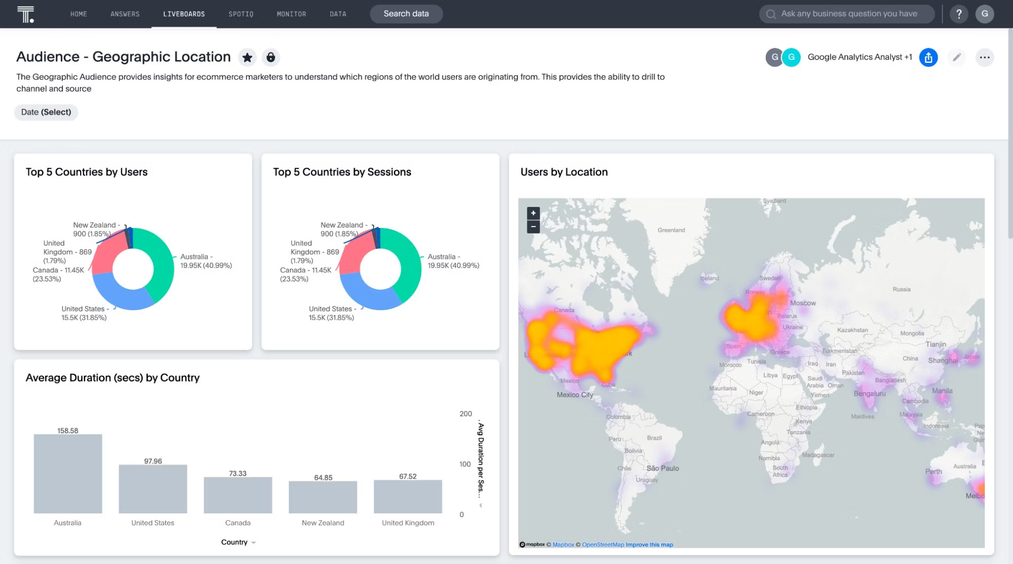
How we consume information makes a significant impact on our perception. With dashboard reporting, everyone can create interactive data visualizations like charts, graphs, and tables to identify critical indicators. This helps you understand trends and patterns, detect outliers, and explore new growth avenues. Whether you want to review the top sales KPIs or analyze customer interactions across digital channels, data visualizations add context to your findings, helping you act faster.
This is exactly how Frontify achieved a 99% improvement rate in extracting data insights and further deep dives. With ThoughtSpot’s intuitive interface, business users created their own Liveboards—within minutes, without any back and forth with analysts. This helped them detect areas of improvement and enable data-driven decision-making organization-wide.
Here’s what Kevin Ailloud, Senior Director at Frontify, has to say about ThoughtSpot:
“It’s a super tool for us to be able to visualize our data, KPIs, our overall funnel, and make smarter decisions.”
2. Customizable interface
Legacy dashboards adopt a one-size-fits-all approach. But today’s data leaders have flexible analytical needs and demands. For instance, a demand gen manager may want to dig deep into a KPI dashboard on business performance, while a CMO needs up-to-date ROI access for ongoing marketing campaigns. Essentially, your team needs an analytical tool that can cater to personalized data demands.
And this is what dashboard reporting is all about. You can customize the interface to include the data that matters and incorporate interactive elements to make data discovery engaging and intuitive.
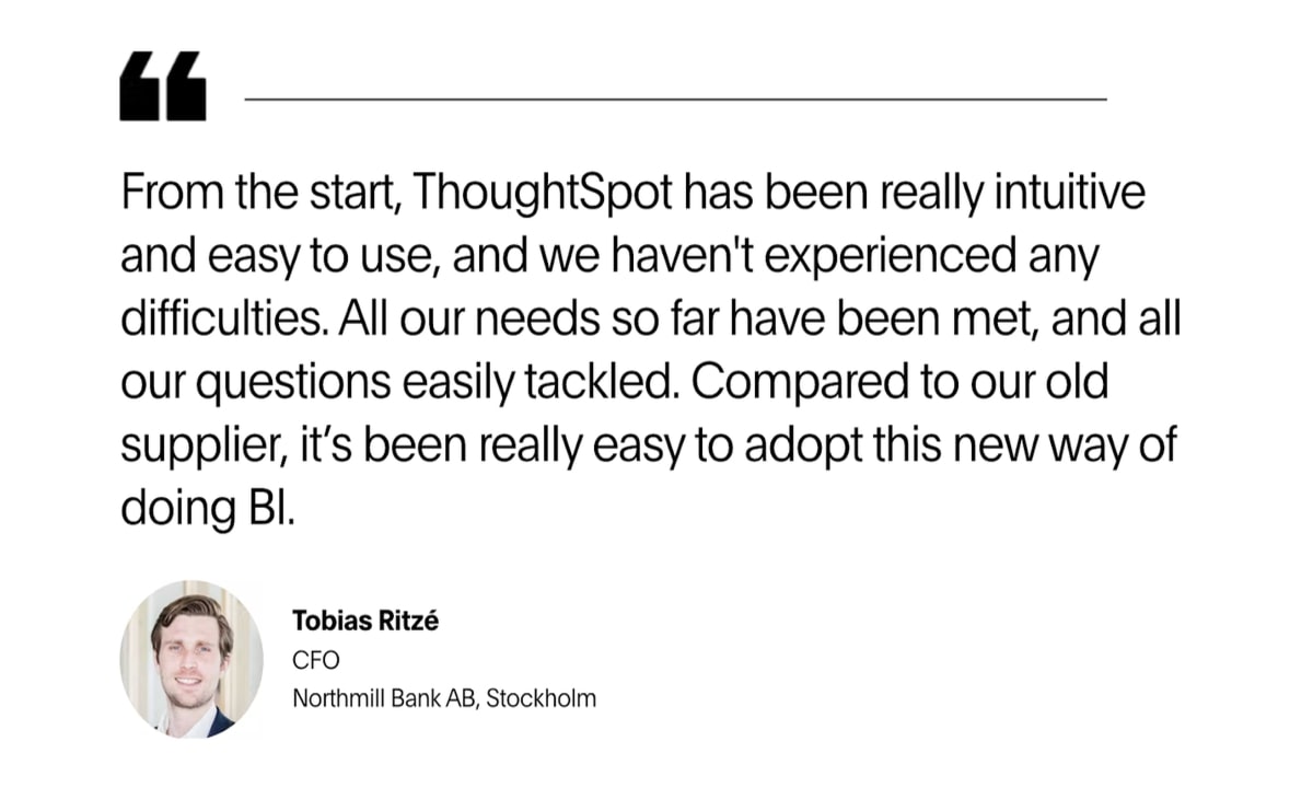
Here’s a real-world example of how users at Northmill leverage ThoughtSpot’s customizable Liveboards to empower business users to find hidden insights:
3. Real-time collaboration
The key from going data-driven to value-driven is real-time collaboration. When teams collaborate easily, they can accelerate the decision-making process by providing instant feedback and iterating. This tight partnership reduces delays and miscommunications. Dashboard reporting tools offer a unique set of collaboration features that allow users to leave comments, track changes made by others, and share insights. For instance, ThoughtSpot’s Liveboards allow you to add notes to help the team gain context about your visualizations and findings.
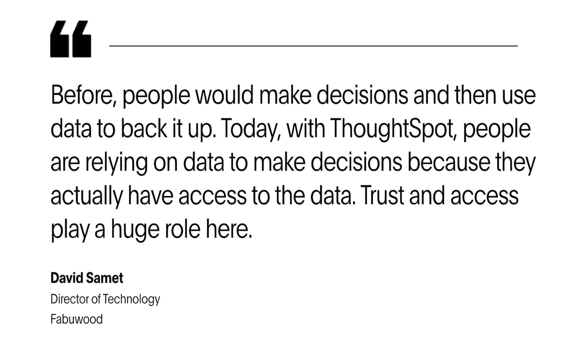
This was the case for Fabuwood. With ThoughtSpot’s AI-powered Liveboards, business users are accessing insights from a single source of truth. All that data measured up to a 300% increase in queries when compared to their legacy BI solution—that led to more efficient business decisions.
4. Faster data exploration
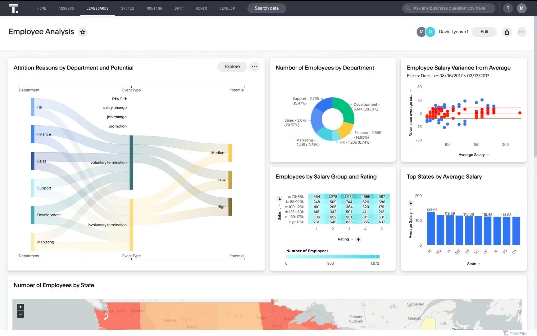
Dashboard reporting isn’t limited to creating visualizations—that’s just half the story. It’s also about going deeper and understanding the ’how’ and ‘why’ of things. With interactive elements like filters, drill-downs, and customizable widgets, you can do a granular analysis of specific data points and gain actionable insights to drive your strategy forward.
That’s how Wellthy was able to save over $200k with ThoughtSpot. Utilizing the user-friendly interface allows users to visualize real-time data, slice and dice into specific searches, and pin charts to custom Liveboards. This infusion of data into everyday decision-making allows the company to boost efficiency and save costs.
Hear it from Kelly Burdine, Director of Science and Analytics at Wellthy, about how the company is leveraging ThoughtSpot to gain a competitive advantage:
Dashboard reporting use cases vary by industry, each tailored to specific business objectives. At its core, the context matters. To help you get started, we’ve listed some of the most common types of dashboard reports:
1. Analytical dashboard reporting
Analytical dashboard reporting offers a surface-level view of crucial metrics. You can monitor the real-time performance of KPIs, perform statistical analysis, and identify areas of improvement. Users typically use analytical dashboards for:
Comparative analysis
Trend analysis
Scenario planning
2. Operational dashboard reporting
Operational dashboard reporting provides real-time insights into day-to-day business activities. With interactive visualizations, you gain a comprehensive understanding of operational business performance to support faster, smarter decisions. Here are a few things that operational dashboards often include:
Up-to-date inventory report
Daily production report
Total sales by date and region
3. Strategic dashboard reporting
Strategic dashboard reporting provides a high-level overview of KPIs that align directly with the organization's strategic objectives. This type of interactive reporting aids you in long-term planning, performance tracking, and keeping a pulse on the company’s financial health. They include information on:
Competitive analysis
Project performance highlights
Updates on strategic initiatives

Dashboard reporting is versatile and is applicable across various business functions. Let’s review some dashboard reporting examples:
1. Financial dashboard reporting
These reports help you keep tabs on the financial performance of your business. It consolidates and displays financial data that allows for quick and easy analysis by stakeholders, including executives, finance professionals, and other decision-makers. Some common metrics in a financial dashboard report include revenue rate, profit margins, and operating cash flow.
2. Marketing dashboard reporting
The ultimate goal of these reports is to display relevant information about or connected to your company’s marketing efforts. From gauging the performance of ad campaigns to monitoring customer behavior, marketers can view these real-time reports and easily weave data into critical decisions. Typically, marketing dashboard reporting includes metrics such as website visits, conversion rates, and bounce rates.
3. HR dashboard reporting
At the heart of every company is its people. HR dashboard reporting offers a surface-level visualization of metrics that guides you into understanding whether your HR division or team may be falling short or excelling at the set goals. Some of the key metrics in this report include cost per hire, employee turnover, employee productivity, and revenue per employee.
Find hidden growth opportunities with the right dashboard tool
As the competitive landscape evolves, you need to expand your vision and look for growth opportunities. Finding the right data visualization tool is a great first step.
With ThoughtSpot’s self-service analytics, your team can easily connect data from various sources, create visualizations, and explore endless possibilities. Whether you are a start-up or an enterprise, ThoughtSpot’s search-based interface empowers every business user to find value in their data.
See for yourself—Join a live demo today.


