


With all the dashboards, reports, and fancy tools at our fingertips, you’d think making sense of data would be second nature by now. The dream of a data-driven future feels so close, doesn’t it?
But here’s the reality:
For most companies, data visualization still feels like it’s reserved for the experts. Meanwhile, the rest of us are stuck waiting days or even weeks for the insights we need.
It’s time to break that cycle. This hands-on guide will show you how to make data visualization clear, accessible, and actionable, so you can move from insight to action.
Table of contents:
Data visualization is the process of representing data in a graphical format. It helps you spot trends, track KPIs, and discover patterns that move your business forward.
With the right data visualization tools, even the most complex data becomes easy to explore. These tools reveal hidden connections between variables, allowing you to dig deeper and make insights more intuitive and accessible to everyone.
For instance, think about your sales performance. Sure, you might have data showing total revenue and closed deals. But when you visualize it, say with a funnel chart or a heatmap, you can see where deals are getting stuck, which regions are outperforming, and where opportunities might be slipping.
Suddenly, the story behind the numbers becomes clearer.
Data visualization isn’t just about pretty charts. It’s about turning raw data into insights that drive action. And it all starts with three essentials:
KPIs: Every great visualization starts with reliable metrics like your monthly recurring revenue (MRR), website traffic, conversion rates, or inventory levels. These KPIs help you identify red flags, monitor progress, and make decisions in real time.
Visuals: Think bar charts, line graphs, scatter plots, or interactive dashboards—these are the tools that bring your data to life. The right visual highlights patterns, reveals trends, and makes it easy for anyone to see what’s happening.
Story: Data alone doesn’t inspire action: you need a narrative to tie it all together. An engaging data story gives your visuals meaning, helping you connect the dots between what’s happening and why it matters.
Discover hidden opportunities in your data
When you're buried in reports and spreadsheets, it's easy to lose sight of what’s important. Numbers blur together, and critical insights get lost in translation.
Data visualization cuts through the noise, helping you zero in on what matters most:
Real-time visibility: Instead of basing your strategies on hunches, visualization gives you a hands-on view of what’s really happening behind the scenes. You can drill into your data and track changes as they happen, whether it’s sales numbers, customer behavior, or website activity.
Pattern detection: Visualization makes it easy to explore your data, helping you catch anomalies, outliers, and subtle shifts in performance. This gives you a critical head start to intervene before damage is done.
Clearer communication
Real impact happens when data becomes the insight that everyone can understand and act on.
Clear, meaningful visuals make complex information easy to grasp.
Break down silos: Data visualization brings together fragmented data from different sources, turning it into a shared story everyone can understand. Instead of wrestling with disconnected spreadsheets, your team can move forward with clarity and alignment.
Contextual insights: Visualization reveals the ‘why’ behind the ‘what.’ By showing patterns, trends, and relationships, it helps your team move beyond surface-level metrics and understand the underlying factors influencing performance.
A richer, interactive data experience
The earliest data visualizations were simple maps and charts. They were impressive back then, but limited and static.
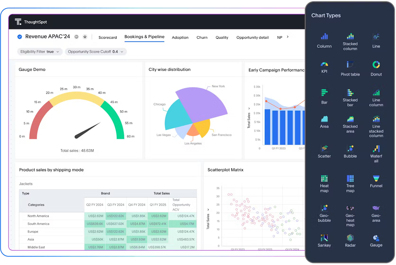
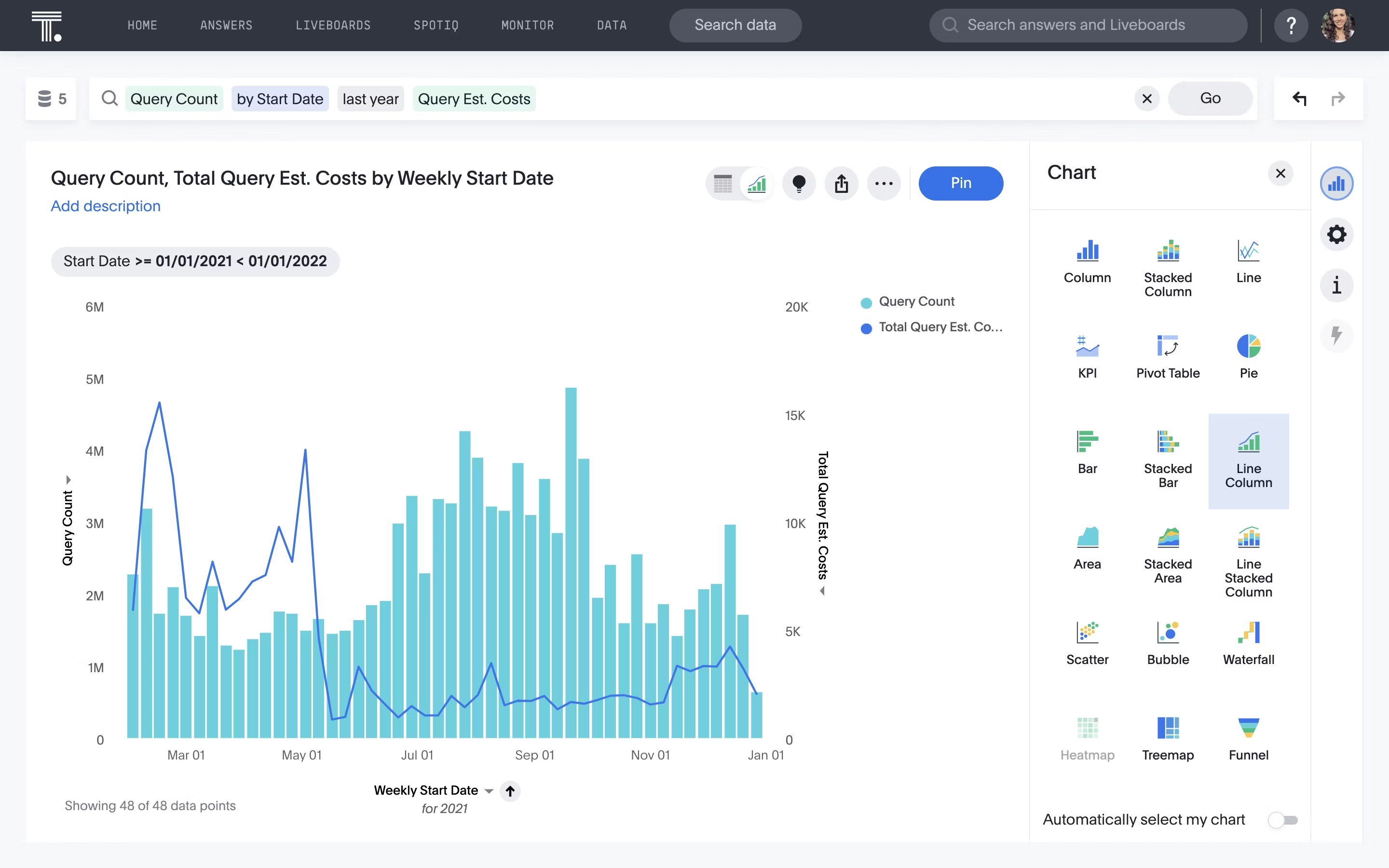
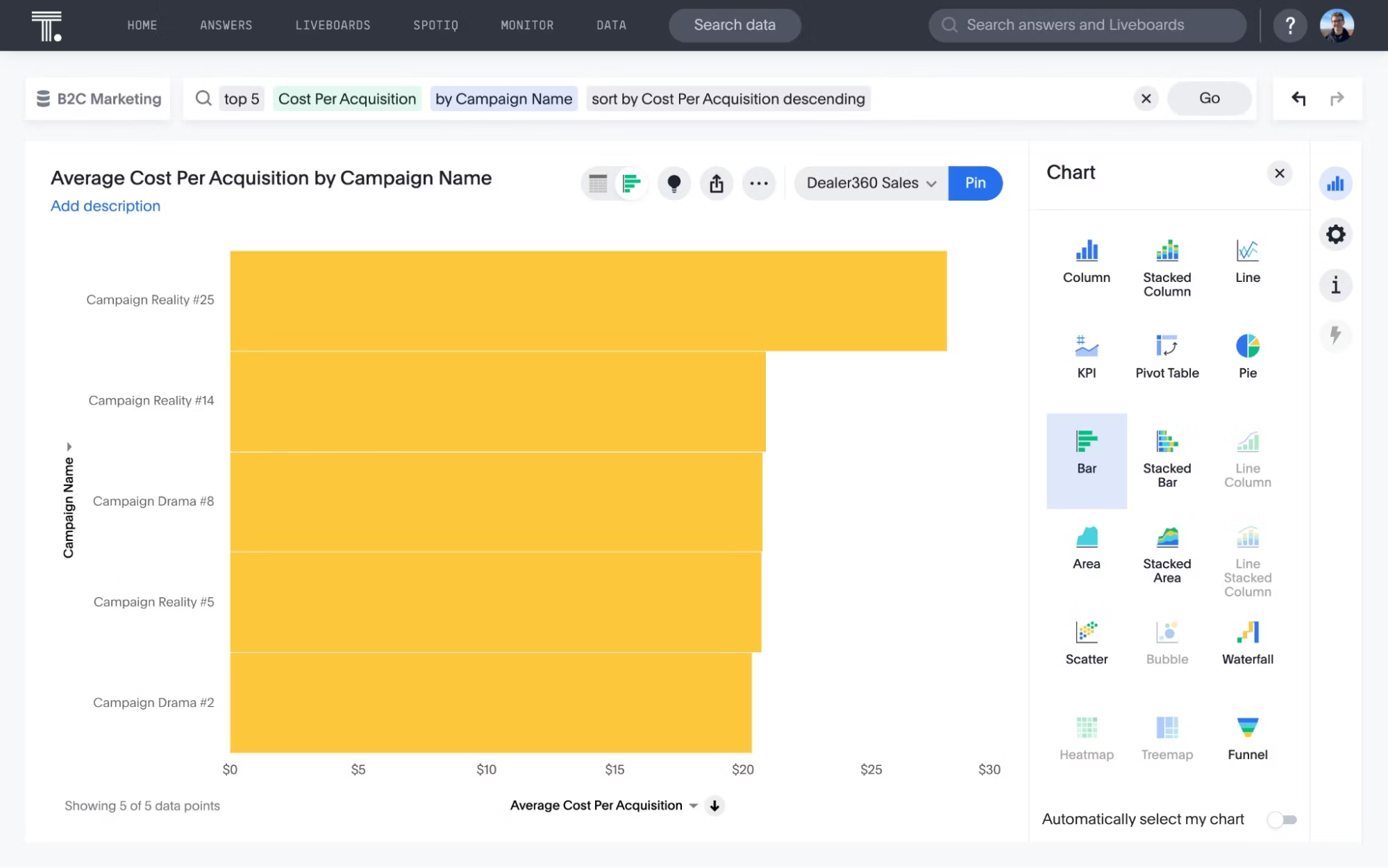
Today, modern BI platforms like ThoughtSpot take data exploration to the next level. With AI-augmented dashboards, you get a real-time, interactive view of your data.
Customizable dashboards: Build tailored views that highlight the KPIs and metrics that matter most to your role, so you see exactly what you need, when you need it.
Interactive features: With just a few clicks, you can drill down into data, apply filters, and explore trends and patterns in real time. This hands-on experience empowers your team to act immediately.
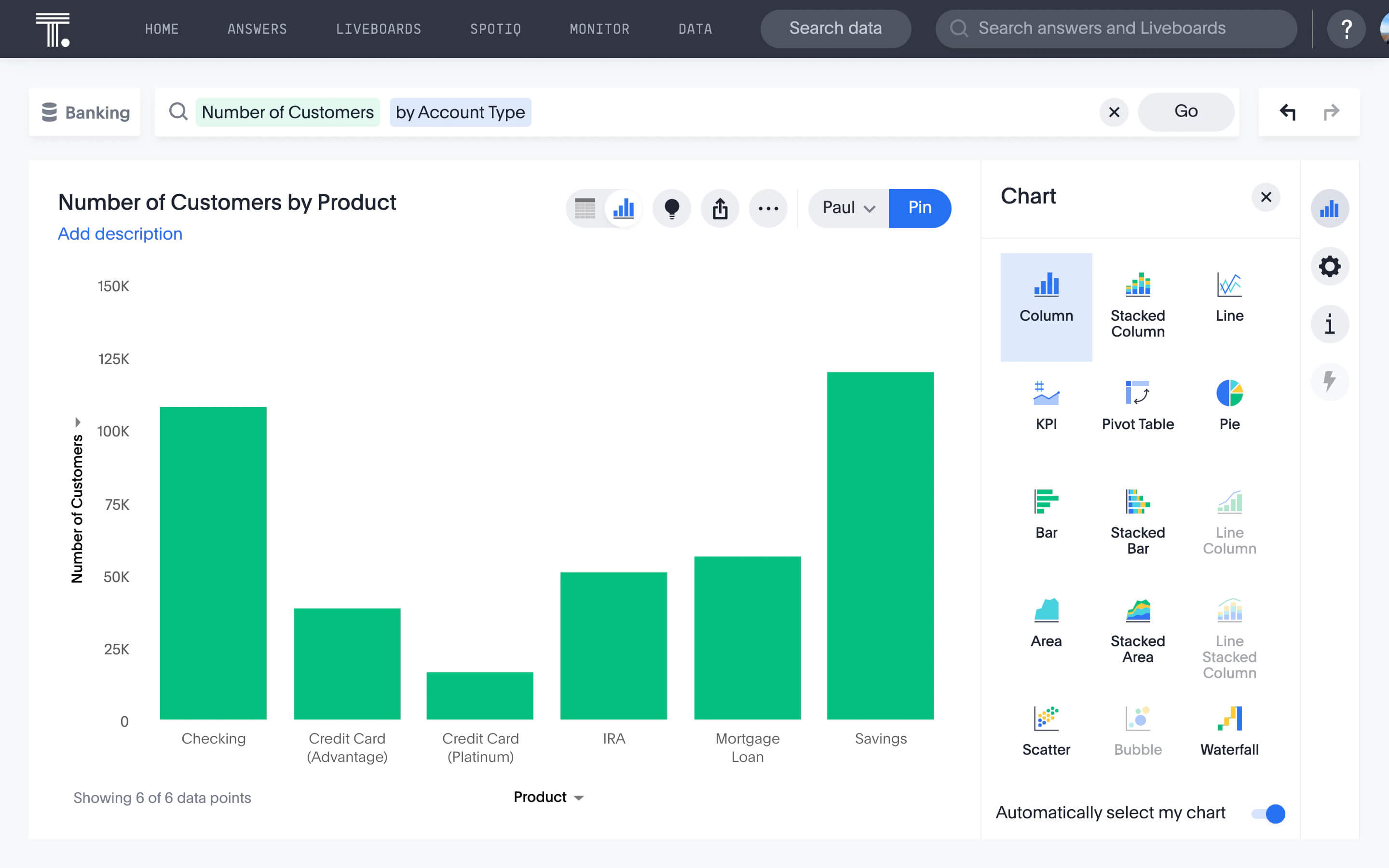
Not all charts are created equal. The type of visualization you use can completely change how your audience interprets the data. Whether you're tracking performance, comparing regions, or revealing trends, picking the right format helps you clearly communicate your findings to your audience.
Line charts
A line chart connects distinct data points through straight lines.
Ideal for showing performance changes over time, like tracking monthly revenue or website visits. They make it easy to spot upward or downward trends at a glance.
Bar charts
Bar charts visually represent data using rectangular bars or columns. Here, the length of each bar corresponds proportionally to its value. You can present these bars horizontally or vertically.
Ideal for side-by-side comparisons, such as sales performance across products, revenue by region, or customer satisfaction levels.
💡 Relevant read: Histogram vs bar graph: Which should you use?
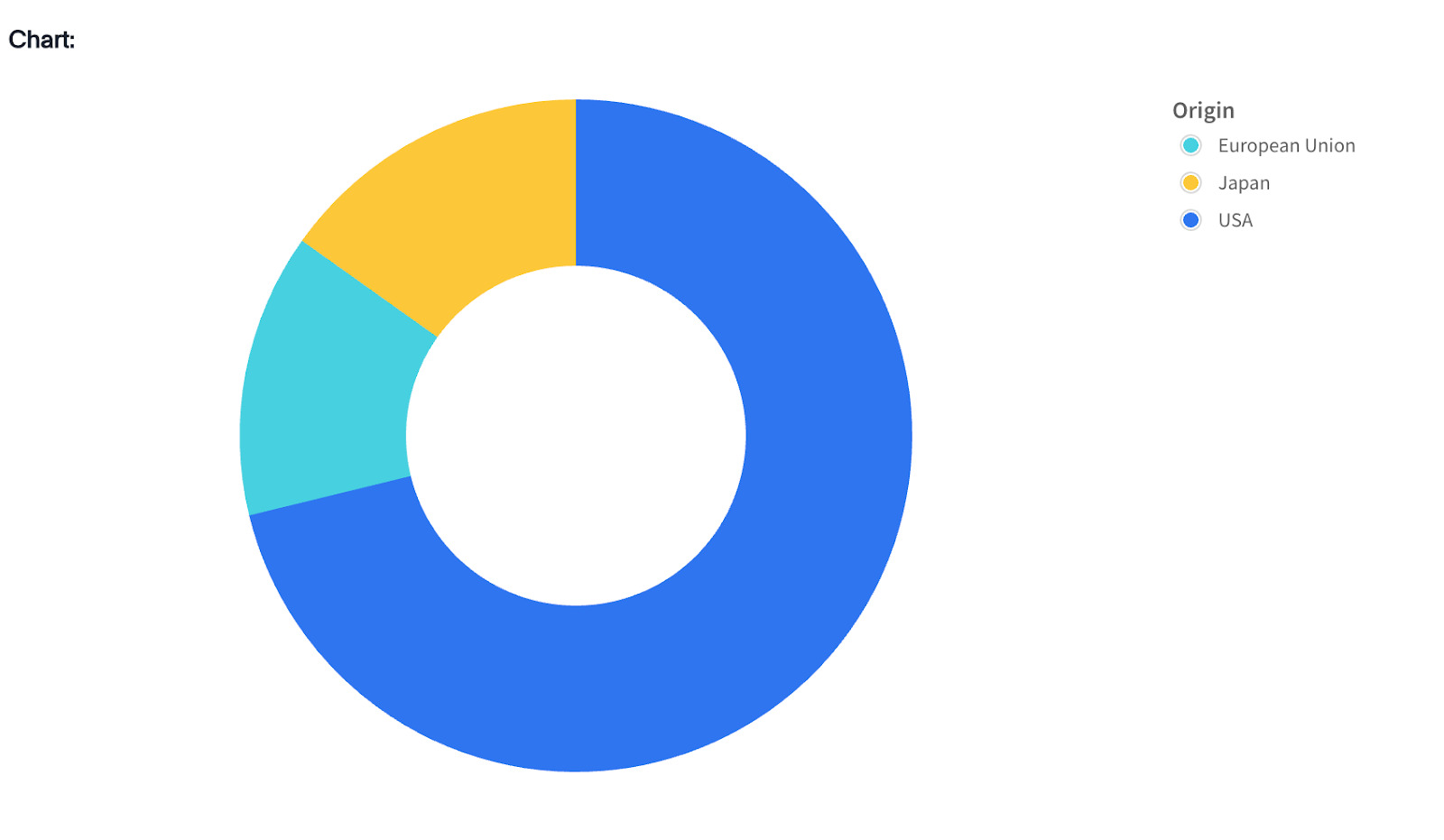
Pie charts
The pie chart is a circular, statistical graphic that divides data into slices.
Useful when you want to show how parts make up a whole, like breaking down market share or resource allocation.
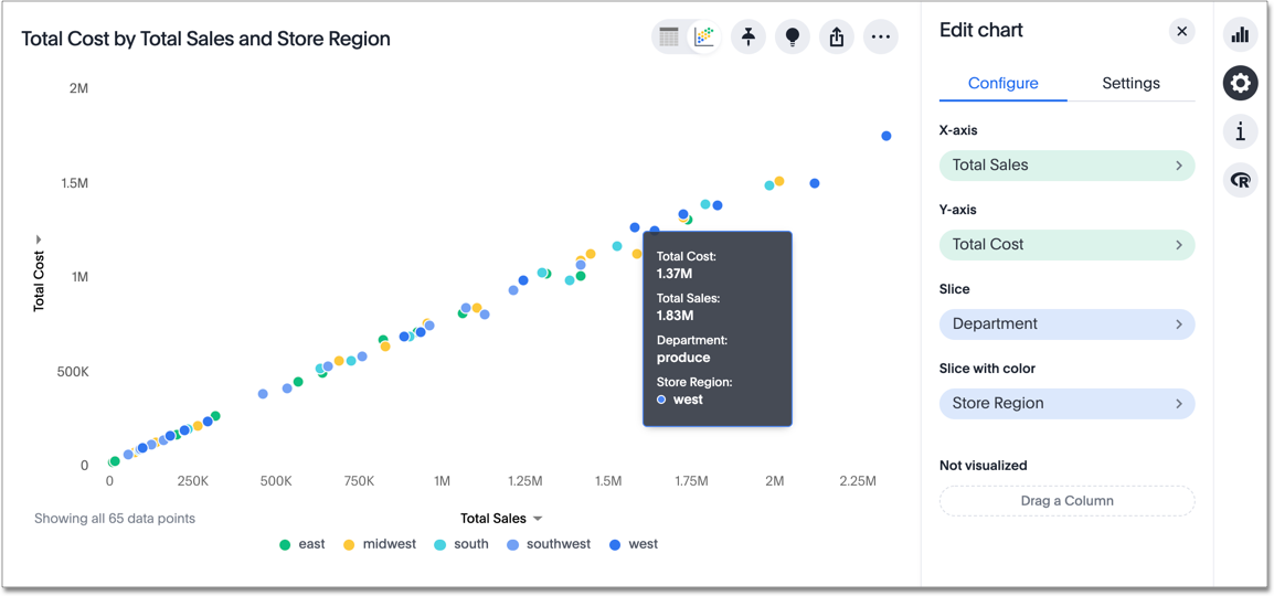
Scatter plot
This chart shows a collection of data points scattered around the graph. Each dot on the chart represents one data point, and where the dot falls tells you how much of each thing it represents.
Perfect for highlighting relationships between two variables, such as price vs. sales volume or marketing spend vs. leads generated.
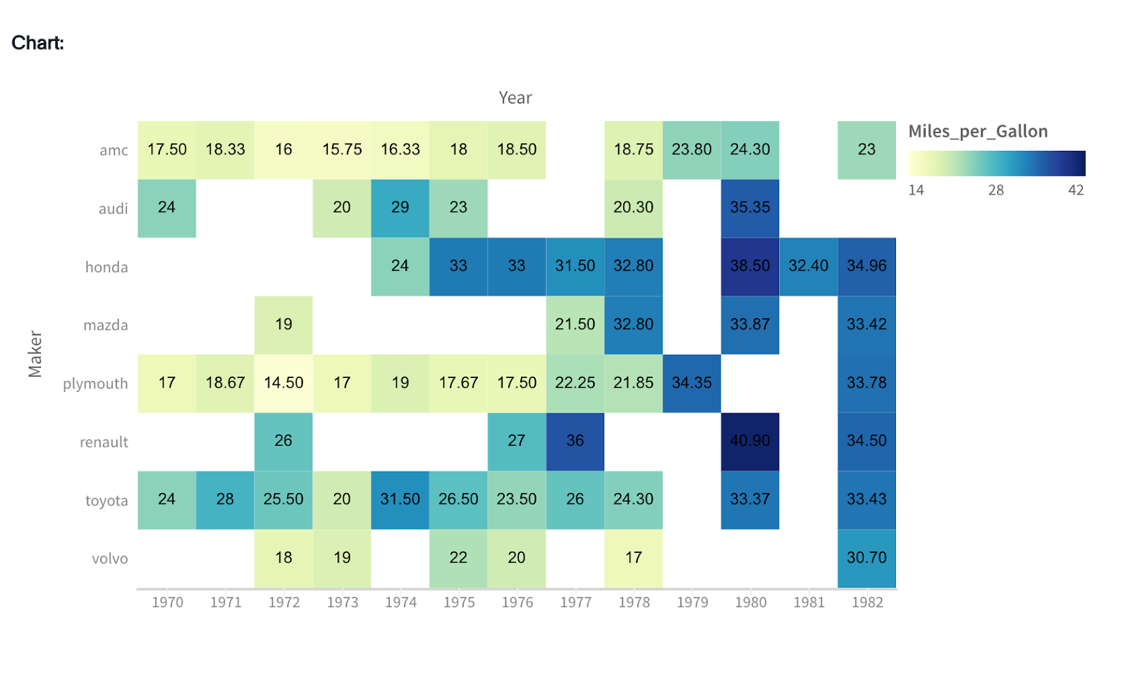
Heatmaps
Heatmaps use bright colors to show the intensity of an activity across different parts of your data.
Excellent for visualizing data intensity, such as customer interactions on a webpage, sales activity across locations, or call center volume during the day.
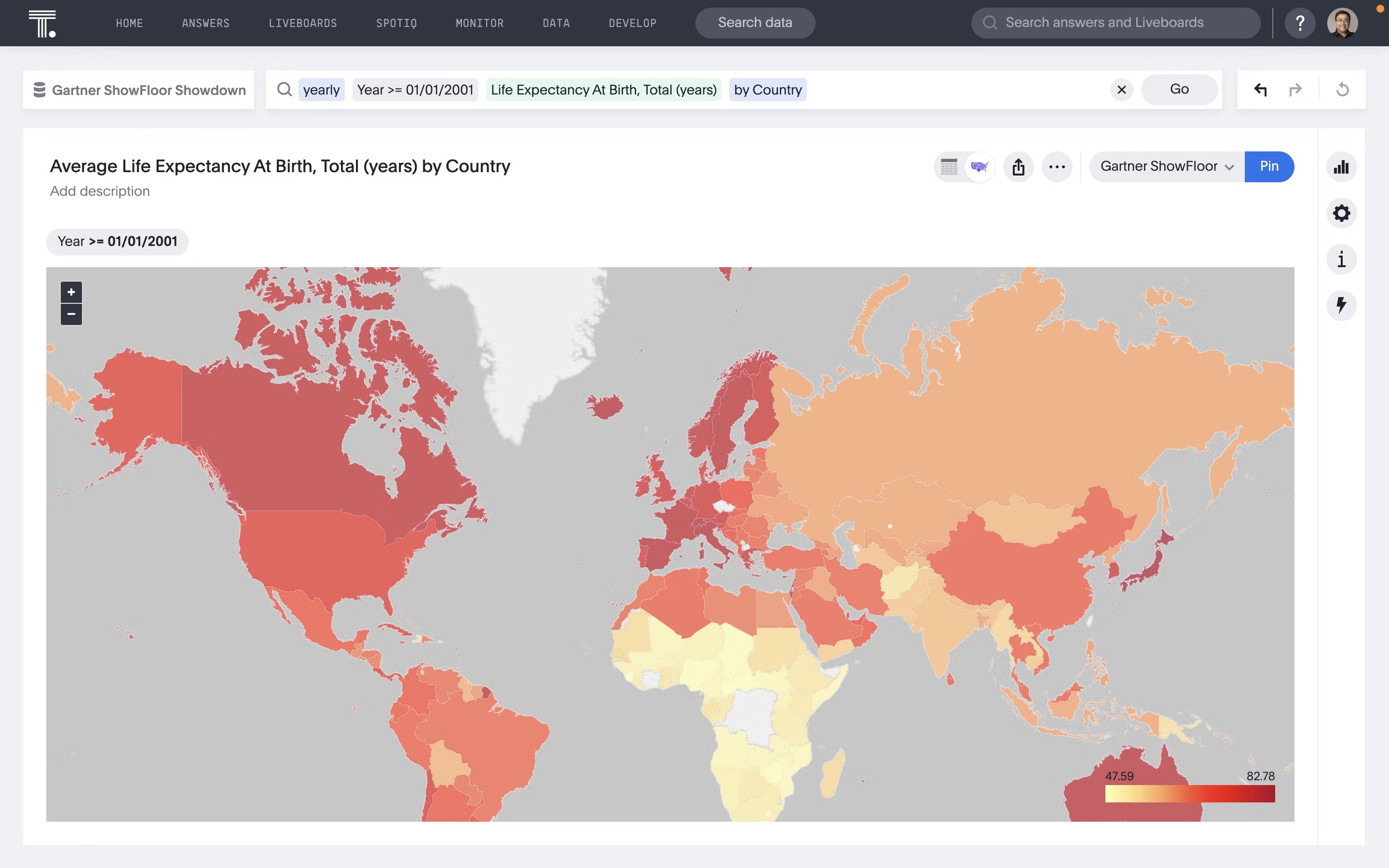
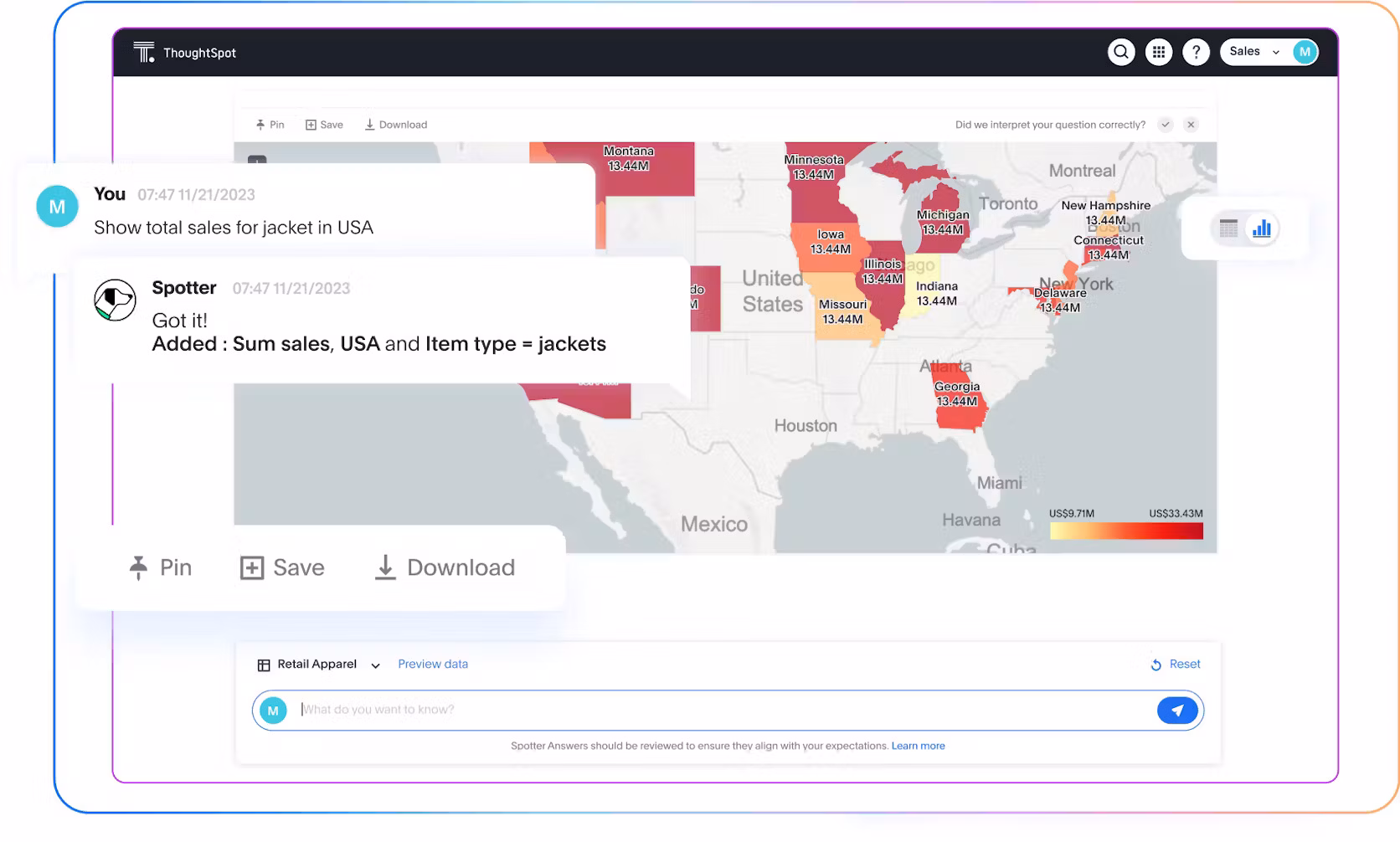
Geo charts
A geo chart showcases data on a map, helping you evaluate how different products are doing across regions. Each location is shaded based on the data.
It makes it easy to spot regional patterns in sales, user adoption, or shipping performance.
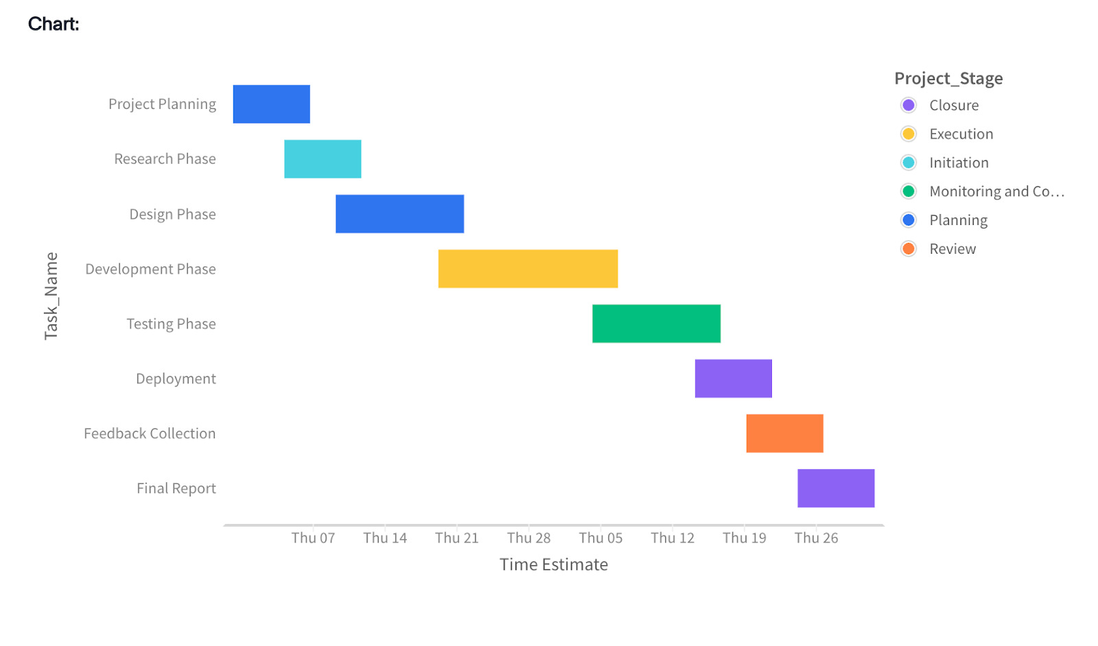
Gantt charts
These visual tools use bars to map out the timeline and progress of tasks, making them a go-to for project management.
Excellent for keeping projects on schedule, tracking progress, assigning resources, and identifying potential bottlenecks before they cause delays.
Histogram
Histograms show how often data falls into different ranges or ‘bins,’ giving you a clear picture of the data frequency.
Helpful for visualizing the shape and spread of data, such as seeing how many customers fall into certain age brackets, purchase sizes, or activity levels.
Product team: Identifying customer churn drivers
Noticing a dip in customer engagement? When you start visualizing user data, the full story comes into view. You can map their entire journey, pinpoint behavioral patterns, and trace issues right back to their source.
Combine this with a powerful AI Analyst like Spotter, and you’re not waiting around for reports. Just ask, ‘Why are active users dropping this month?’ or ‘Where are users churning in the onboarding flow?’ and Spotter gives you instant, contextual answers. You get the clarity to act fast, fix friction points, and keep your customers engaged.
Marketing team: Analyzing campaign data
Understanding what your audience wants is just half the battle, especially when you’re juggling campaigns, channels, and customer segments.
That’s where visualizing your campaign data makes all the difference.
With the right visuals, you can instantly see who’s engaging, which channels are performing, and how different audiences interact with your brand. These signals help you fine-tune your messaging, double down on what’s working, and deliver campaigns that truly connect.
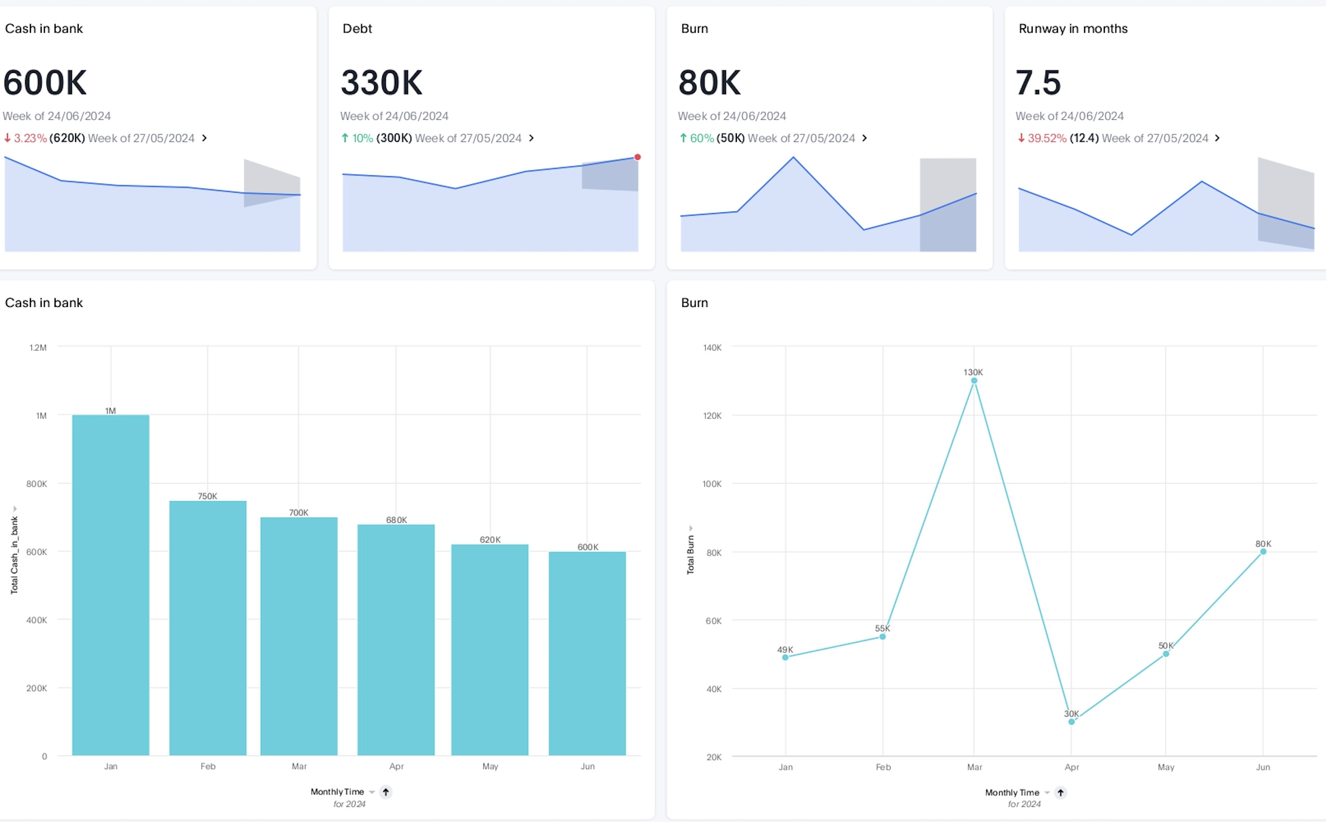
Finance team: Optimizing cash flow
Keeping cash flow healthy is no small task, especially when revenue streams, expenses, and forecasts are constantly shifting. Visualizing your financial data changes that.
In seconds, you’ll see exactly where money’s coming in, where it’s going out, and what’s changing.
Armed with this visibility, your team can make informed adjustments, strengthen liquidity, and keep the business running on a predictable, stable cash flow.
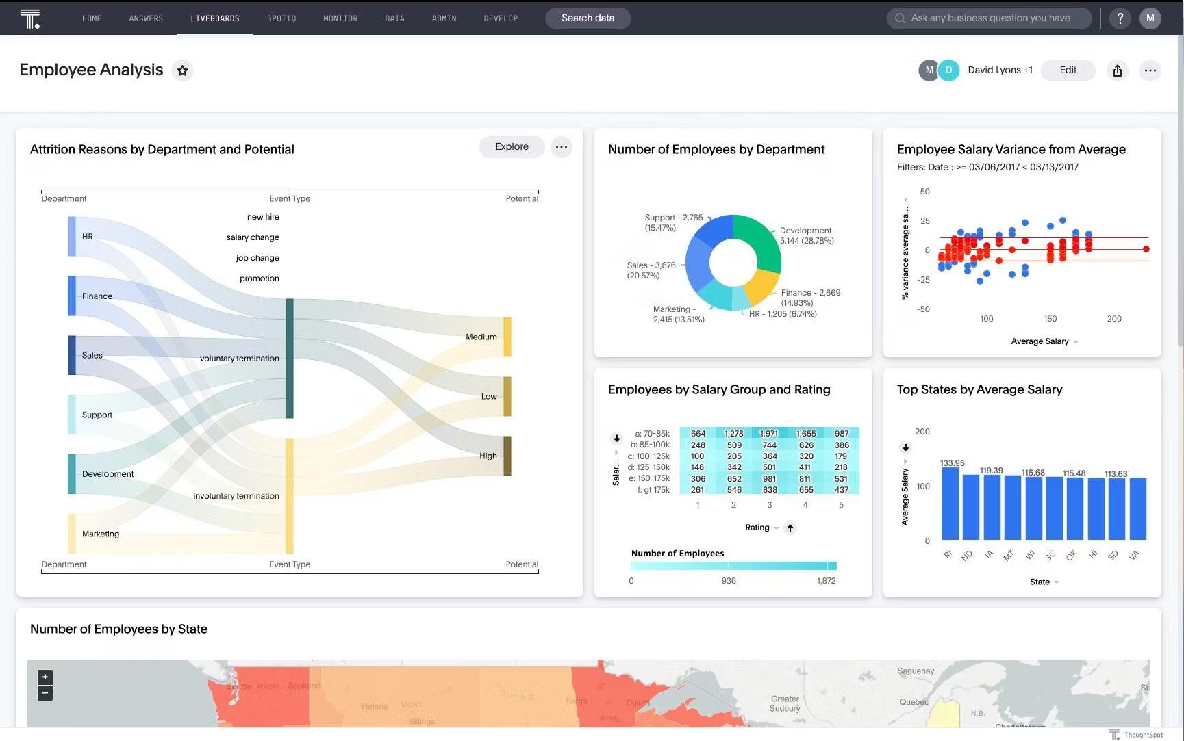
HR team: Understanding workforce dynamics
Team challenges often stay hidden until productivity drops or top talent walks out the door. But by visualizing workforce data and tracking metrics like overtime hours, employee satisfaction scores, and turnover by team, you can catch the warning signs early.
These proactive insights help your HR team intervene before issues escalate. This includes taking targeted actions such as reallocating workloads, improving onboarding, or launching retention efforts where they’re needed most.
The result: a workforce that feels supported, stays engaged, and performs at its best.
Sales team: Tracking pipeline health
Your pipeline isn’t just a list of deals—it’s the heartbeat of your sales strategy. Visualizing real-time pipeline data shows you where deals are heating up, where momentum is stalling, and what needs attention now.
This empowers your reps to prioritize high-potential opportunities, adapt strategies on the fly, and keep revenue flowing like clockwork.
To become a truly data-driven organization, you need more than static charts and pretty graphs. You need a data visualization tool that empowers everyone to explore data, ask questions, and build dashboards that drive real action.
Here are key capabilities every modern data team should look for:
| Category | What to consider | Why does it matter? |
|---|---|---|
| Ease of use | Is the interface intuitive for non-technical users? | Allows adoption across teams, not just analysts. |
| Real-time data monitoring | Can it handle live data streams and update visualizations instantly? | Critical for time-sensitive decisions and fast-moving teams. |
| Data connectivity | Does it integrate with your current data sources (cloud, on-prem, APIs)? | Avoids silos and creates a unified view of your data. |
| Flexibility and customization | Can you tailor visuals and dashboards easily? | Supports different user needs. |
| AI-powered features | Does it support automated insights and natural language queries? | Helps users go beyond charts to actionable insights. |
| Collaboration features | Can teams share, comment, or co-create dashboards? | Encourages alignment and faster decision-making. |
| Customer support and community | Is documentation, support, and community help easily accessible? | Smooths onboarding and troubleshooting for better ROI. |
💡Confused by all the data viz tools out there? This guide makes it simple—compare top platforms and pick the best one for your team.
Gartner reports that by 2026, a CDAO’s ability to drive data and AI literacy will rank among the top three drivers of business success.
But that’s not just a mandate for data teams—it’s a call to action for anyone investing in analytics today. Choosing the right visualization platform isn’t just about speed or aesthetics. It’s about building a culture where insights are accessible, intuitive, and actionable for everyone.
Here are five expert-backed strategies to help you make that shift:
Adopt the right tech stack: Choose tools that support both deep analysis and intuitive self-service. Real-time dashboards, natural language search, and AI-powered insights should also be part of the experience. This helps everyone, from SQL pros to business users, explore data their way.
Identify levels of data literacy: Assess data skill levels across functions and roles, and then tailor enablement programs to build confidence. The goal is clear: to build a culture where everyone feels empowered to engage with data.
Leverage AI-powered analytics: Use AI-powered analytics not just to automate reports, but to amplify decision-making. By surfacing hidden patterns and generating contextual narratives, AI bridges the gap between raw data and operational impact.
Be the example: Set the tone by embedding data into everyday decision-making, rewarding data-driven behaviors, and creating space for continuous learning. Culture doesn’t shift on its own; it follows leadership.
Make data a shared language: Align teams on shared KPIs, clear definitions, and reliable data sources. When everyone works from the same foundation, collaboration accelerates and confusion disappears.
Turn complexity into clarity with AI-powered data visualization
Dashboards and charts are everywhere, but how often do they actually give you the answers you need?
As your business grows, your questions are only going to get tougher. And legacy BI tools? They aren’t built to keep up. You need solutions that give you real answers, without opening five different tabs to find them.
With ThoughtSpot, your users don’t just get another generic chart. They get automated, personalized, and actionable insights they can trust, right when they need them.
Move from dashboards to decisions–start your free demo today.


