


When you visualize data, picking the right chart matters. Some highlight differences between categories, while others reveal patterns within a dataset.
Bar graphs and histograms are two of the most common charts, and they might look alike at first glance. Both use bars to represent data, but the similarities mostly end there.
Understanding the difference helps you tell the right data story. In this article, we’ll break down what bar graphs and histograms are, how they differ, and when to use each so your data visualizations are clear, accurate, and meaningful.
Table of contents:
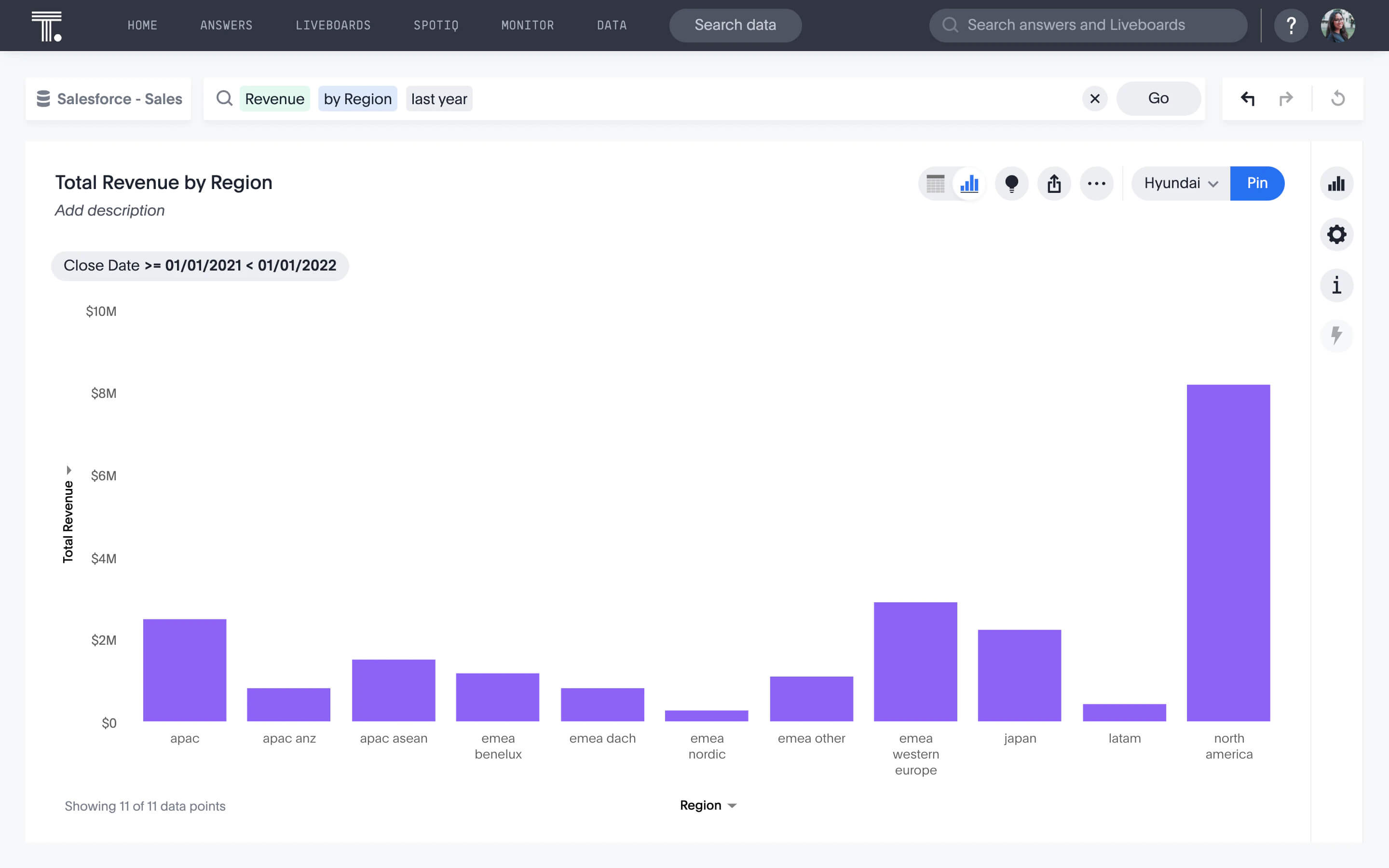
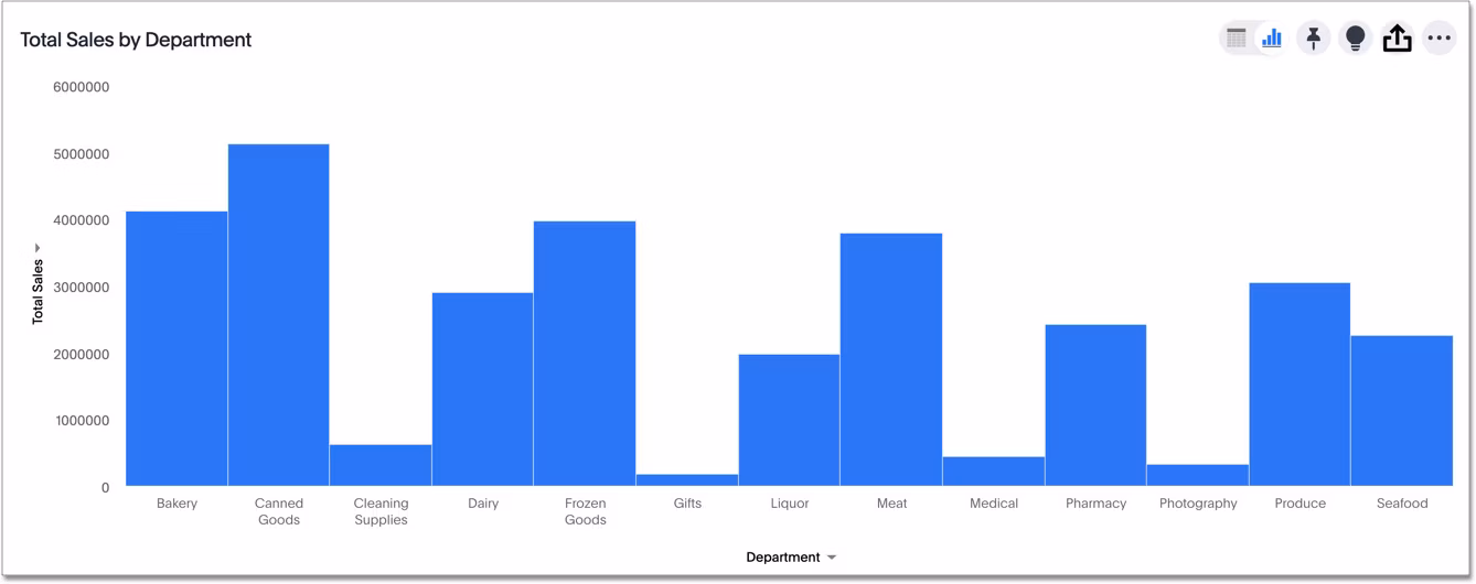
A bar graph, also called a bar chart or column chart, compares numerical data across categories. One axis lists categories, the other shows their values, and each bar represents a single data point, like sales by region, votes for a candidate, or product revenue.
Bars are separated by small gaps to show categories are distinct, not continuous. Bar graphs can display sums, averages, or any metric tied to one category. You can also order bars by size, time, or any sequence that makes comparisons clearer. Variations like stacked or grouped bars let you show multiple data points per category without clutter.
A histogram is used to show the distribution of a single, continuous dataset. Instead of comparing categories, it reveals how often different values occur.
To create a histogram, you divide your data into bins, groups of numbers that fall within a certain range. For example, if your data ranges from 1 to 100, you might have 10 bins: 1–10, 11–20, and so on. The height of each bar shows how many values fall into that bin.
Unlike bar graphs, histogram bars are directly next to each other, showing that the data is part of a continuous range. You can’t rearrange the bins, the order must go from lowest to highest. Histograms are great for spotting patterns, clusters, or gaps in your data that averages alone might hide.
| Feature | Bar graph | Histogram |
|---|---|---|
| Data type | Discrete categories | Continuous dataset |
| Purpose | Compare values across categories | Show the distribution of values |
| Bars | One value per category | Count of values per bin |
| Arrangement | Can be reordered | Must follow numerical order |
| Bar spacing | Slight gap between bars | Bars touch each other |
1. Data type
Bar graphs work with separate categories, things you can count individually, like product types, regions, or candidates in an election. This makes it easy to compare one category directly against another.
While Histograms, in contrast, handle continuous data, such as ages, daily temperatures, or sales amounts, where values fall along a spectrum. They’re better suited for spotting trends and patterns in large datasets that aren’t easily divided into distinct groups.
2. Purpose
Bar graphs are ideal when your goal is to compare differences between categories. They quickly highlight which categories lead or lag, making comparisons obvious.
For continuous datasets, histograms reveal the distribution of values, uncovering patterns such as clusters, gaps, or outliers. This gives a more nuanced view than simple averages or totals, helping you understand the underlying story in your data.
3. Bars
Each bar in a bar graph represents a single value for its category, like total revenue, number of votes, or units sold.
Unlike bar graphs, histograms show how many data points fall within a specific range or bin. For example, a histogram of customer ages could show how many fall in 20–29, 30–39, or 40–49 age groups, giving a visual sense of distribution that a bar graph cannot.
4. Arrangement
Bars in a bar graph can be reordered to highlight trends or comparisons, such as largest to smallest, chronological order, or geographic order.
Histogram bins, however, must stay in numerical order to accurately reflect the data’s progression. Rearranging bins would distort the dataset’s natural distribution and could mislead the viewer.
5. Bar spacing
The gaps between bars in a bar graph emphasize that the categories are separate and distinct.
In histograms, bars touch each other, visually indicating that the data is continuous and the bins are connected. This helps viewers immediately understand that the values are part of a range rather than separate entities.
💡 Relevant read: 24 types of charts and graphs for data visualization
Knowing the differences between these charts makes it easier to choose the right one for your data. The choice usually comes down to whether you want to compare categories or understand the distribution of values.
When to use a bar graph
Bar graphs are best for comparing discrete categories. For example:
Showing revenue for each division in a company
Comparing the votes received by candidates in an election
Tracking the number of new clients added by different sales partners
Visualizing how many units of each product are sold in a month
You can arrange bars in a way that emphasizes patterns, like largest to smallest, chronological order, or geographic order. Bar graphs make the differences between categories clear and easy to interpret at a glance.
When to use a histogram
Histograms are ideal for exploring the distribution of continuous data. For example:
Plotting customer ages to see which age groups are most represented
Visualizing daily sales numbers over a year to identify high- and low-performing days
Analyzing temperatures over a month to spot trends or outliers
Histograms help you see patterns that averages alone might hide. You can spot clusters of data, gaps, or unusually high or low values, giving a more detailed understanding of the dataset.
Using both charts together
Sometimes, the same dataset can benefit from both visualizations. For instance, daily sales over a year can be plotted in a histogram to show frequency patterns. Then, calculating monthly averages and plotting them in a bar graph can reveal seasonal trends, like dips in summer or spikes during holidays.
Even if you know the difference between bar graphs and histograms, it’s easy to make mistakes that turn your charts into bad data visualizations. Here are some pitfalls to watch for:
Using a bar graph for continuous data: A bar graph is meant for discrete categories. Using it for continuous data, like ages or daily sales, can hide patterns, clusters, or gaps that a histogram would clearly reveal.
Picking inappropriate bin sizes in histograms: Choosing too few bins oversimplifies your data, masking important details. Too many bins can make the chart cluttered and difficult to interpret. Finding the right balance ensures meaningful patterns stand out.
Mislabeling axes: Clear and accurate axis labels are essential. Without them, viewers might misinterpret your data, such as thinking percentages are raw counts or vice versa. Always include units and descriptive labels.
Ignoring bar spacing conventions: In bar graphs, gaps between bars emphasize that categories are separate. In histograms, bars touch each other to show continuity. Ignoring this can confuse viewers about whether the data is discrete or continuous.
Overcomplicating charts: Adding too many colors, series, or bins can overwhelm readers. Keep it simple and highlight only the most important insights. For example, use a single color to emphasize a key trend rather than coloring every bar differently.
Creating bar graphs and histograms is straightforward, but the right tools can make your insights even clearer and faster to interpret. Digitizing your charts lets you easily adjust layouts, colors, and bins, and quickly test different views of your data.
Platforms like ThoughtSpot go a step further by automatically suggesting the best-fit visualizations for your queries. Whether you’re comparing categories with a bar graph or exploring distributions with a histogram, ThoughtSpot helps you move from data to insight in seconds, so you can focus on making decisions, not formatting charts.
See how effortless it can be to turn your data into clear, actionable visualizations–sign up for a free trial.
FAQs
1. What is the main advantage of a histogram over a bar graph?
A histogram reveals patterns and trends in continuous data that a bar graph can’t. It helps you understand the shape and distribution of your data, not just totals or averages.
2. Can I use a bar graph and a histogram for the same dataset?
Yes, if you want to highlight different aspects. Use a histogram to show the distribution of the data, and a bar graph to summarize it by category or average.
3. How do I choose the right bin size for a histogram?
The right bin size balances clarity and detail. Too few bins oversimplify patterns, while too many can make the chart cluttered. Adjust bin sizes until patterns like clusters or gaps are visible without overwhelming the viewer.
4. Can a bar graph be a histogram?
Not exactly. Bar graphs are for discrete categories, while histograms are for continuous data. Using a bar graph for continuous data can hide patterns and lead to bad data visualization.
5. How do I know if my data is discrete or continuous?
Discrete data has separate, countable categories, like product types or the number of sales. Continuous data can take any value within a range, like temperature, age, or daily revenue.


