


As the world continues to move faster and faster, business people, from executives to the frontlines to the analysts that support them, need the ability to find insights whenever and wherever decisions are made. That’s why we launched ThoughtSpot Mobile for both iOS and Android.
It’s all about putting the power of data in the hands of every employee with self-service analytics, right from the palm of their hands.
In building these applications (you can read our case study here), we learned some important best practices along the way that would be helpful for others designing mobile applications.
1. Blend useful and intuitive experiences
Reduce the effort users have to put in to get what they want. Organise information in a way that requires a minimum number of actions to reach the destination.
Break large tasks into smaller, meaningful chunks. Hide secondary actions.
Offload tasks. Set smart defaults.
Design for interruption. Allow users to save a state and re-engage later. Users expect to continue the journey from where they stopped.
Focus on User Goals, but do not overwhelm the user with too much information. Don't interrupt.
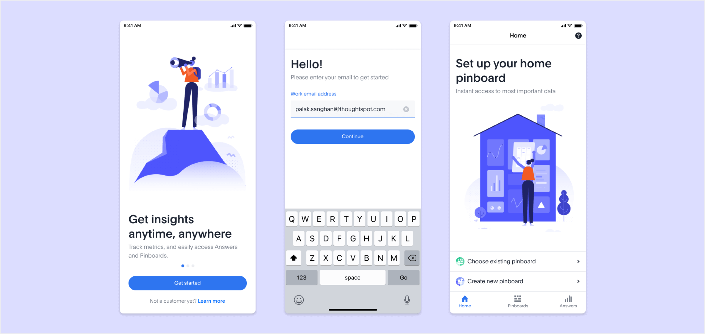
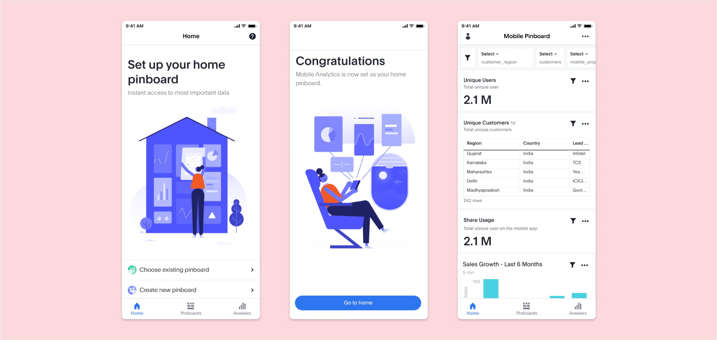
Home Pinboard Setup - simple walkthroughs, quick email sign up followed by onboarding
2. Make user interfaces invisible
Make the content the interface and remove unnecessary elements that do not support user tasks. Cards are a great way to display actionable content. Keep the interface light and airy.
Add breathing Room. Use white space to draw attention to important content.
The most successful apps are highly focused and present a limited set of features. Limit feature set by prioritising what’s important and trimming nice-to-have features.
Content prioritisation can simplify the UI and improve the UX.
Simple and direct language maximizes clarity. Avoid acronyms, brand specific terms, cultural specific axioms, and technical terminology that people might not understand. Use familiar, understandable words and phrases.
Use a typeface that works well in multiple sizes and weights to maintain readability and usability in every size.
Use legible font size. Text should be at least 11 points so users can read it at a typical viewing distance without zooming.
Use sufficient colour contrast for text. Insufficient contrast makes text blend in with the background. Strive for a minimum contrast ratio of 4.5:1 for body text and image text.
Start Getting Better Insights
3. Cut out the clutter
Cut out the clutter. Reducing clutter will improve comprehension, so get rid of anything in a mobile design that isn’t absolutely necessary. A simple rule of thumb is one primary action per screen.
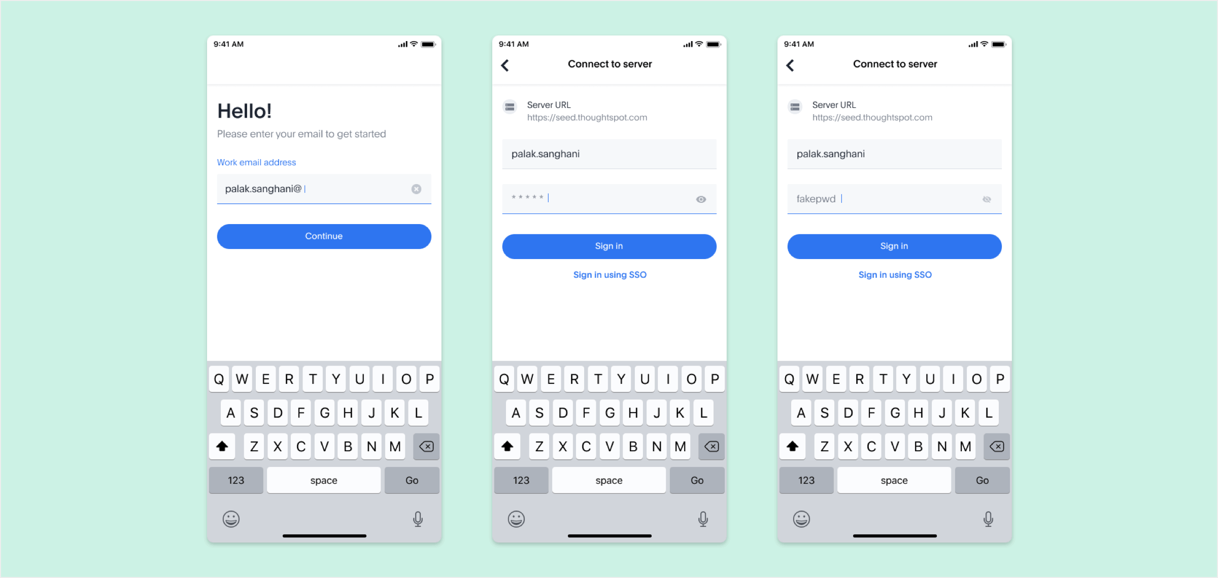
Avoid Login Walls. Don't force early registration; instead, gather data slowly.
Avoiding Information Overload so the amount of input to a system exceeds its processing capacity. Decision makers have fairly limited cognitive processing capacity, so reduction in decision quality occurs.
Chunking helps. Break down long forms into pages, progressively disclosing fields as necessary. Streamline this mobile app design process by integrating autocomplete, spell-check, and prediction text assistance. Using mobile app development software can further simplify this process.
Great user onboarding not only lowers abandonment rates, but can also help boost long term success metrics like user retention and user lifetime value
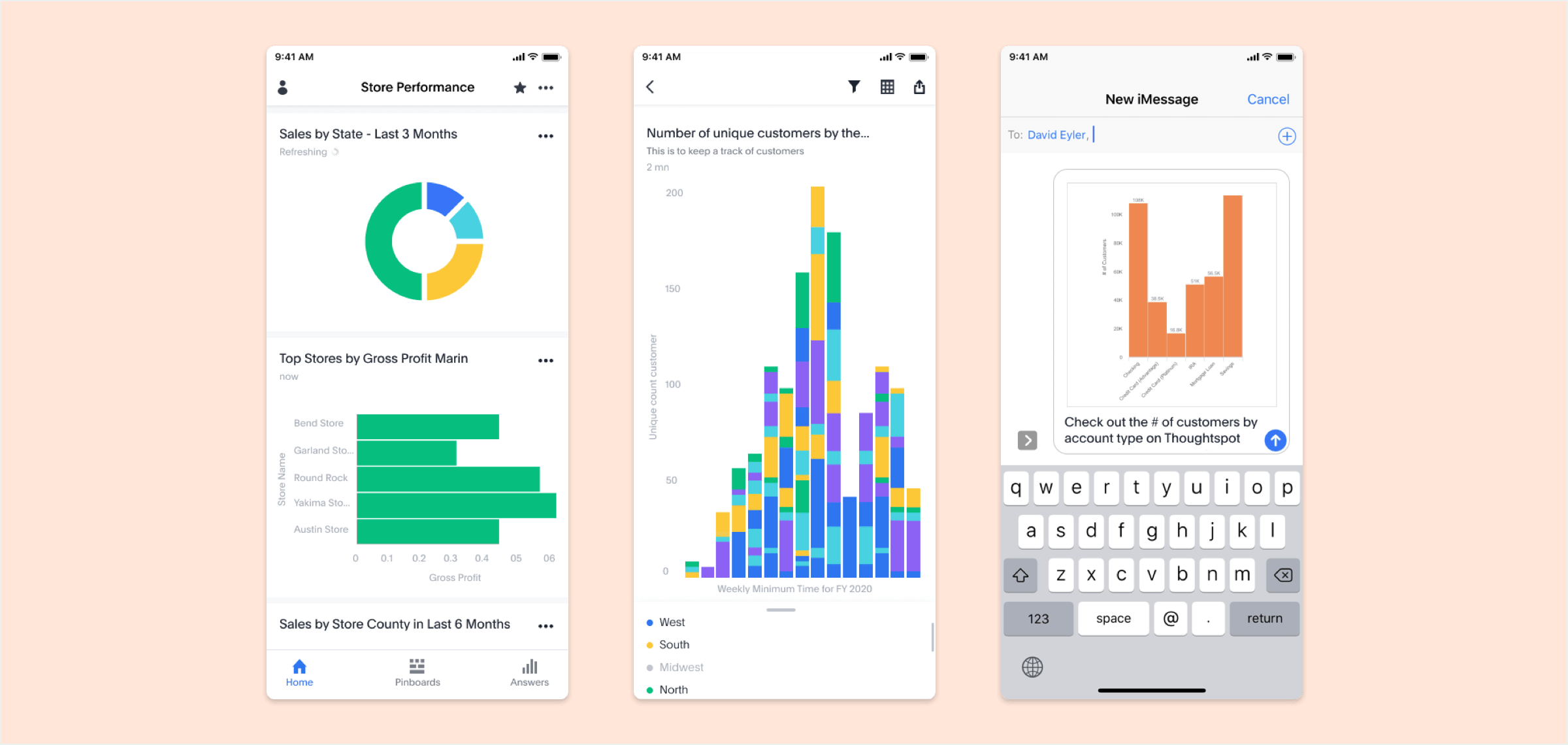
Lightening fast charts that are easy to interact with, consume, and share
4. Navigation should be simple, yet discoverable
Navigation should inspire users to engage and interact with the content. It should be implemented in a way that supports the structure of the app without calling attention to itself.
Navigation must be discoverable and accessible, while occupying little screen space.
Navigation should accommodate the needs of the majority of app’s users. For instance, in an AI video generator app, creators might need quick access to templates, script input, voice settings, and export options—so those actions should be front and center in the navigation.
Assign different priority levels to common user tasks. Give prominence in the UI to paths and destinations with high priority levels and frequent use.
Navigation should be available at all times, not just when we anticipate that the user needs it. Minimise the user’s memory load by making actions and options visible.
Icons and other graphic elements should help users to understand the menu options.
Communicate the current location using location indicators.
Make it easy to interact. menu options should be big enough to easily tap. Use recognisable design patterns as well as recognisable icons.
Hidden navigation drives down engagement, slows down exploration and confuses people.
Tabs are great because they display all major navigation options up front, and with one simple tap, the user can instantly go from one view to another. Should use labels. Can use segment control when there are a couple of options.
Reduce search effort. If search is a key function of your app, it needs to be in front of people. Either display it at the top of the screen or have a visible reference that activates search mode.
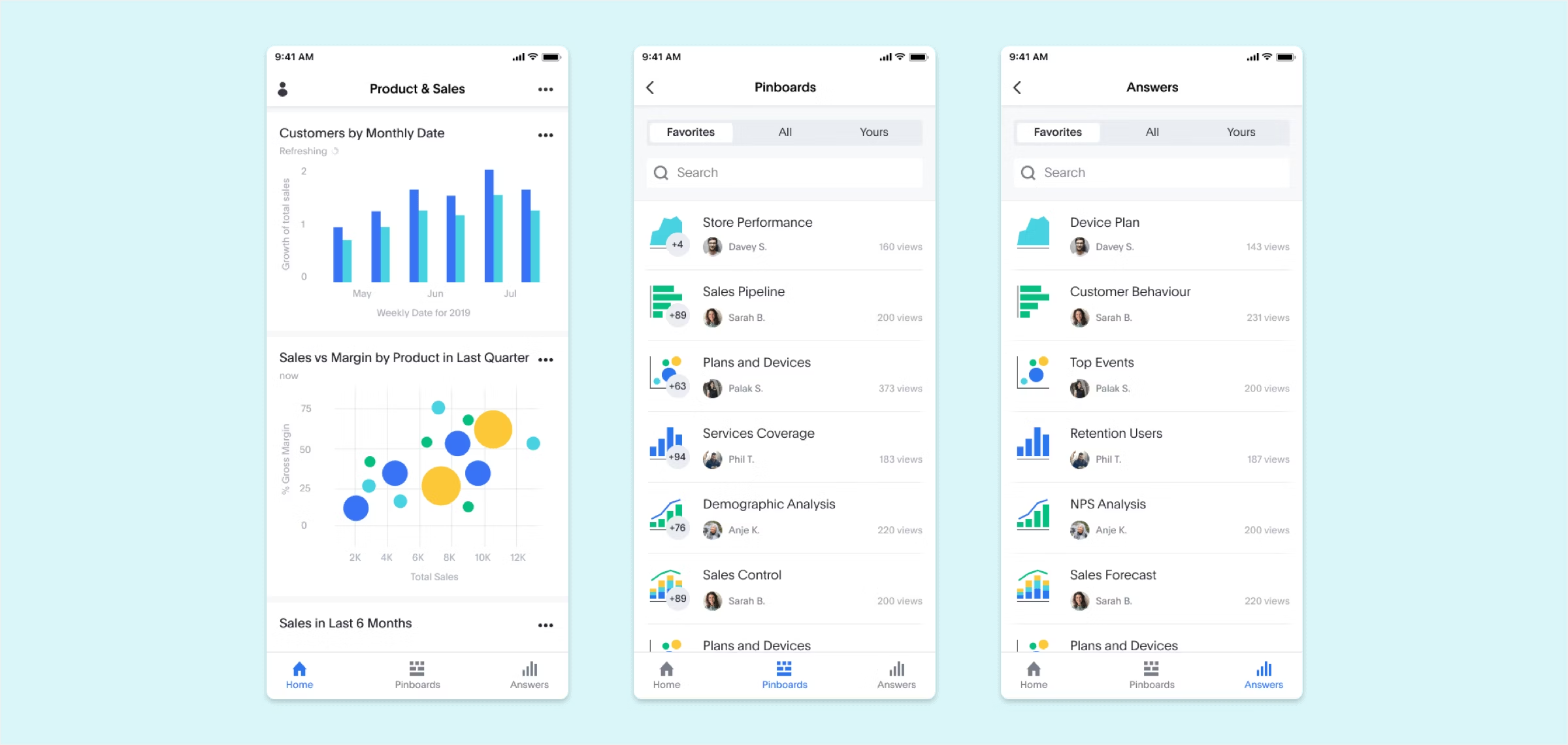
Simple Navigation, with icon and label, available across the app
5. Build for one handed operation
Screen sizes are going to keep expanding, 85% of users use their phone with one hand. The bigger the display is, the more of the screen is less easily accessible.
Place the top-level menu, frequently used controls, and common action items in the green zone of the screen, which is comfortably reached with one thumb.
Place destructive actions in the hard-to-reach red zone so users don’t accidentally tap them.
6. The appearance of speed matters
Don’t make users wait for content. Make the app fast and responsive.
To make the interaction predictable, it’s essential to provide some sort of feedback in response to every user action. Feedback acknowledges actions and helps users understand the results of operations. Lack of feedback can cause them to question whether an app has processed the action. An app that provides visual feedback eliminates guesswork for the user.
Let people know that things are going to take a while by using a progress indicator. The progress indicators inform users to wait, so we should replace the indicators with skeleton screens as soon as possible.
Use a skeleton screen to focus on actual progress and create anticipation for what is to come. This creates a sense that things are happening immediately, as information is incrementally displayed on the screen and people see that the application is acting while they wait.
Perception can be just as important as raw speed. If users get something interesting to look at while waiting, they will pay less attention to the wait itself. To ensure people don’t get bored while waiting for something to happen, offer a distraction.
Do things in the background to make imminent actions appear fast. Actions that are packed into background operations have two benefits: They are invisible to the user, and they happen before the user asks for them.
Pull to refresh to load new content, you simply need to drag a list down with your finger to trigger a refresh action.
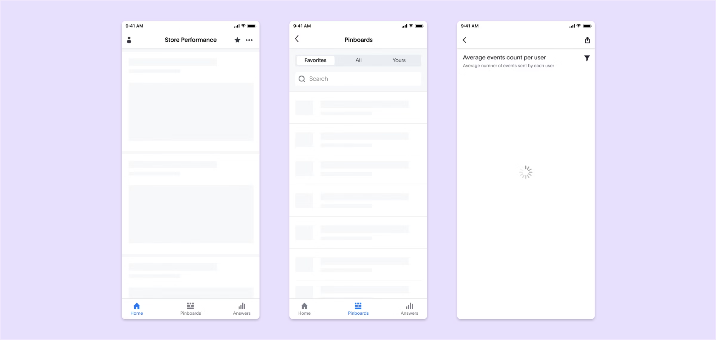
Skeleton screens and spinners show the loading state for different screens
7. Thoughtful, timely notifications are essential
Think twice before sending a message. Users are bombarded with useless distracting notifications. Annoying notifications are the number one reason people uninstall mobile apps.
Mobile is all about making every message count. Don't overwhelm the users with push messages.
The value users get from notifications should be sufficiently greater than the interruption. Don't send push notifications for the sake of engaging users.
Personalising content to inspire and delight is critical.
Don't send push notifications at odd hours. Send notifications at most convenient times according to the user's time zone.
Use different message types: push notifications, email, in-app notifications and news feed updates. Diversify your messaging — your messages should work together in perfect harmony to create a great user experience.
It’s better to ask for permissions in context and communicate the value the access will provide. Users are more likely to grant permissions if asked during a relevant task.
Using storytelling to engage with the users, including data storytelling. Using short notifications on the page instead of pop-ups and overlays, and ground every story in relevant facts the user will care about.
8. No web experiences
Don't replicate web experiences on an app. Users expect certain interaction patterns and interface elements in mobile apps, which is not how you visualize website structure. Maintain visual consistency with the colour palette, typography, and all other design elements.
Provide seamless experience across all devices. It also builds trust with the brand.
Avoid using underlined links, instead use buttons.
Don't take users to a browser. This increases abandonment and reduces conversion.
Avoid creating dead-end pages that act as blockers for user flow.
Error states and empty states should provide instructions and actions to move forward.
Design for glanceability and quick scanning as user behaviour. Glanceability refers to how quickly and easily the visual design conveys information.
Make sure your product works when it isn’t connected to the Internet at all. Allow caching of data.
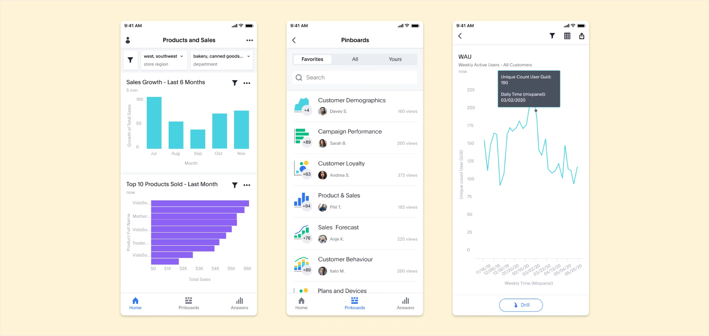
Filters, Pinboards, Drill are customised for the mobile experience
9. Incorporate security and trustworthiness at the outset
Don’t ask a user to rate your app during their first experience. Don’t ask a user to rate an app when they perform a task. Wait until users prove to be repeat users, and they’ll be more likely to rate your app and provide better informed feedback.
Make sure you provide transparent permission policies and allow your users to control how their personal information is shared within a mobile app.
Reinforce credibility by displaying trusted badges of security, especially when users are trusting your brand with their personal and financial information.
10. Personalise the experience
Personalisation helps provide a more unique and relevant experience to the user. Whenever possible, personalise the UX by leveraging user data to display relevant content and material in the app.
Including the user’s name on the screen and in messaging is an easy and effective way to personalise.
Personalisation should push users toward content that they’re looking for and away from content that’s irrelevant to them. It can also eliminate distractions
Consider adding embedded analytics into your app, so users can explore their own, personalised data to find insights
See how companies like Frontify, Harri, Modern Milkman, and more are increasing user engagement by building personalised analytics experiences with ThoughtSpot Embedded.
11. Delight with animations and micro-interactions
Add delightful animation using an animation software to make the interface feel human and create an emotional connection with your users.
Animations and micro-interactions, just as interactive data visualization, catch attention and create the right mood, so there’s no need to add clutter or extra text.
Utilizing animations, such as AI images, enhances the interface's responsiveness during the loading of results. The immediacy of transitions creates the impression of the app reacting promptly to user input.
Acknowledge touch gestures with subtle UI changes - thus increase the perception of performance.
12. Echo core interactions
Echoing can reinforce a core interaction across an experience, it can also unify the design of a product through familiar visual design elements and ideally make mundane interactions fun.
Echoing occurs when a specific interaction design is reused in various contexts across a product experience. Since the same interaction model is reused, people can learn it in one place and apply their knowledge elsewhere.
13. Engage gradually
Gradual engagement is the process of moving a user through the app – actually engaging with it, and seeing its benefits. With gradual engagement, the first time experience for new users is focused on giving them an understanding of how they can use the app and why they should care to, not filling our a registration form.
14. Act just in time
Reveal relevant features only when they are needed. Surface them just in time.
Dismiss keyboard when it’s not needed. It helps communicate otherwise invisible gesture only functionality.
Reveal useful information when people actually need it, not at all times.
15. Hide show passwords
Imprecise fingers and small screens make it harder to accurately input complex characters into password fields.
Try to keep people logged in as much as possible by not displaying sign out actions upfront. This makes entering passwords a rare occurrence.
Making it easy to verify complex characters in the password field with hide & show
"What we need to do to design is to look at the extremes. The middle will take care of itself."
Dan Formosa
For most companies today, mobile is a key part of your product strategy. It helps you meet customers where they are, providing value wherever and whenever they need it.
If you’re building mobile applications, and want to deliver the most personalised, engaging experience for users, consider adding intuitive analytics that let your users find insights and take better action. With ThoughtSpot, any user, regardless of their technical skills, can engage with data right in your mobile app. Start a free 14-day trial to learn more.


