


Most executives spend more time tracking down data than actually using it. Between scattered spreadsheets, delayed reports, and back-and-forth with analytics teams, the insights you need for critical decisions always seem just out of reach.
Executive dashboards solve this problem by putting your most important metrics in one place. But not all dashboards are built to deliver real ROI. The best ones don't just display data—they help you make faster, smarter decisions by integrating AI and smart features. Here's how to build an executive dashboard that provides real value.
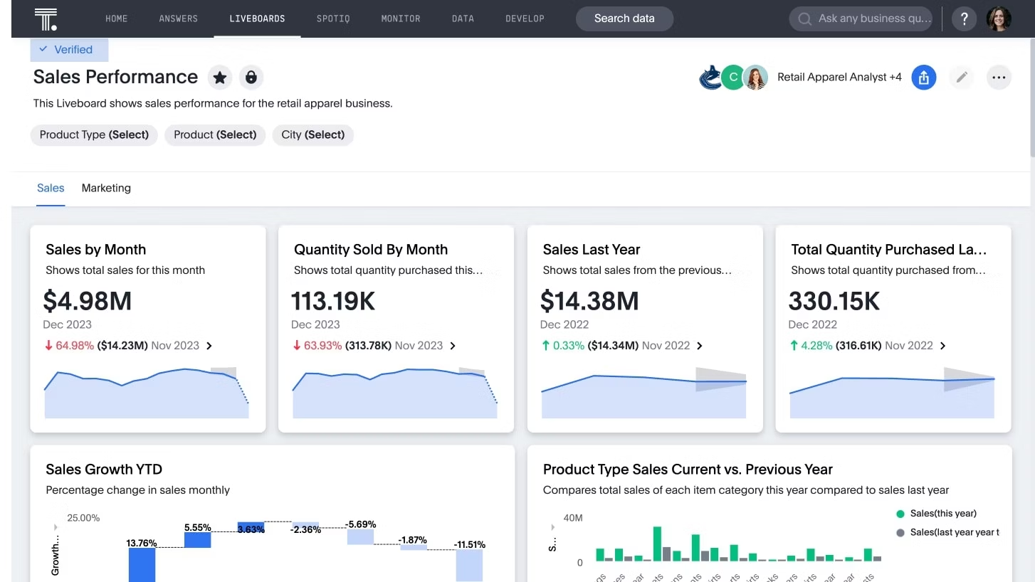
An executive dashboard is a visual interface that consolidates key performance indicators (KPIs) from across your business into a single, real-time view. It visualizes data through charts, graphs, and tables to give you immediate insight into company health and strategic performance.
Think of an executive dashboard as your business control center. Instead of hunting through spreadsheets or waiting for reports, you get instant answers to your burning questions like "Are we hitting our revenue targets?" or "Where are we seeing the biggest growth opportunities?"
Executive dashboards vs regular dashboards
The difference between executive dashboards and other dashboards comes down to scope and audience. Regular dashboards focus on operational metrics for specific teams or processes:
Marketing dashboards: Track campaign clicks, lead conversion rates, and social media engagement
Sales dashboards: Monitor pipeline velocity, deal stages, and quota attainment
Operations dashboards: Show ticket volumes, response times, and system uptime
Executive dashboards zoom out to strategic, cross-functional KPIs that tie directly to company-wide goals and long-term outcomes like market share, profitability, and customer lifetime value.
Executive dashboard examples and corporate dashboard types
Understanding different examples of dashboards helps you build the right view for your specific needs. Each serves a distinct purpose in your analytics strategy.
What is a corporate dashboard?
A corporate dashboard is a broader, organization-wide view that communicates overall business performance to leadership teams and sometimes the entire company. Think of it as an "all-hands" dashboard that keeps everyone aligned on strategic progress.
An executive dashboard is actually a specific type of corporate dashboard, tailored for C-suite decision-making rather than company-wide communication.
Where executive dashboards fit among other examples of dashboards
Dashboards typically operate on three levels:
Strategic dashboards: Used by executives to monitor long-term strategy and overall company health
Tactical dashboards: Used by department heads to track quarterly goals and manage team initiatives
Operational dashboards: Used by frontline teams to monitor daily activities and real-time processes
Executive dashboards sit at the strategic level, but they depend on data flowing up from tactical and operational views. That’s also why it’s so important that dashboards allow executives to “drill down” to a more granular level when they want to understand specific dynamics in greater detail or work out the root cause of a problem.
Start Getting Better Insights
The Executive Command Center model: 3 views every executive dashboard needs
The most effective executive dashboards organize information around three critical views that mirror how leaders actually think about their business. This command center model ensures you always have visibility into current performance, future opportunities, and emerging risks.
View 1 – Performance: "Are we on track?"
This view answers whether you're meeting your strategic targets right now. It displays high-level KPIs like revenue growth, profitability margins, and progress on key initiatives. The focus is on current results that tell you if your business is executing according to plan. These metrics give you an immediate read on overall health without requiring you to dig through detailed reports.
View 2 – Pipeline: "What's coming next?"
This view tracks metrics like pipeline velocity, sales forecasts, campaign performance, and upcoming product milestones. These are leading indicators help you predict future revenue, growth opportunities, and potential challenges on the horizon. By monitoring what's building in your pipeline, you can make proactive adjustments instead of reactive corrections.
View 3 – Health & risk: "Where are we drifting off course?"
This view surfaces early warning signs before they become major problems. It monitors customer health scores, churn risks, operational bottlenecks, cash flow concerns, and quality issues. When you spot these signals in real time, you can address issues while they're still manageable rather than waiting until they impact your bottom line.
The best executive dashboards are designed around specific decision-making needs. These five executive dashboard examples show how different leaders use ThoughtSpot Analytics to track what matters most.
1. CEO dashboard
A CEO dashboard provides the ultimate bird's-eye view of your entire business. It connects performance across departments to show whether you're executing on strategic priorities.
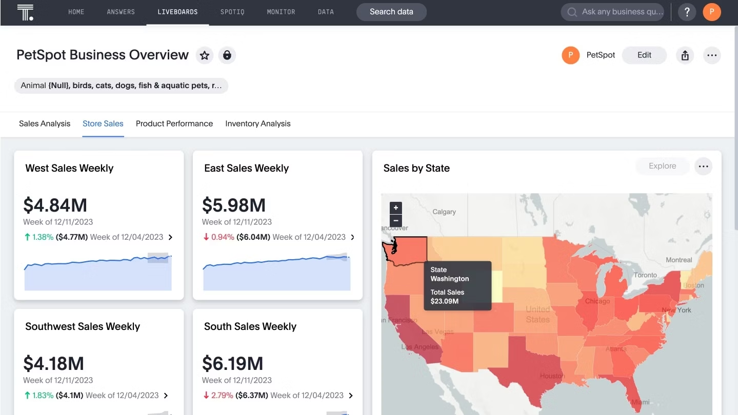
Questions this dashboard answers: Are we hitting our strategic targets? Where are we growing or lagging by region or product? How are our key initiatives progressing?
Key metrics to track:
Revenue growth: Year-over-year and quarter-over-quarter performance
Geographic performance: Revenue and growth rates by region or market
Lead generation: Pipeline health and conversion metrics
Gross profit margin: Overall profitability and cost management
💡 Design tip: Try organizing your layout around three core views: current performance, future pipeline, and risk indicators. Keep it simple with one to two key tiles for each area.
2. CMO dashboard
A CMO dashboard connects marketing activities directly to revenue and customer growth. It visualizes your entire marketing funnel from initial awareness to customer loyalty.
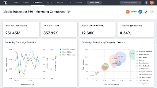
Questions this dashboard answers: Which channels drive profitable growth? Where do we see friction in the customer journey? How are our campaigns performing against targets?
Key metrics to track:
Conversion rates: By channel, campaign, and customer segment
Customer lifetime value (CLV): Long-term value of acquired customers
Campaign ROI: Return on investment for marketing spend
Marketing qualified leads: Quality and quantity of leads generated
3. CFO dashboard
A CFO dashboard serves as a financial command center, providing clear visibility into cash flow, profitability, and other key financial metrics that drive your business decisions.
Questions this dashboard answers: Are we hitting our financial targets? Where are costs drifting from budget? What's our cash and margin trajectory?
Key metrics to track:
Total revenue: Current performance against forecasts
Net profit: Bottom-line profitability and trends
Cash flow: Operating cash flow and burn rate
Growth of asset value: Long-term financial health indicators
4. COO dashboard
A COO dashboard focuses on operational efficiency and execution. It monitors the core processes that keep your business running smoothly, from supply chain to service delivery.
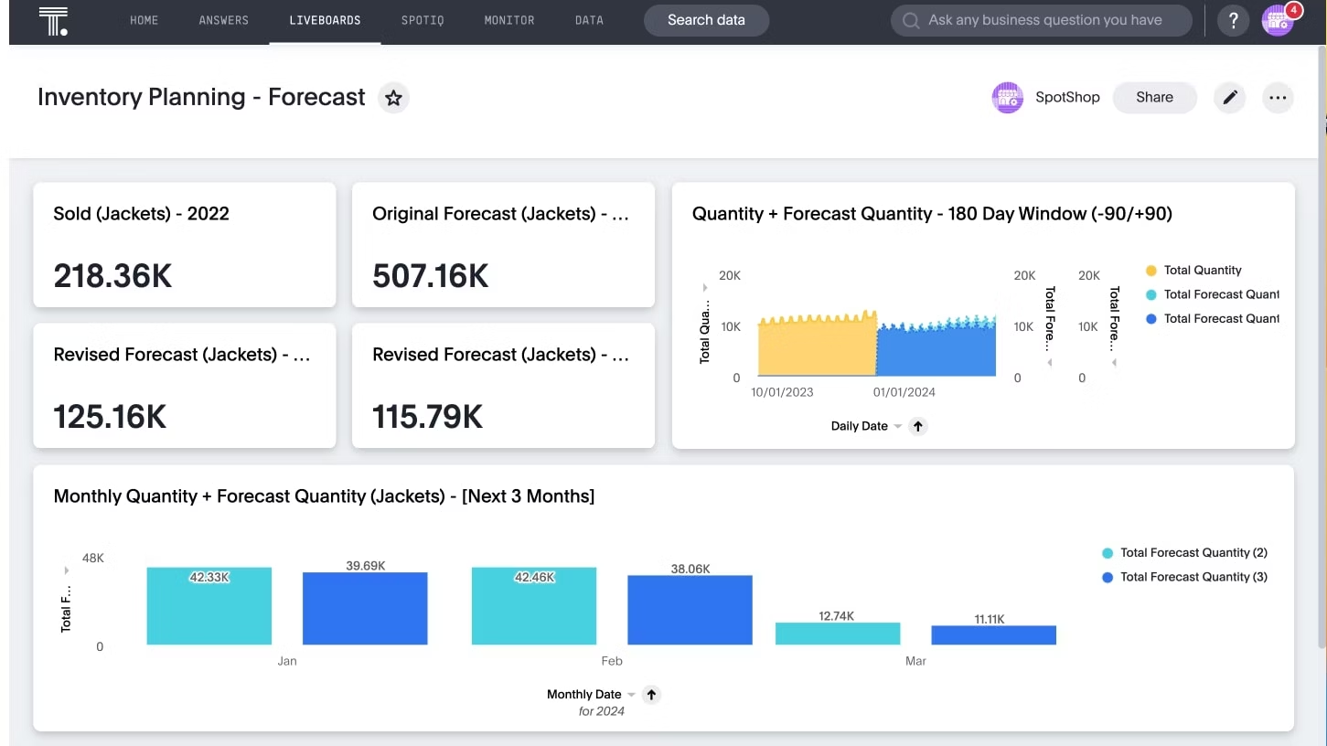
Questions this dashboard answers: Where are the bottlenecks in our operations? Are we meeting our service level agreements? Where is volatility emerging in our processes?
Key metrics to track:
Inventory levels: Stock optimization and turnover rates
Production cycle time: Efficiency of manufacturing or service delivery
Order fulfillment time: Customer satisfaction and operational performance
Quality metrics: Defect rates and customer satisfaction scores
5. CRO dashboard
A CRO dashboard provides a complete view of your revenue engine, from sales and marketing alignment to customer retention and expansion opportunities.
Questions this dashboard answers: Are we efficiently converting pipeline into revenue? Where are our biggest churn risks and expansion opportunities? How healthy is our sales process?
Key metrics to track:
Customer lifetime value: Long-term revenue potential per customer
Customer retention rate: Percentage of customers retained over time
Sales cycle time: Average time from lead to closed deal
Pipeline velocity: Speed of deals moving through your sales process
Why executive dashboards matter
When designed properly, executive dashboards do more than display numbers. They provide the unified view you need to make faster, smarter decisions that drive your business forward.
1. Unify fragmented data into actionable insights
According to research by Gartner, only 14% of organizations have a 360-degree view of their customers. Your data is likely scattered across CRM systems, marketing automation tools, financial software, and countless spreadsheets.
An executive dashboard brings all this information together into one connected view. Instead of waiting days for analysts to compile reports, you get real-time insights across revenue, operations, and customer metrics in seconds. Decision-making goes from reactive to proactive, eliminating the fragmentation that slows down critical business decisions.
2. Spot trends that static reports miss
The future of executive analytics goes beyond traditional reporting. While static reports show historical performance, interactive dashboards powered by agentic AI let you explore the "why" behind the numbers. You can ask follow-up questions, uncover hidden patterns, and get actionable insights that drive smarter decisions in real time.
Dutch telecom carrier Odido saw this transformation firsthand. By switching to interactive analytics for network troubleshooting, they cut their investigation time from weeks down to just 90 minutes—a change that saved an estimated €1M.
“Specialist, highly-trained analysts are now free to help us meet our most strategic challenges. We’ve estimated that we’re saving in the region of €1 million annually by freeing up at least 40 days a month in data analyst time, along with outsourced IT costs.”
- Hermen Geerts, Business Intelligence Specialist, T-Mobile Netherlands
3. Enable faster, more confident decisions
Executive dashboards help you spot shifts in data and market trends quickly, so you can adjust your strategies on the fly. When you get a clear picture of how the business is performing, it's easier to identify new opportunities and figure out what needs fixing.
Fabuwood, a kitchen cabinet manufacturer, noticed a difference right away. After their data team implemented self-service Liveboard Insights, Fabuwood executives could jump into live sales data in Databricks right away—no waiting around.
"With ThoughtSpot, I appreciated that drill down was readily available. It could take up to a week to build each additional ad-hoc report. So, the fact that drill down works with live data, and goes from the most aggregate level all the way down to the most detailed level—that was definitely an ah-ha moment for me. And there's an ah-ha moment each time a new user gets it." -
David Samet, Director of Technology, Fabuwood
Ready to build smarter executive dashboards?
See how you can move from static reports to interactive insights that your entire leadership team will actually use. Start your free trial.
How to build an executive dashboard that drives decisions
Building an effective executive dashboard isn't about cramming every metric onto one screen. Follow this step-by-step approach to create dashboards designed for decision-making.
Step 1: Start with decisions and audience
Identify the critical decisions your dashboard must support. Interview executives to understand their recurring questions: What keeps them up at night? Which metrics drive their strategic calls? Then define your audience scope—C-suite only or broader leadership—to determine appropriate detail levels and access controls.
Step 2: Choose five to 10 strategic KPIs
Select metrics that directly impact strategic objectives. Mix leading indicators (pipeline velocity, customer health scores) that predict future performance with lagging indicators (revenue, profit margins, churn) that confirm results. Avoid metric overload; too many different visualizations dilute focus from what truly matters.
Step 3: Connect live, trusted data sources
Integrate your CRM, ERP, marketing platforms, and data warehouse with automated refresh schedules. Real-time connectivity ensures executives make decisions on cthe urrent reality, not yesterday's snapshot. Establish data governance protocols to maintain accuracy and consistency across all connected systems.
Step 4: Design for quick scanning and exploration
Prioritize visual hierarchy with generous white space and logical metric grouping in your dashboard design. Executives should be able to grasp key insights in under 30 seconds, then drill into specifics when needed. Ensure mobile responsiveness—critical decisions don't wait until executives return to their desks.
Step 5: Test, iterate, and evolve
Your dashboard is a living tool, not a one-time deliverable. Launch with a pilot group and gather feedback within two weeks. Schedule quarterly reviews to assess relevance as business priorities shift. Track dashboard usage patterns to identify underutilized metrics and missing insights.
Executive dashboards with ThoughtSpot Liveboards
Traditional BI tools often create bottlenecks where every follow-up question requires a new request to your data team. Modern, AI-powered dashboards break this cycle entirely.
AI-powered dashboards vs static reports
AI-augmented dashboards help you understand the "what" and "why" behind every number, as well as what actions to take next. Liveboard Insights are interactive, AI-powered executive dashboards that let you:
Drill down instantly: Click any data point to explore underlying details
Ask follow-up questions: Use natural language to get immediate answers
Get proactive insights: Receive AI-generated alerts about anomalies and trends
Access live data: Connect directly to your cloud data warehouse for real-time information
Unlike traditional BI platforms that lock you into pre-built views, this approach gives you the freedom to explore your data without waiting on analysts to build custom reports.
A corporate dashboard your entire leadership team can use
With the right analytics dashboard solution, executives don’t have have to wait for data teams to answer their questions. ThoughtSpot Analytics includes Spotter, a team of dedicated data experts for each user that provides:
Conversational analytics: Ask questions in natural language and get instant visualizations
Contextual insights: Receive explanations of what's driving changes in your metrics
Automated monitoring: Get proactive alerts when KPIs move outside expected ranges
Secure exploration: Drill into data with built-in governance and permissions
This means your CEO can explore regional performance data, your CFO can investigate cost variances, and your CMO can analyze campaign effectiveness without creating a backlog for your analytics team.
Put your executive dashboard strategy into action
Executive dashboards are far more than nice-to-have reporting tools. They're strategic assets that help you spot opportunities, identify risks, and make confident decisions faster than your competition.
Ready to see what modern executive dashboards can do for your business? Start your free trial today and experience the difference AI-powered analytics makes for leadership decision-making.
Executive dashboard FAQs
1. Can AI replace human interpretation on executive dashboards?
No—AI surfaces patterns and anomalies that would take hours to find manually, but it can't replace executive judgment. You still need business context and data literacy to interpret insights and decide on actions. ThoughtSpot's AI handles analysis and pattern detection, while you provide the strategic thinking that only human leaders can deliver.
2. How often should executive dashboard data be updated?
Most executive dashboards should refresh daily or multiple times per day so decision-makers have current information. However, some strategic metrics may only need weekly or monthly updates depending on how frequently the underlying data changes.
3. Can small businesses benefit from executive dashboards?
Absolutely. The core principles of tracking clear KPIs with live, accessible data apply whether you're a startup or a Fortune 500 company. Small businesses often see even greater impact because executive dashboards can help limited resources focus on what matters most.
4. Who should own an executive dashboard inside the company?
Executive dashboard ownership is typically a shared responsibility:
Your data or BI team manages the technical infrastructure and data connections
A business sponsor—usually your CEO, CFO, or COO—defines and owns the KPIs that matter most
An analytics lead ensures the dashboard stays aligned with evolving strategic priorities


