


Think about the last time a visual made you pause mid-scroll. Maybe it was a before-and-after fitness post. Or a chart that broke down a complex issue so clearly, you got it instantly. Those kinds of visuals stick with us, not because they’re flashy, but because they tell a story.
The same holds true in the world of data.
Imagine a product team trying to fix a broken onboarding flow. A spreadsheet packed with drop-off rates might get a quick glance. But a simple line chart showing exactly where users fall off, paired with a short explanation of how much revenue is being lost, suddenly makes the problem impossible to ignore.
That’s the power of data storytelling. It bridges the gap between insight and impact. And in this guide, we’ll show you exactly how to make that happen.
Table of contents:
A data story is a narrative that gives meaning and context to a dataset.
While traditional BI and data science techniques focus on surfacing insights, a data story connects those insights with qualitative context and domain expertise to paint a clearer, more actionable picture.
Let’s say you’re a sales leader investigating a revenue dip. Raw data may show a decline, but once you dig in, you discover that the drop began after a pricing change. Now it’s not just a datapoint, it’s a story you can act on.
Data storytelling is the broader skill of communicating insights in a way that resonates with your audience.
This technique brings together data analysis, visualization, domain knowledge, and thoughtful presentation to make insights clear, compelling, and actionable. Instead of just sharing data, you deliver a data story with clarity, context, and purpose, so your message resonates.
Let’s go back to the sales example. You’ve discovered the problem, now it’s time to inspire action.
To do that, you’ll pull together a concise slide deck showing exactly when the decline began, highlight the affected segments, and include a few quotes from your sales team. In a 10-minute meeting, you walk your exec team through the story and end with a clear recommendation: revisit pricing with intention.
That’s data storytelling: the process that helps turn your data into a decision-making tool.
1. Makes data understandable
Not everyone speaks the language of data. Data storytelling helps you translate complex analysis into something everyone can relate to. With the right visuals and context, insights stop being ‘just numbers’ and start becoming ideas your team can act on.
2. Builds trust
When everyone’s working from the same clear story, it creates alignment. Your team isn’t just handed charts or dashboards; they’re brought into the full picture. That shared understanding builds trust in both the data and the decisions that follow.
3. Drives better decisions
Raw data rarely inspires action on its own. But a well-told story? That’s a catalyst. By connecting insights to business context, storytelling turns analysis into action, helping your team see what’s happening, why it matters, and what to do next.
4. Supports collaboration
A compelling data story invites conversation. It gives your team a shared frame of reference, making discussions more focused, productive, and strategic. Instead of debating opinions, you’re creating solutions grounded in evidence.
5. Fuels a data-driven culture
When stories become the default way to share insights, data gets democratized. It’s no longer locked away in dashboards or only understood by analysts. This shift turns data from a siloed resource into a shared language, empowering every team to make decisions grounded in evidence, not instinct.
Data storytelling hinges on more than just charts and numbers. Here are the core elements that make data storytelling effective:
1. Reliable data
Every compelling story begins with a strong data foundation. If your data is incomplete, inaccurate, or irrelevant, your narrative falls apart. Use a variety of analytical approaches to make sure your insights are trustworthy.
2. Narrative structure
Rather than dropping stats on a slide, build a narrative arc: introduce the problem, reveal the insight, and lead your audience toward a solution. This structure keeps your audience engaged.
3. Visualizations
Visuals turn complex data into something people can instantly act on. Charts, graphs, diagrams, and even short videos can help you clarify patterns, highlight changes, or emphasize contrasts.
You don’t need to be a data scientist to tell a great data story. Here’s a simple process that can help you turn raw numbers into narratives that actually drive decisions.
Step 1: Start with a clear purpose
Before you start slicing and dicing your data, ask yourself: What story am I trying to tell, and what decision am I trying to inform?
Data storytelling isn’t about pointing to a chart and saying, ‘Look, something happened.’ It’s about communicating insights in a way that leads to action. Maybe you’re explaining a drop in product usage or investigating why customer churn is high.
With tools like ThoughtSpot’s Spotter, you can ask a question like ‘Why are customers churning?’ and Spotter will instantly surface the key drivers, complete with visuals and a contextual summary.
That kind of clarity keeps your entire story relevant, right from the first glance.
Step 2: Know your audience
Once you’ve got a purpose, think about who you’re telling this story to. That shapes everything, from what you say to how technical you can get.
For example, if you’re speaking to execs, they’ll want the big picture: What does this mean for the business? What decisions do we need to make? But if you’re presenting to a data science team, they’ll care more about your methodology, models, or confidence levels.
Same story, different angles. When you speak your audience’s language, your insights stick longer.
Step 3: Build a narrative arc
Even the most valuable insights can fall flat if they’re dropped into a deck with no structure.
So think like a storyteller. Give your data a beginning, middle, and end by:
Starting with context: What’s the business challenge or opportunity?
Introducing conflict: What’s going wrong?
Offering a resolution: What did you learn, and what needs to happen next?
Structure makes your story much easier to follow.
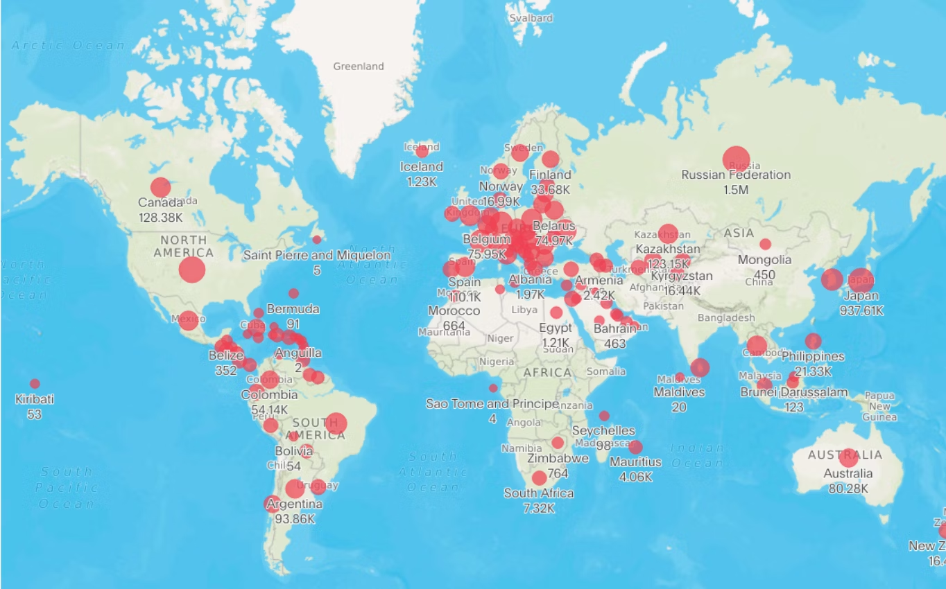
For example, in this geo chart, the red zones instantly catch your eye. The pattern is clear. The problem is visual. And it naturally invites the next question: What’s causing this? That’s the kind of arc that keeps your audience engaged.
Step 4: Use visuals with intention
Visuals are one of your best storytelling tools, but only when they’re used with purpose.
A poorly designed dashboard can bury important trends. But a clean, focused chart can highlight it better. Well-designed visuals are more than eye candy—they’re the moment your audience gets it without needing to decode a spreadsheet.
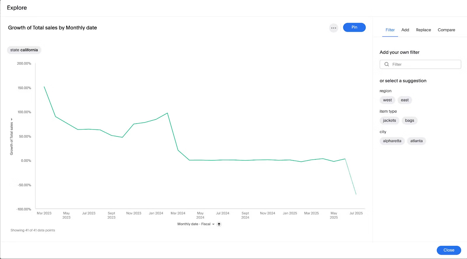
Take this example. You don’t need a label to see what’s happening; the downward trend is obvious. That’s the goal—visuals so clear, the story jumps out before you even read a label.
Step 5: Edit it for clarity
Just like any good piece of writing, your data story deserves thoughtful edits.
As the mathematician Blaise Pascal famously said, ‘If I had more time, I would have written a shorter letter.’ A great data story isn’t just about what you include—it’s about what you cut. Every sentence, stat, or chart should move the narrative forward. If it doesn’t? Edit ruthlessly, and know that your story will likely iterate with you as your business grows.
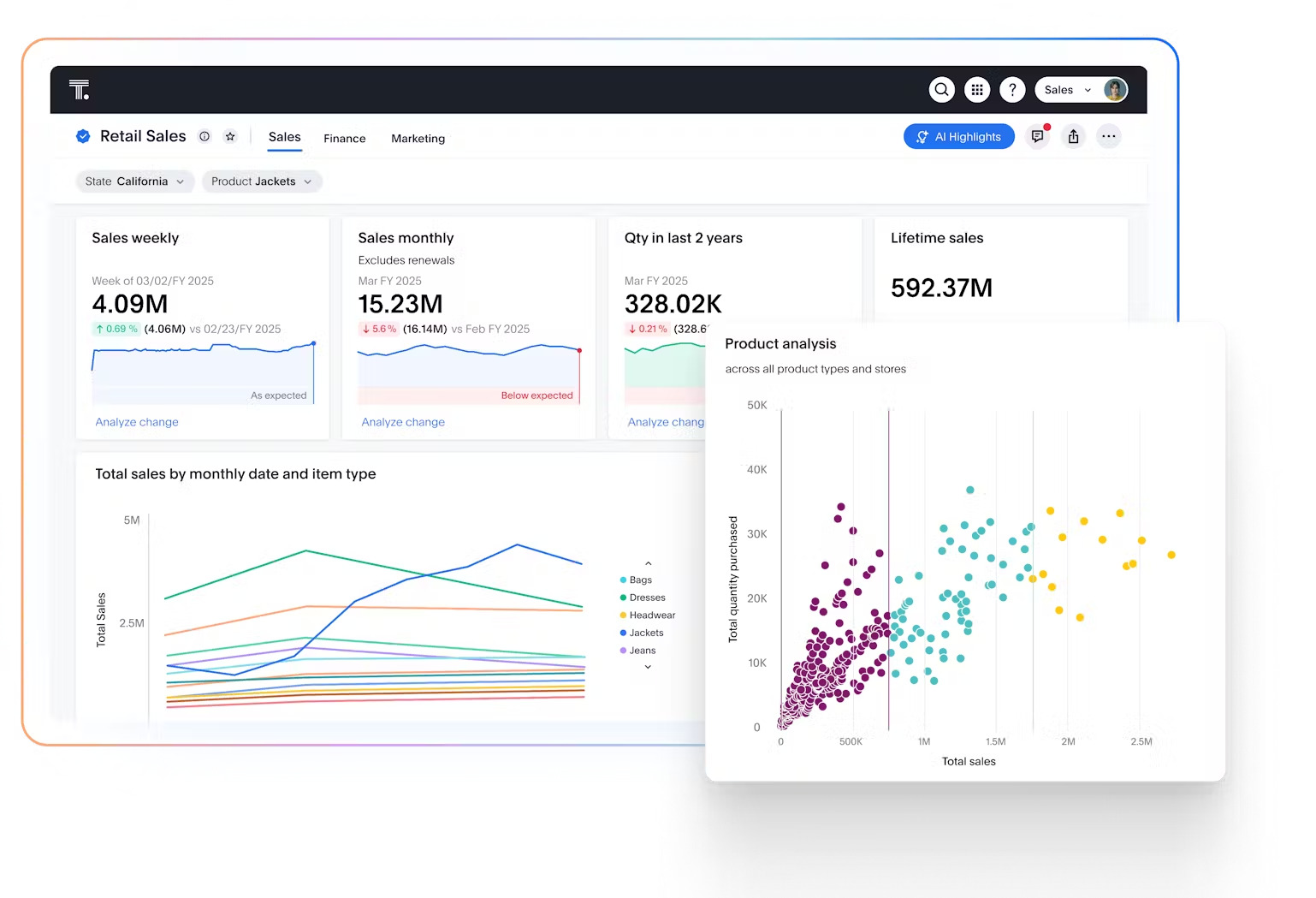
Take a look at this dashboard. By drawing the viewer's attention to the most critical data elements, you don’t overwhelm users with ‘noise.’:
1. Comparing business performance
Comparing performance across time, teams, or markets helps you spot what’s working, what’s lagging, and why. Maybe one region keeps outperforming. Maybe a once-steady product line is quietly losing steam. On their own, these signals are easier to miss. But when you frame them as part of a larger story, the picture gets clearer.
That kind of clarity makes it easier to get everyone aligned, focus your strategy, and act before a small dip becomes a big problem.
2. Evaluating customer subscriptions
In the streaming wars, getting subscribers is just the start. You’ve got to keep them coming back.
When you can show, for example, how weekend binge-watchers behave differently from weekday viewers, it’s easier for marketing, product, and content teams to make smart, fast calls. Best of all, those decisions are rooted in real behavior, so every campaign, feature, or recommendation actually hits the mark.
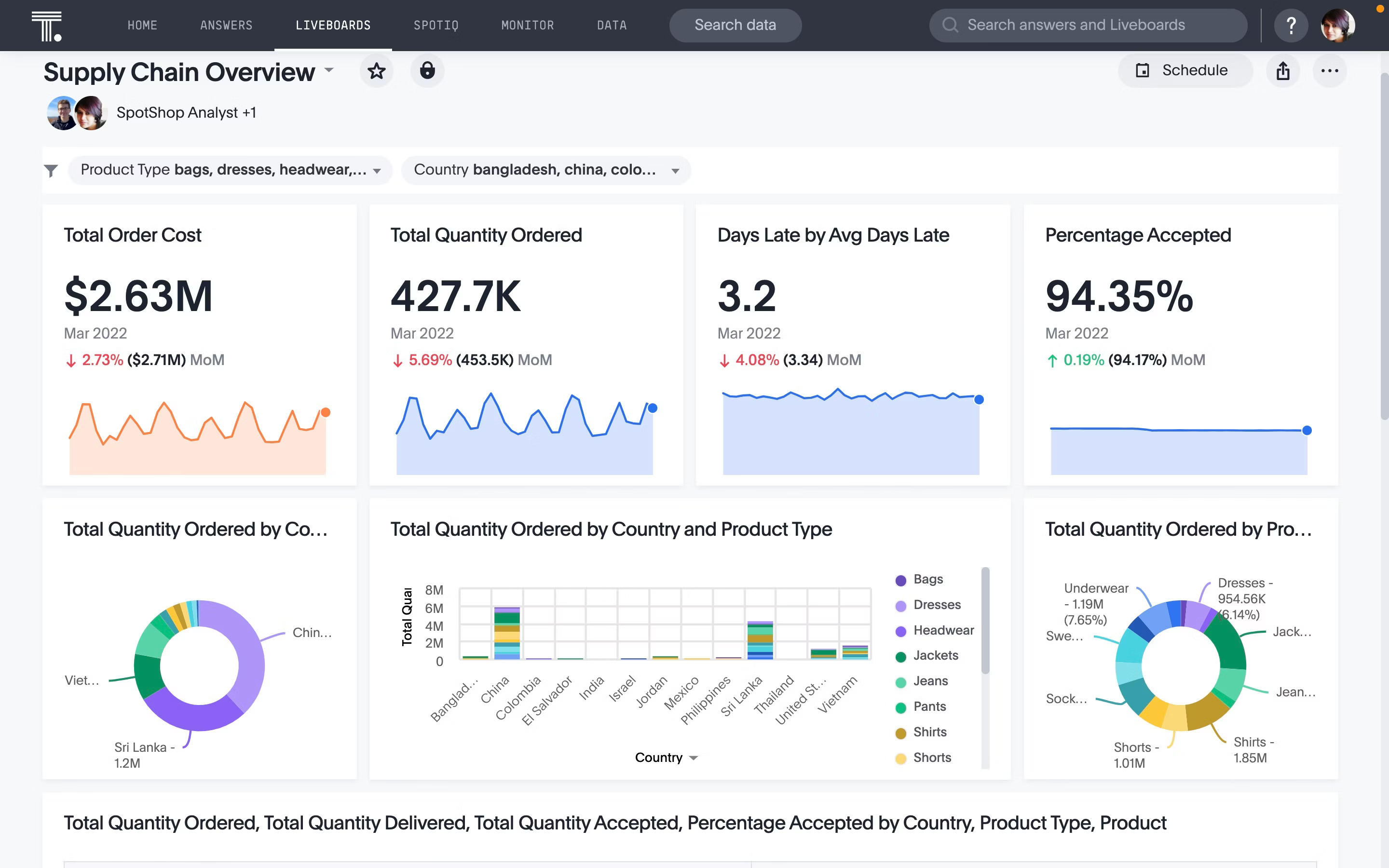
3. Preventing inventory stockouts
Inventory issues don’t happen overnight; they creep in slowly. That’s why spotting the early signs matters.
With data storytelling, you’re not just showing what’s happening; you’re explaining the root cause behind supply issues. Whether it’s a sudden spike in demand or a supplier falling behind, your team gets the full picture and can act fast.
Here’s how big players like Canadian Tire are leveraging ThoughtSpot to optimize inventory planning with AI-powered, interactive dashboards:
Make storytelling the backbone of your data strategy
Most data tools aren’t made for storytelling. They’re clunky, slow, and built for technical teams, not for the business users who need the insights. The result? Missed opportunities, buried takeaways, and data that never make it out of the dashboard.
That’s not the case with ThoughtSpot. Our Agentic Analytics Platform puts the power of AI directly in your hands. Just ask a question, and get instant, AI-assisted answers, visualizations, and recommendations.
See how easy it is to bring your data to life. Schedule a ThoughtSpot demo today.
Data storytelling FAQs
How is data storytelling different from traditional reporting?
Traditional reports are often static and text-heavy; they show what happened. Data storytelling goes further by adding narrative and context to explain why it happened and help clarify what to do next.
What’s the biggest mistake people make with data storytelling?
Trying to show too much at once. If your audience leaves confused or overwhelmed, the story failed. Simplicity is your superpower.
What types of visualizations work best in storytelling?
The best visualizations for storytelling are the ones that clearly support your main message. Line charts are great for showing trends over time, while bar charts make it easy to compare categories at a glance. If you’re highlighting a key moment or insight, annotated visuals can guide your audience straight to the takeaway. The key is to choose visuals that clarify, not complicate your story.
When should I use data storytelling?
Any time you need to explain a trend, justify a decision, or get buy-in from stakeholders. It’s especially useful when the stakes are high and alignment matters, like launching a new product, diagnosing a drop in engagement, or pitching a strategic shift.


