


Data visualization is a critical component of UX design. It allows designers to take complex data sets and turn them into visual representations that are easy for users to understand. By doing so, data visualization can help users make better decisions and navigate through information more effectively.
Anyone who has ever created a data visualization knows that the design process can be tricky. Data visualization design has many things you need to consider, from the layout of your data to the colors you choose.
Data visualization is a powerful tool for understanding complex information and communicating insights to others. However, designing compelling data visualizations can be challenging. Here are 12 tips that will help you improve your data visualization design.
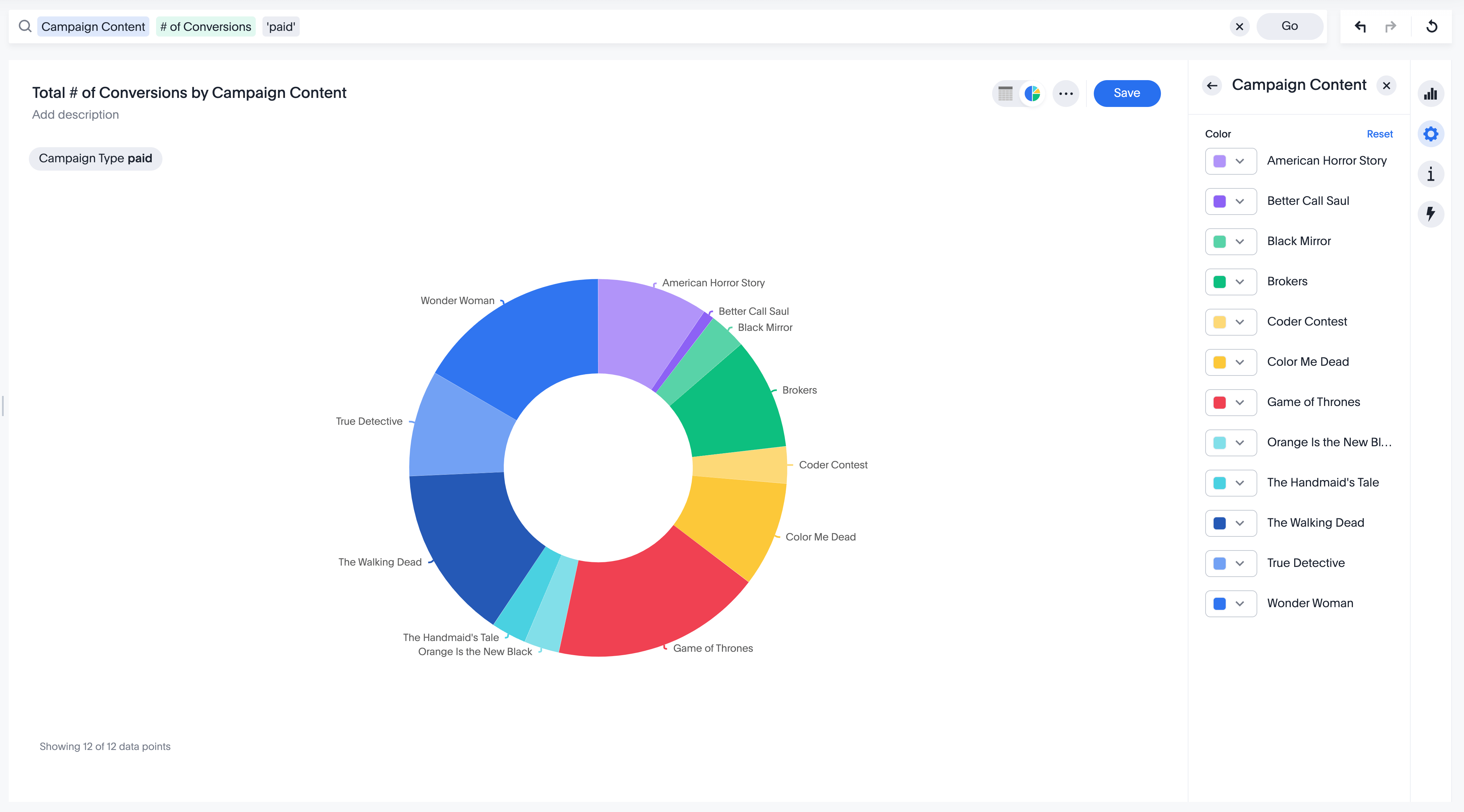
1. Choose colors carefully
A color is a powerful tool that can help make your visualization more visually appealing and easy to understand. However, using colors wisely is essential, as too many colors can be confusing. When choosing colors, consider both the message you're trying to communicate and the type of data you're working with. For example, using warmer colors (like red and orange) to visualize data points increasing and cooler colors (like blue and green) to visualize data points decreasing.
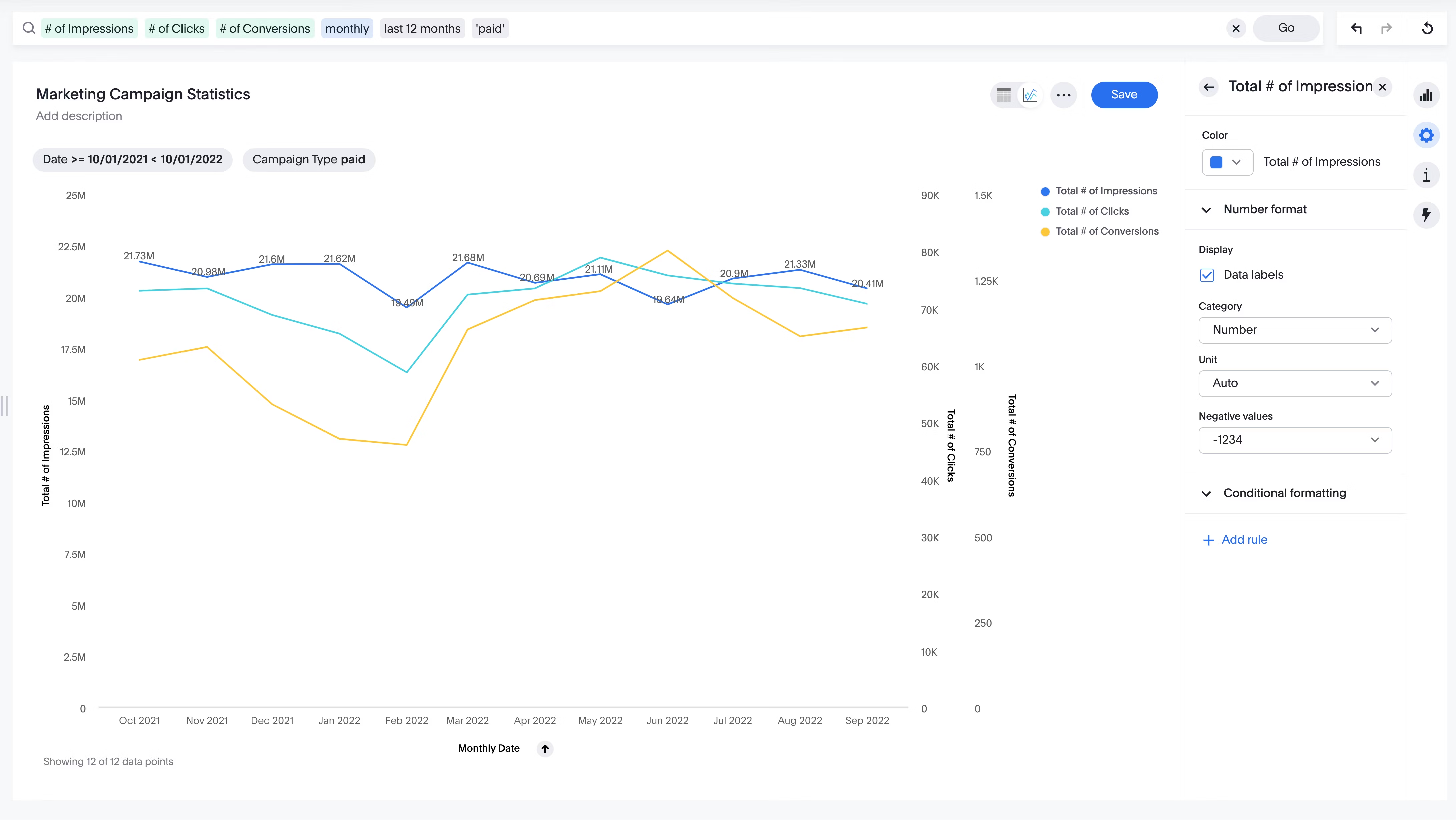
2. Use relevant and informative data labels and annotations
It's important to use data labels and annotations when creating visualizations. This makes it easy for the viewer to understand what they are looking at. Data labels help to identify the data points on the visualization, while annotations provide additional information about the data. Both of these elements are essential for making sure that the viewer knows what the visualization is all about. When labeling data points, be sure to use clear and concise language. By taking these steps, you can ensure that your visualization is easy to understand and interpret.
Start Getting Better Insights
3. Use typography effectively
When it comes to data visualization, typography is just as important as the actual data. A clean and legible font can make the difference when trying to convey information. Likewise, text that is too small may make a visualization less appealing. There should be contrast between the text and background colors. By considering these simple tips, you can ensure that your data visualization will be easier to read and understand.
4. Alignment is key
Elements in a data visualization should be aligned correctly in order to create a visually appealing design. Incorrect alignment can make the data difficult to read and understand, and can even lead to false conclusions. There are a few key things to keep in mind when aligning elements in a data visualization. First, ensure that the x- and y-axes are properly aligned. Second, make sure that the data points are correctly aligned with the axes. Finally, ensure that any text or labels are correctly aligned with the rest of the visualization. By taking care to align all elements correctly, you can create a visualization that is easy to understand and interpret.
5. Make use of white space wisely
Too much white space can make the data difficult to read, while too little white space can make the visualization too busy. The goal is to balance providing enough information and keeping the visualization easy to read. The best way to do this is to use white space strategically, highlighting some aspects of the visualization while leaving other parts empty. This will help draw the viewer's attention to the most critical elements of the data while allowing them to take in the full visualization at a glance.

6. Limit chartjunk
Bad data visualizations take away viewers' attention from important details. This is because they have too many unnecessary design elements, also known as chartjunk.
"Chartjunk" refers to any unnecessary or distracting elements in a design, and eliminating chartjunk is essential for creating an effective visualization. Every element in a visualization should serve a purpose, and anything that doesn't contribute to the overall message should be removed. In some cases, this might mean removing unnecessary labels or legend items. In others, it might mean streamlining the layout or using a more appropriate chart type. By removing chartjunk, you can create visualizations that are clear, concise, and easy to understand.
7. Select the right chart type
There are dozens of different types of charts out there (bar charts, line graphs, scatter plots, etc.), and choosing the right one is crucial to making your data visualization effective. The type of chart you use will depend on the specific data you’re trying to visualize. In general, bar charts and line graphs are good for comparing data points, while scatter plots are better for showing relationships between data points. For example, if you’re trying to show how two variables are related, a scatter plot would be a better choice than a bar chart. Similarly, if you’re trying to compare the values of different data points, a bar chart would be a better choice than a line graph. The most important thing is to choose the chart type that will best help you communicate your data.
💡 Relevant read: Histogram vs bar graph: Which should you use?
8. Draw attention to important data with contrast
Contrast is one of the most important design principles in data visualization. By using light and dark colors, or big and small shapes, you can highlight the data you want your audience to focus on. For example, if you're going to emphasize a particular data point, you can make it larger or brighter than the other points on your graph. Alternatively, you can use contrast to de-emphasize specific data points. For instance, if you want to downplay the importance of a particular outlier, you can make it smaller or darker than your other surrounding data points. By carefully using contrast, you can guide your audience's attention to the most important parts of your data visualizations.
9. Highlight patterns and relationships with shapes
Shapes can be used to highlight patterns and relationships in data. For example, you could use circles to represent one data type and squares to represent another. Doing this lets you see how the two types of data compare. You can also use overlapping shapes to show how two variables are related. For instance, if you have data on employment and crime rates, you could use overlapping circles to show how the two are related. The size of the overlapping area would represent the degree of correlation between the two variables. As you can see, shapes can be a powerful tool for visualizing data and identifying relationships between variables.
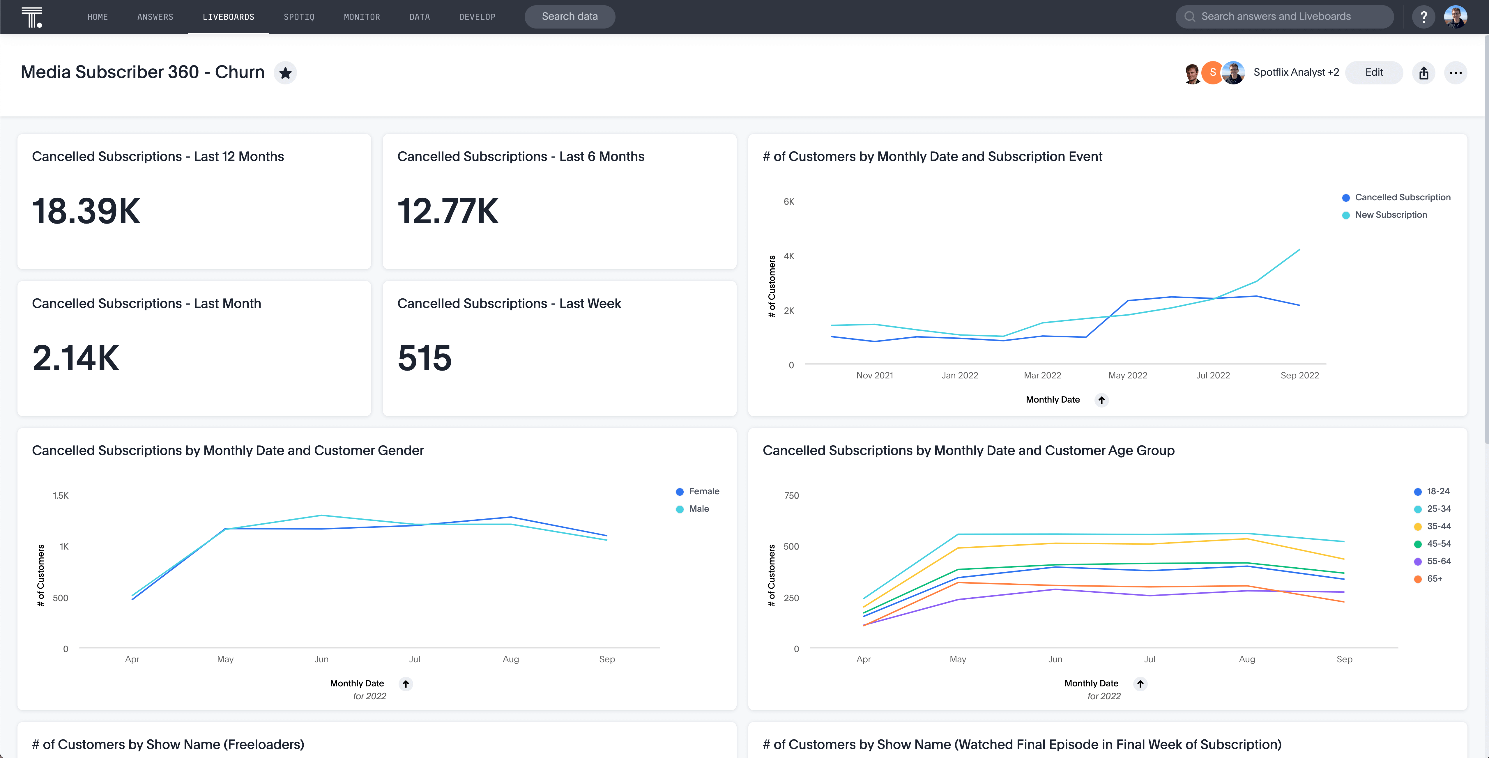
10. Use a consistent scale
When using multiple charts or graphs to compare data, make sure they all use the same scale. This way, your audience can quickly see how the different data sets stack up against each other. For instance, comparing sales figures for two products and using charts with the same scale will clarify which product is selling better. Similarly, if you're looking at changes in temperature over time, using the same scale on all of your charts will help your audience to see any patterns or trends. In short, using comparable scales on your charts and graphs is a simple way to improve the clarity of your data presentation.
11. Convey a visual hierarchy
The main goal of data visualization is to present information in an engaging and understandable way. To do this, you must first ensure that your audience understands which parts are most important by using principles like size or color; this concept goes by the name "visual hierarchy." There's no one perfect way for each person creating these graphics but they should be able to represent their findings well with some type arrangement scheme so people can easily spot what matters most at first glance.
12. Use data interactively
Interactive data visualizations are a unique way to explore large datasets, revealing hidden patterns and trends that would be difficult with traditional static screenshots. When designing an interactive data visualization, it's important to consider what the user needs and how they interact; by taking time in this area, you can help them find hidden insights on their own.
Focus on what matters
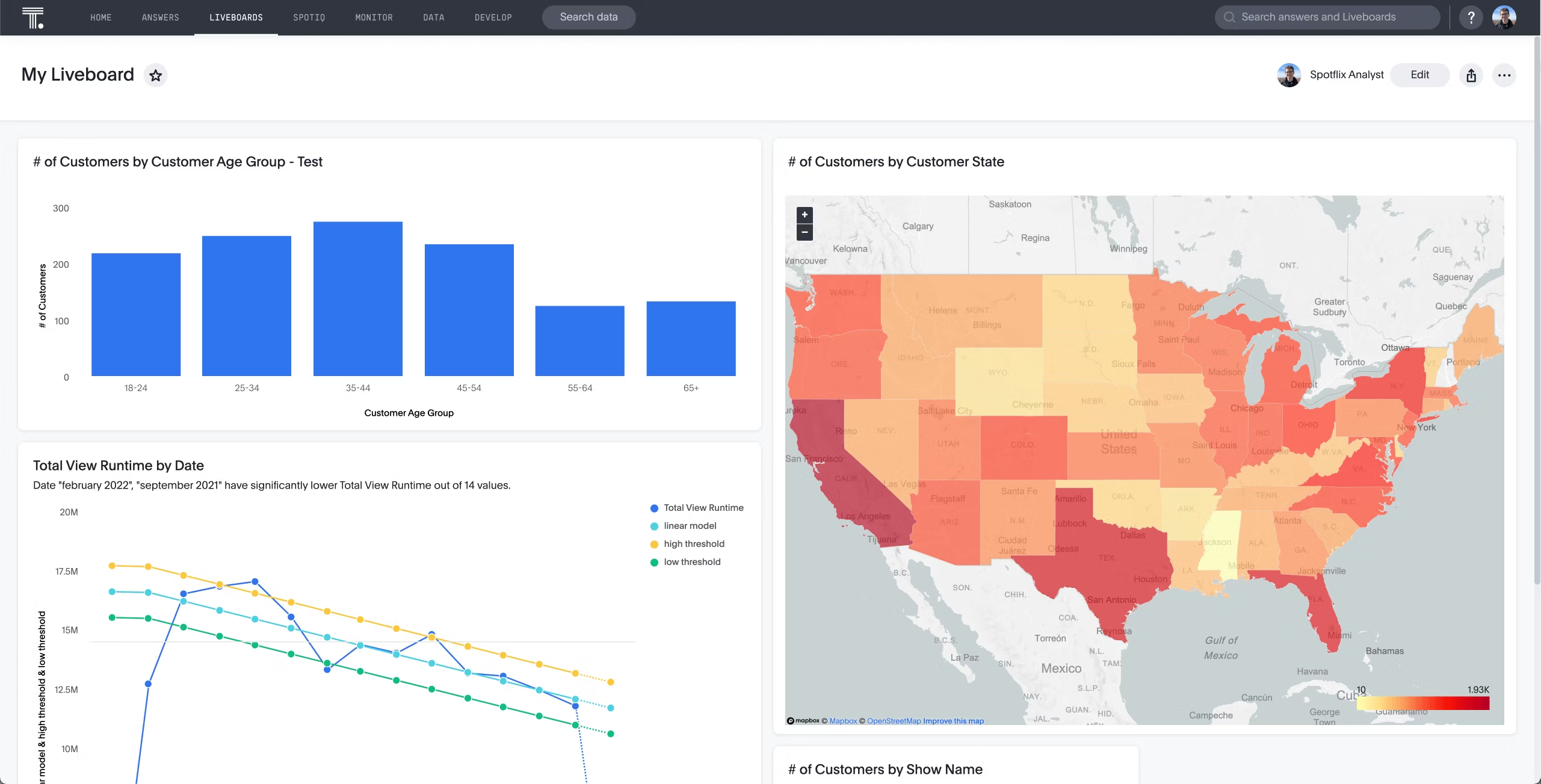
So there you have it, 12 ways to improve your data visualization design. Please take a few minutes to go over these tips and start applying them to your next project. And if you’re looking for more help, be sure to check out ThoughtSpot. We make interactive data visualization easy so you can focus on the insights that matter most. Sign up for a free trial today and see how our platform can help you uncover valuable insights hidden in your data.


