

The world is quickly becoming a digital one, and the trend is only picking up. In this new world of data, the importance of understanding data in multiple dimensions - and performing advanced analyses across all of these dimensions - grows as well.
With ThoughtSpot, we’re solving both of these issues. Not only do we democratize access to data through paradigms everyone already understands like search, we democratize the very kinds of analysis that can be run on enterprise data.
How?
The integration of R within our product.
While there are different uses for R in analyzing data, this blog post will detail one of the use cases many of our customers are already leveraging R for: analyzing time series, including sales forecasting, and identifying outliers.
Note that the intent of this post is not to provide the statistical context and basis for the algorithms and techniques we use, but rather how to get a meaningful output from R - even if you don’t have a statistical background. If you’re interested in diving deeper, links are included at the end of this post.
Time Series Forecasting
When analyzing time series data, there’s one basic question nearly everyone tries to answer: can I predict the future based on patterns I find in this data? It’s obvious why. Having a reliable window into the future, one that helps guide the decisions you’re making today, can drive serious returns for any organization.
Easier said than done.
Luckily, R provides us with the necessary tools to provide a solution to this question through a select few packages. It may seem daunting, but the following example will illustrate the ease of running this analysis in ThoughtSpot to return a png image that shows the projected forecast for any time series.
First, let’s load the required packages:
The xts package is a highly popular package in R when dealing with time series data, as it enables users to easily work with irregular time series (e.g. stock trading data gathered daily but skips weekends). The forecast package enables us to generate a predictive model and later plot both the predicted values and the original time series. The ggplot2 package is a popular visualization package to produce publication-quality graphics that are intuitive and clear.

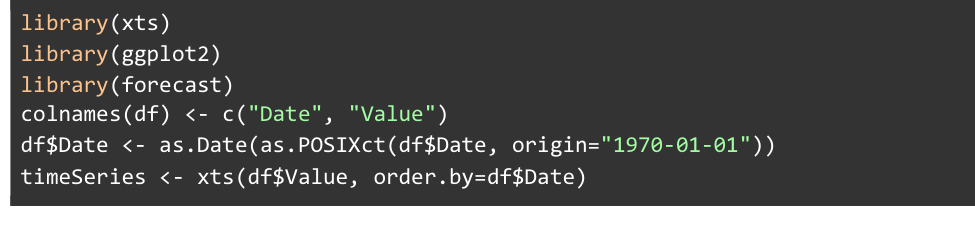
ThoughtSpot automatically generates a data frame object for us named df that contains all data from our selected columns. We label the columns inside of this df object to help us easily refer to the appropriate column throughout our script. These labels tell us that the first column, Date, in df corresponds with our date values, and the second column, Value, corresponds to the values measured at each date.

This line converts the values in our Date column into actual Date objects in R.

Now with our newly-converted Date column, we then create an xts time series object that is in chronological order.

Now that we have an xts time series object, we can try to automatically fit an ARIMA (AutoRegressive Integrated Moving Average) model to the data.
The lines above enable us to actually get the image output from R. These lines tell R to output the plot to a .png file, and #output_file# is a special token recognized by ThoughtSpot that should be used whenever we need to specify a filename. The forecast package allows us to use a forecast(...) function that takes in an ARIMA model and outputs a forecast object that predicts a specified number of periods. Here, we have decided to forecast 5 periods in the future. The package also provides an autoplot(...) function that, when passed a forecast object, will automatically plot the forecast. The output is expected to look like so:
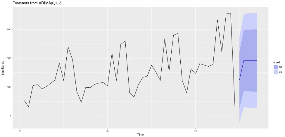
Here we see the forecasted values (blue line), the 80% confidence interval for forecasted values (darker blue area around blue line), and the 95% confidence interval for forecasted values (light blue area around blue lines). The title also contains the type of ARIMA model that was generated: ARIMA(0, 1, 2).
Time Series Outliers
We’ve now seen the uses of forecasting time-series data, but what if our data is not well-maintained or extreme outliers exist in the data? It is crucial to account for these when running time series analysis in R.
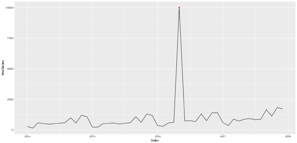
If a few extremely high or extremely low outliers exist, our predictive model could possibly be affected like so:

Here, replacing just one of the points from the previous example has significantly altered our ARIMA model and as a result our forecast also changes. So how do we ensure these data points don’t dramatically skew our analysis?
Luckily, R also offers the ability to detect these time series outliers. To do this, we can reuse the packages previously used and construct a script that starts out similar to the previous example:
Up to this point, we’ve created an xts object exactly like how we were doing it in the previous example.

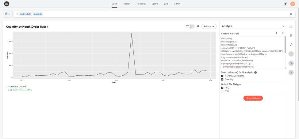
This is called the tsoutliers(...) function on the timeSeries object we just created, and places the outliers that were found in an outliers object. Now that we have both the time series and the outliers found within it, we just need combine this information on the same plot.
The first line uses the same autoplot(...) function utilized in the previous example, except we’re only telling it to plot our timeSeries object and to store the plot in some img object. The second line creates a new outliersDf data frame that contains the date of each outlier in the first column, and has the actual values on those dates in the second column. We then graph these points and add them to the img object in the final line and color these points red.
All that’s left is to set up the png graphics device and print out the img object that’s been created.
Using this, it’s easy to find and mark the outlier we just manually inserted into the time series. One drawback of this plot, however, is that, although we can visually approximate when the outlier occurred, we don’t know the exact date of the outlier. Adding a text label to our plot is one option, but we can also directly get textual output from R in ThoughtSpot to figure out the exact date. The outliers object has an index field that contains all the dates, and we can print out this information like so:
The output should then look something like this:
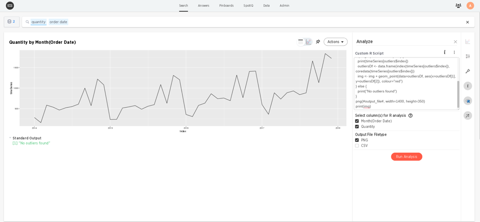
Great! Now it’s simple to see exactly which outliers occurred on what day. One other important caveat to think about though, is what the result will be when the script runs on a time series that has no outliers. When running this script on the original dataset, we encounter an error when trying to add the outliers to our plot. The script can be made more robust against these time series by altering it slightly:
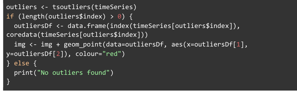
Here, we’re checking to see if the outlier$index vector that contains our outlier dates has a length greater than 0, which it should be if any outliers have been identified in the data. Otherwise, we want to print out that none were found.
While it’s up to the individual analyzing the data to figure out what any specific outlier means in the context of their business, R can be a powerful tool to identify these outliers and ensure they don’t impact the value of the analysis being conducted.
This is just one way to use R in ThoughtSpot, but there are plenty more use cases. From textual analysis on customer reviews to predictive modeling in your sales pipeline, leveraging R in ThoughtSpot can be a powerful way to run advanced analyses, extract insights, and drive your business forward.
Interested in learning more about how to use R in ThoughtSpot? Here are some helpful links that provide some more background and examples of these R packages:


