

Who here remembers high school? Prom? Football games? Math?
Several of us lucky few look back fondly at our glorious TI-graphing calculators, which not only could be hacked to play Mario, but which also held some graphing capabilities.
We laughed at the concept of graphing by hand, while those without silently and angrily took out their rulers and paper.
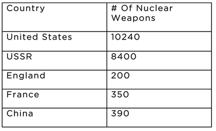
Graphing by hand sucked. So that you can personally remember, please draw the following table
and send it to:
1 Palo Alto Square
Bldg 1, Suite 200
Palo Alto, CA 94306
Or if you can’t bear that much lack of technology, you can take a pic of it and email your chart to [email protected].
Obviously, those who suffer through the 5 minutes it takes to plot out five data points and send it to us will be sent an awesome prize.
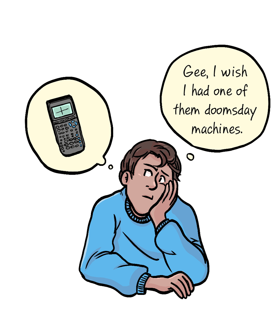
People have been graphing charts (charting graphs?) for hundreds of years. If you refused to do the five minutes of work it takes to draw the above, imagine having to work with dozens or hundreds of data points.
And here enters the real issue. Today, tables are not made up of hundreds of data points, but millions. Even teenage you would go to your room, slam the door, and play loud music and cringe at the thought of using your graphing calculator.
Although computers are able to create visualizations quickly, they’re still playing catch up with data collection. Today, the amount of data collected is in the zettabytes (which, as we all know, is a quadrillion megabytes), i.e., a bit too much for the average person to wrap his or her head around or take full advantage of. For example, what would a quadrillion pennies look like1?
To process so much information, people need charts. Studies claim visualization is useful for everything from athletics to personal goals to playing instruments. Studies even show that many people actually cognitively convert words into pictures to understand them.
In other words, information is processed faster and more effectively in visual form.
For example, instead of reading this whole post, you could have just looked at this graph:
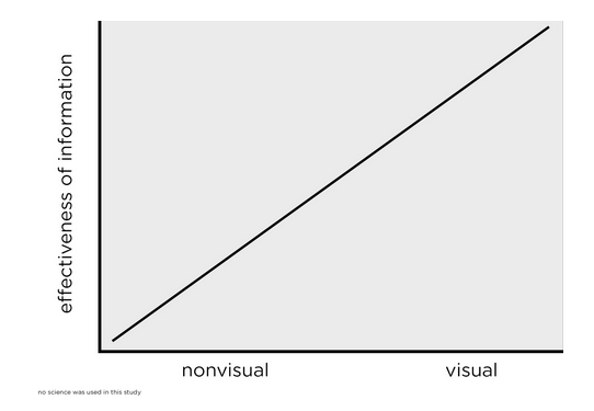
See how easy that was to understand? If we wish to understand the nonstop collection of data, we need to be able to quickly create charts with massive amounts of data.
And here is where we remember that this is a corporate blog. Being able to use ThoughtSpot to create charts from millions of rows of data, instantly, is great. Without a background in data analytics, I have a tendency to make really pointless charts. High school me would have cried and complained on Myspace been very upset had I spent more than 30 seconds (let alone days/weeks) creating a pointless chart, but with our technology, I just try a new search. Creating charts is fun. If I went back in time and told high school me that creating charts was fun, I never would have believed it2.
2 Nor would I believe that Snapchat would become a thing.


