

Well, that was interesting! I just finished the Show Floor Showdown for Business Intelligence at Gartner Data & Analytics Summit with team ThoughtSpot.
(Reminder: ThoughtSpot was named a Visionary in Gartner’s 2022 Magic Quadrant™ for Analytics and BI Platforms.)
For the setup, we were asked to play the roles of sustainability experts, government officials, and business leaders working to understand the impact of sustainability goals on economic, environmental, and social outcomes.
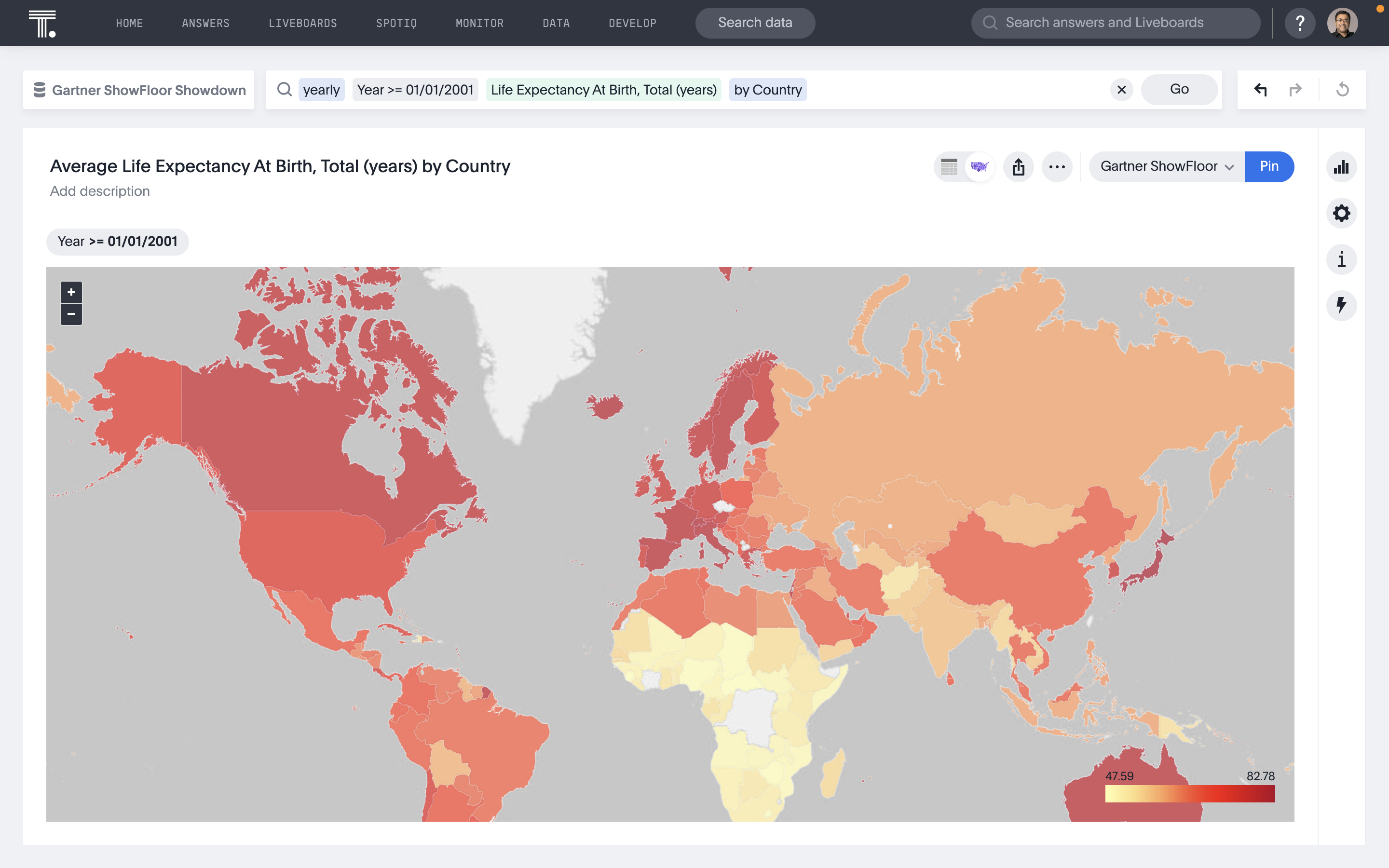
Gartner gave us plenty of flexibility in the data we used. Our hypothesis was that average life expectancy would provide plenty of insights into whether sustainability initiatives were having a positive effect. So we downloaded some mortality data from the United Nations, reformatted it for analysis, joined it with several additional statistical data sets from the UN and the World Bank, and got to work.
Uncovering early insights with search
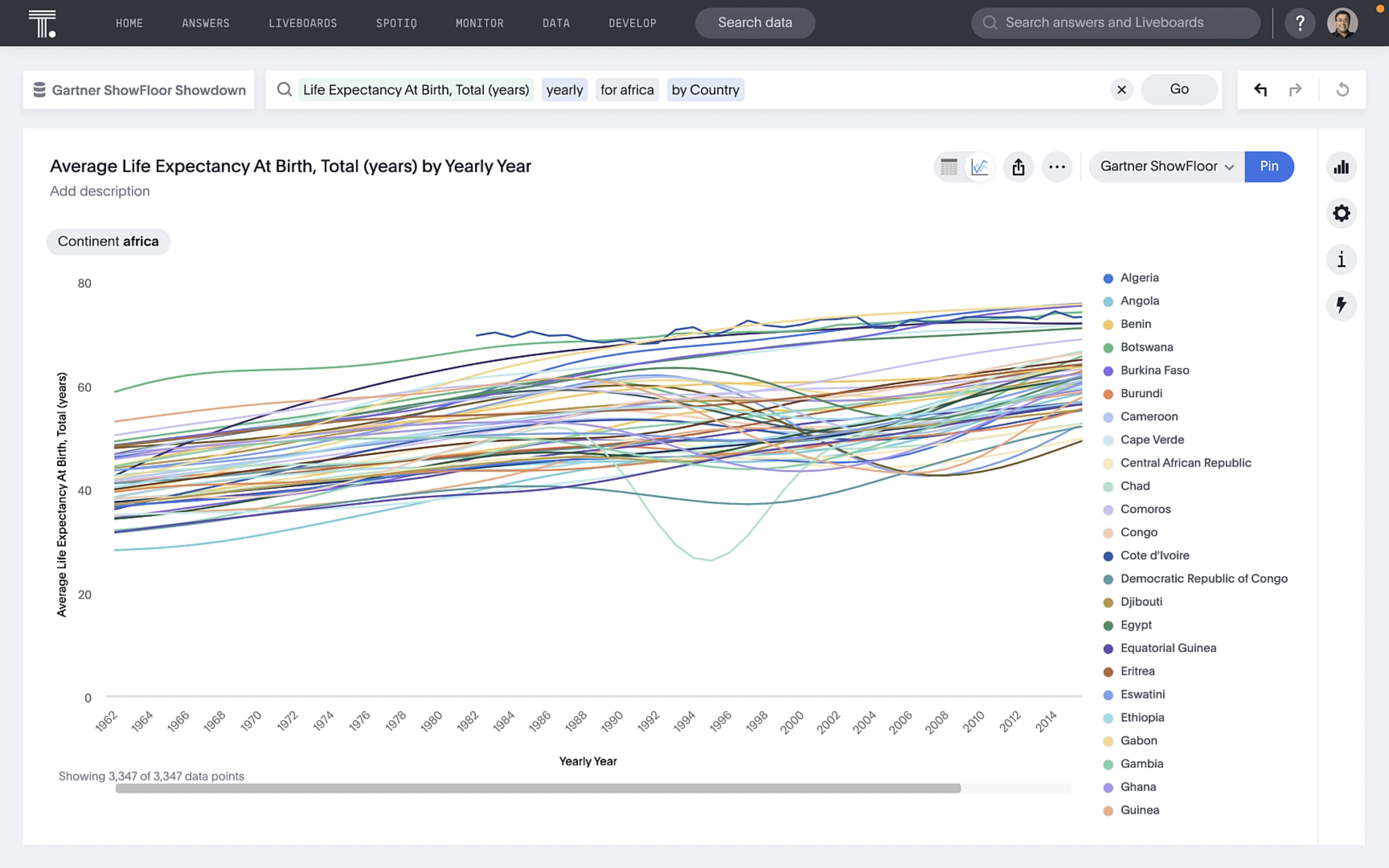
Early in our analysis, we noticed that average life expectancy in Africa over the last 20 years was much lower than on other continents.
As we looked into this more, we saw that life expectancy has generally trended up for African countries. But, there have also been some significant dips.
Now, we are not social academics in real life, but a few folks on my team recalled that several countries in Africa have experienced civil wars. With ThoughtSpot, I had plenty of options for how to filter these countries. We added a conflict variable to our worksheet, which makes it simple to model data for search. Thist indicator was essentially a true/false field that would enable us to filter to countries that have - or have not - experienced significant internal conflicts.
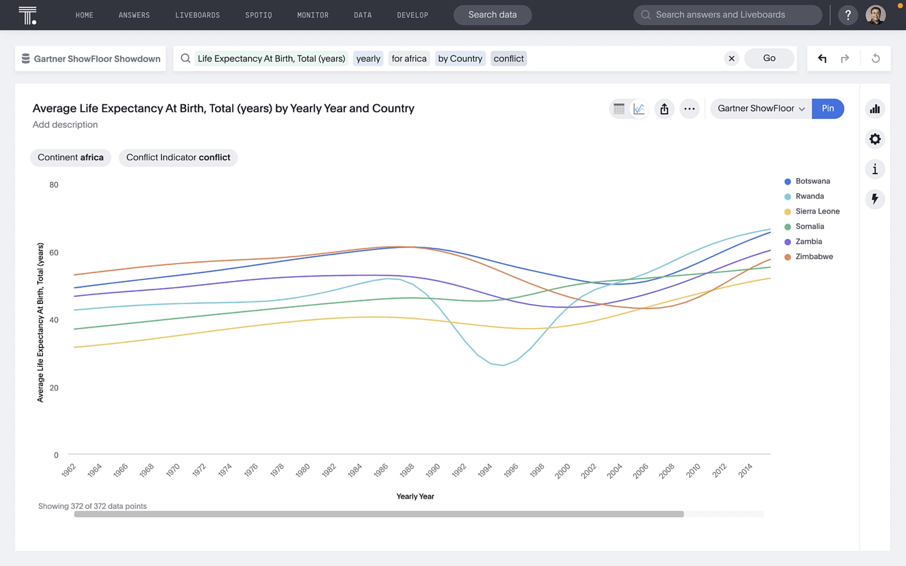
Every single country we identified experienced a dip in life expectancy at birth, highlighting that even the best sustainability efforts in the world are no match for the destructive power of war.
Discovering unexpected trends with AI
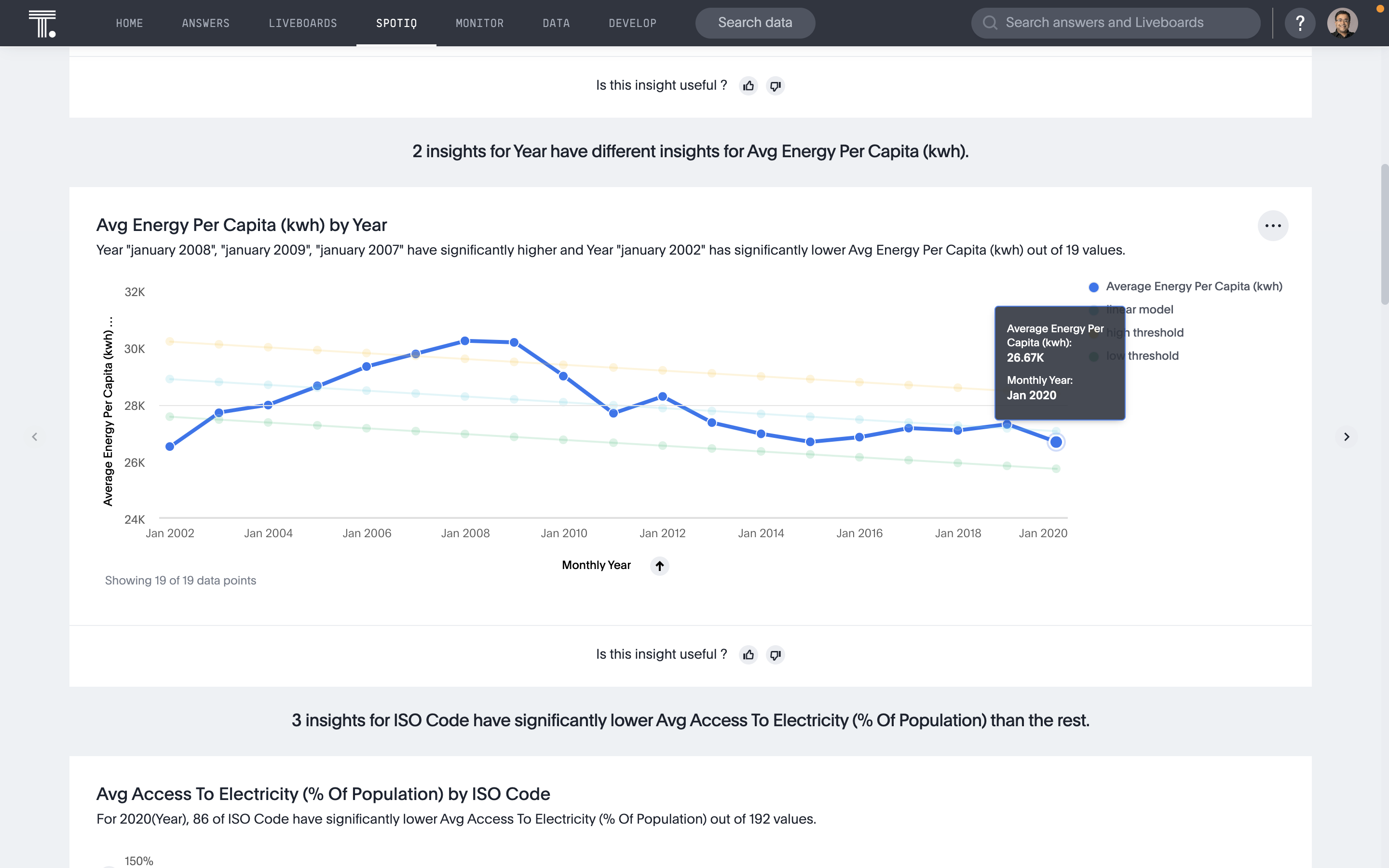
As we continued combining and analyzing different data sets, we did find a few things that seemed to be positively correlated with life expectancy. So we applied ThoughtSpot’s AI to dig in and tell us how the world was performing around these variables.
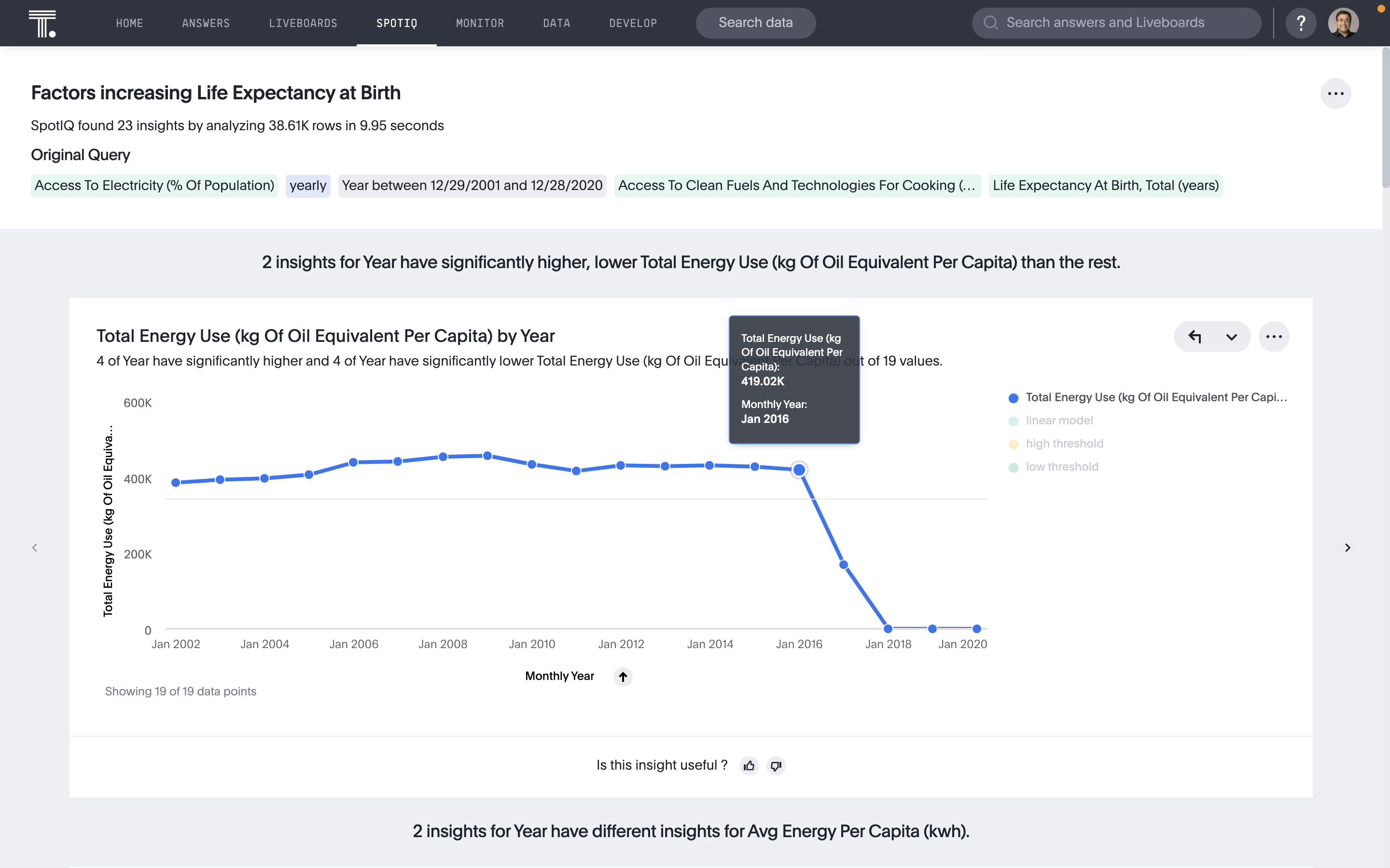
In the image above, we can see on the blue line that energy usage per capita actually declined during the Great Recession. Though it increased in 2012, it actually declined again from 2014-2016. There’s a steep decline in 2017, but I’d have to look into this data set more to understand why.
Here we saw a similar pattern for energy consumption. This also dropped around the Great Recession. It bounced back a bit in 2012, but then declined again and has been somewhat stable for the last few years.
While it was great to develop these insights, they’re just the tip of the iceberg. In the real world, I’d use ThoughtSpot to drill into different types of energy consumption to see how metrics break down between fossil fuels and renewable energy. I’d also be curious to see which areas are doing a better or worse job taking advantage of the clean resources they have available.
The future is bright for Live Analytics
Big thanks to all of the customers, partners, and colleagues who joined us at the Showfloor Showdown or otherwise made time to say hello during the event. Meeting you, hearing your stories, and seeing data leaders from Vanguard, Mayo Clinic, and GSK share their success with ThoughtSpot on the mainstage were the highlights of my summit experience. I can’t wait to see you all again next year, so I can hear how you’re driving analytics adoption and creating true differentiation for yourselves in the market with Live Analytics. If you haven't checked out ThoughtSpot, get started for free today. Happy searching!


