

Everyone is talking about the mass shooting epidemic facing America. 35 victims in San Bernardino, California. 12 in Colorado Springs, Colorado. 19 in Roseburg, Oregon. And that’s just in the last six months. The rising number of fatalities is undeniable and terrifying for most citizens. Mass shootings are happening so frequently that it’s become hard to keep up with all the stories. It’s tragic and the collective angst of our nation has us all calling for change. Everyone wants to save lives - the big question is how we should go about doing it.
Gun control is a highly polarizing topic in this country. When opinions are strongest and opposing, one of the best ways to bring people together is to show them the facts and data. To that end, the team here at ThoughtSpot used our search-driven analytics technology to analyze the public data available from the Mass Shooting Tracker. Data collection for this project began three years ago following the Newtown, CT elementary school massacre, with a "mass shooting" defined as an occasion during which four or more people are shot.
Only with a better understanding of the facts will we find a middle ground for change. Here are six charts that help visualize the rise in mass shootings over the past 3 years.
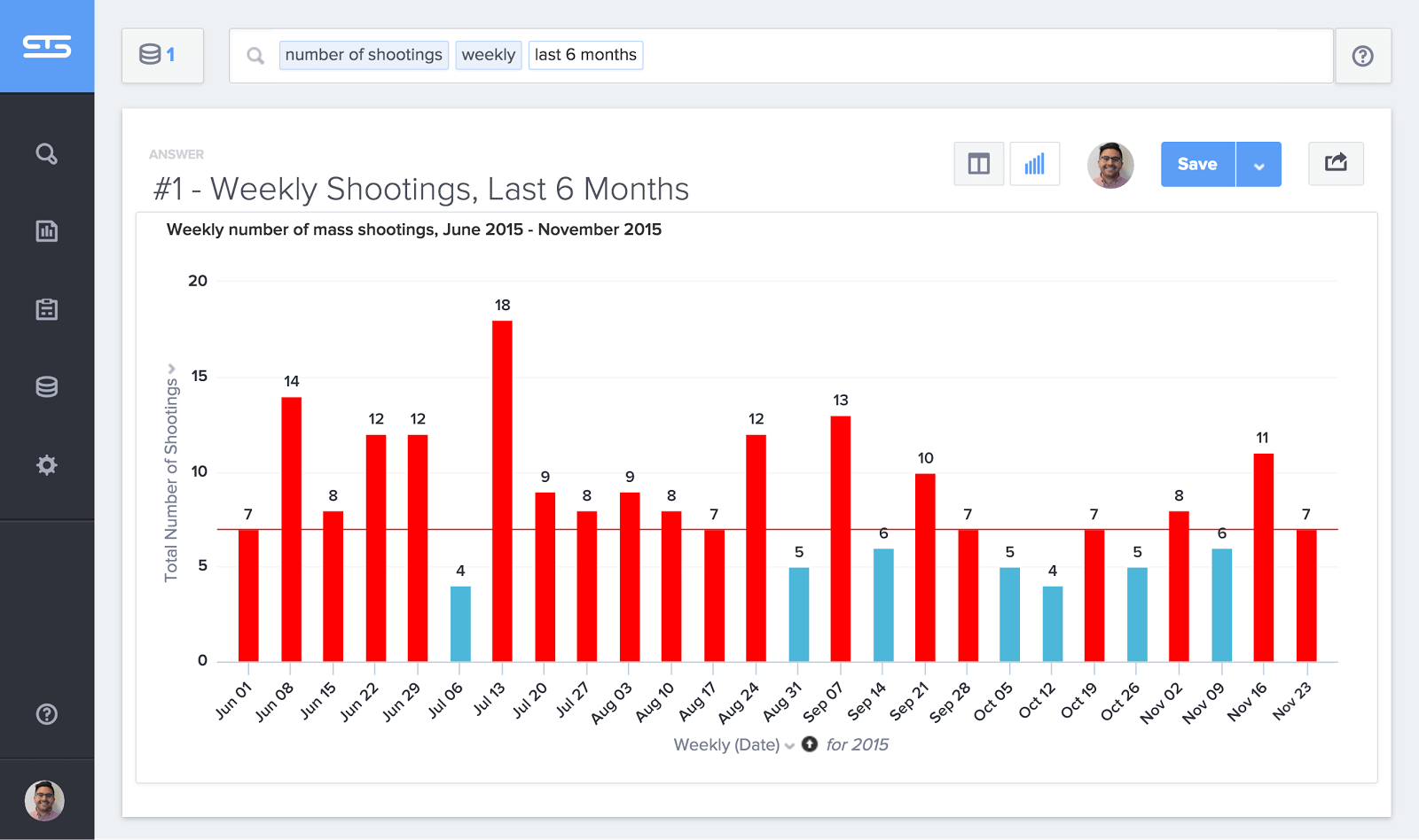
1. We're averaging 1 mass shooting per day
This chart shows weekly mass shooting trends since the beginning of June. The weeks with an average of one shooting per day are highlighted in red. America now averages 8.5 mass shooting incidents per week. The highest on record is 18 mass shootings in one week (July 13, 2015).
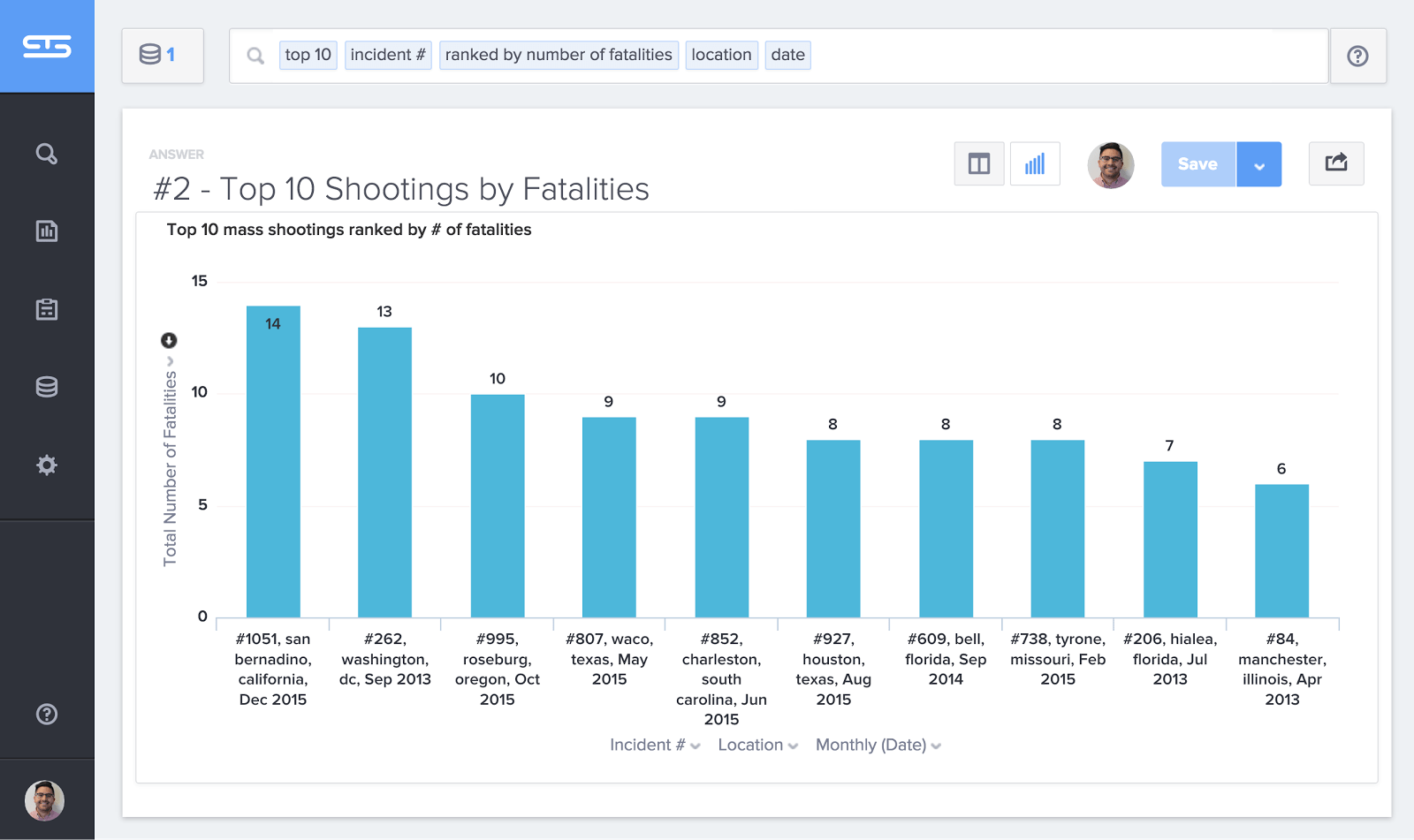
2. Fatalities are rising fast
The number of mass shootings is on the rise and so are the number of deaths per shooting. 7 out of the 10 most fatal shootings took place this year. This chart shows the top 10 most fatal mass shootings over the past three years. 14 people died in San Bernadino last week.
3. Mass shootings are everywhere
This map plots the last three years of mass shootings in the U.S. by location. The only states without mass shootings were Hawaii, North Dakota, New Hampshire, and Wyoming. 30% of shootings occurred in the same 20 metro areas.

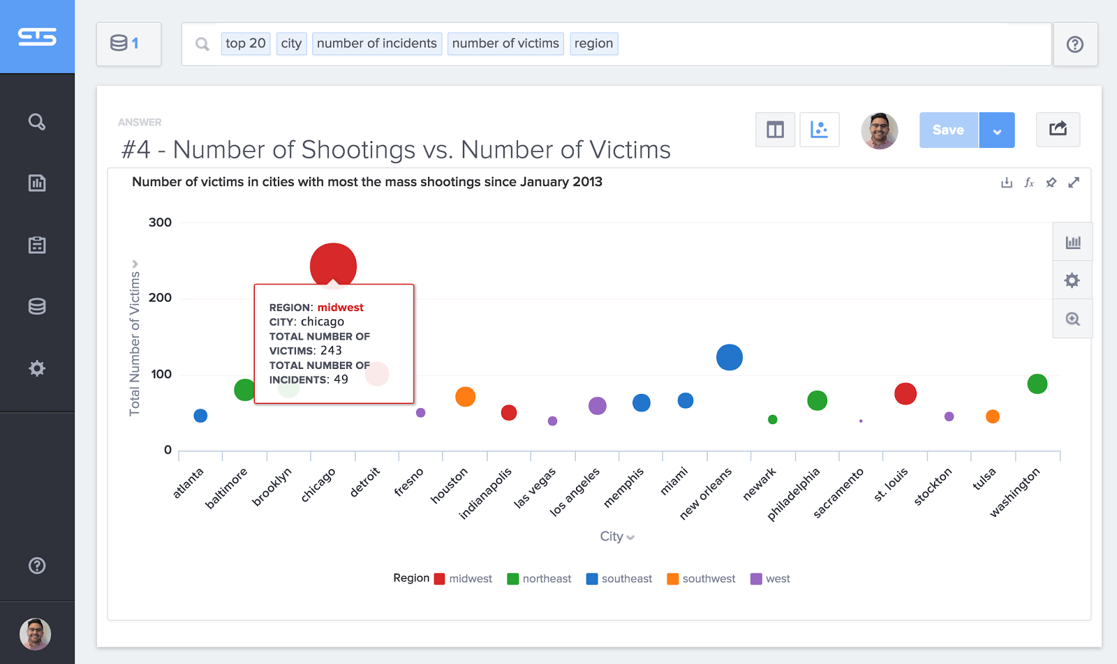
4. Chicago has the highest number of shootings and fatalities
Chicago has 2.5 times as many incidents in the last 3 years as the next highest city (New Orleans). The size of the bubble represents the number of shootings. The height on the chart represents the number of fatalities.
5. Louisiana is the most dangerous state
Even though California accounted for the most shootings (124) over the last three years, Louisiana mass shootings have nearly 3x as many victims per capita. This map shows the victims per capita (per 100,000 residents) for states with more than 5 mass shootings.

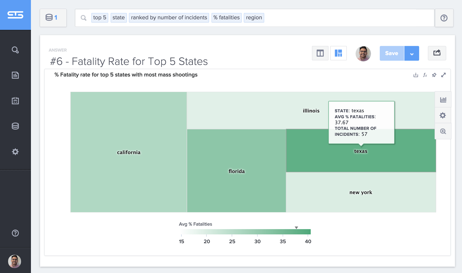
6. States with fewer gun laws have more gun deaths
Texas, a state that is known for having few gun laws, has an average fatality rate that is 43% greater than California and 95% greater than Illinois. This tree map plots the average fatality rate (depth of color) against the number of incidents (rectangle area).
We hope this data helps explain the magnitude of the mass shooting epidemic facing our nation. We can keep surfacing the data, but it falls upon all of us to keep having the tough conversations. If you found this analysis useful, please share it with your local elected officials to help shine a light on these tragedies.
And if there’s another dataset you’d like to see analyzed in ThoughtSpot, please send it to [email protected].


